10 Kitchen Backsplash Ideas That Instantly Update Outdated Kitchens—fast and Fabulous
Let’s be honest: nothing dates a kitchen faster than a sad, tired backsplash. The good news? Swapping it out is one of the fastest ways to make your space feel brand-new—without gutting the whole room. Whether your cabinets are vintage (in a cute way) or your countertops scream 2008, these backsplash ideas will do some heavy lifting. Ready to make your kitchen look like it belongs on your inspo board?
1. Go Glossy With High-Shine Subway
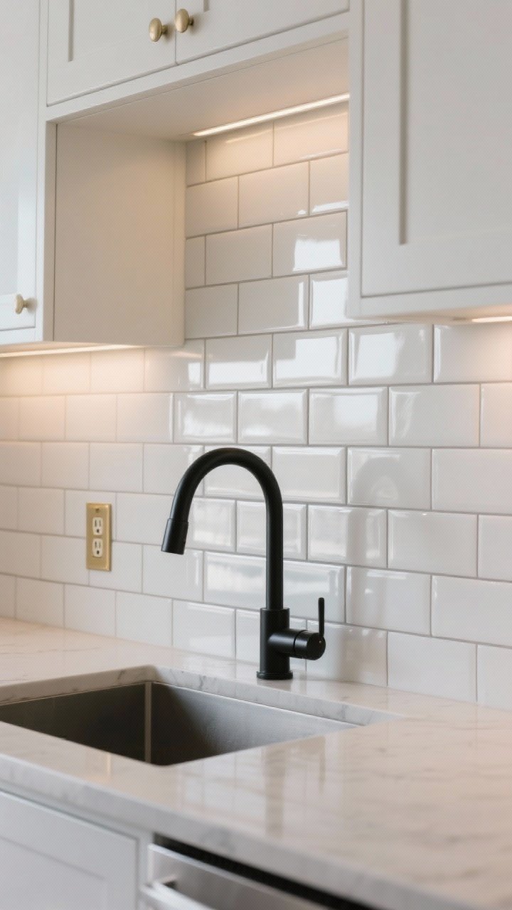
Subway tile isn’t new—but hear me out. A high-gloss version bounces light like a dream, instantly brightening a dim kitchen and making everything feel crisp and modern.
Tired of snacking when you’re not even hungry? This reset helps you stop the loop and feel back in control.
A simple reset for moments when cravings take over. Easy to use, easy to repeat, and designed to help you feel satisfied instead of stuck.
Want it to feel custom? Switch up the layout. Stack them vertically for height or try a herringbone pattern for subtle drama. And keep the grout tight for a sleeker vibe.
Pro Tips
- Color cue: Warm white tile + soft gray grout = fresh but not sterile.
- Layout hack: Vertical stacking makes low ceilings feel taller.
- Finish matters: Glossy surfaces reflect light and hide tiny splashes better.
2. Peel-and-Stick Magic (Yes, Really)

If you’re renting or just noncommittal (relatable), peel-and-stick backsplash tiles are your best friend. They’ve come a long way—think convincing marble, zellige-inspired textures, even realistic terrazzo.
Installation is painless: measure, peel, press, done. And when you’re ready for a new look, they come off without heavy-duty tools or tears.
Pro Tips
- Surface check: Works best on smooth, clean walls or existing tile.
- Seam smart: Use a sharp utility knife and a metal ruler for clean edges.
- Heat caution: Keep a bit of distance from stove burners—FYI, many brands have heat-resistant options.
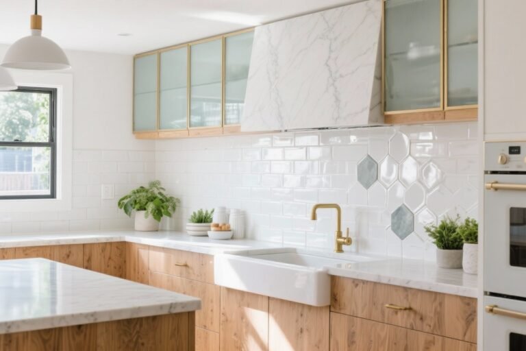
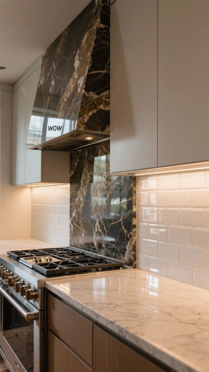
3. Slab It Up: Stone or Quartz Sheet

Want instant luxury? A full-height slab backsplash (stone, quartz, or porcelain) looks expensive—even when you choose a budget-friendly remnant. The lack of grout lines makes it feel sleek and very now.
Transform Your Home With 7,250+ Stunning Landscaping Designs—No Expensive Designers Needed!
- 🌿 Access 7,250+ stunning landscaping designs.
- 💰 Save thousands—no pro designer needed.
- 🏡 Plans for gardens, patios, walkways, and more.
- ✨ Simple, beginner-friendly DIY layouts.
- 🛠️ Customize any design to fit your yard.
It’s also practical: fewer seams mean easier cleanup and less staining. If you can match your countertop, it’ll look like a designer came by and waved a magic wand.
Pro Tips
- Vein matching: Ask for bookmatched patterns for a high-end look behind the range.
- Budget saver: Use a slab just behind the stove and tile elsewhere.
- Matte vs. polish: Honed finishes = softer, more modern; polished = brighter, more glam.
4. Zellige Vibes: Handmade Texture Without the Fuss
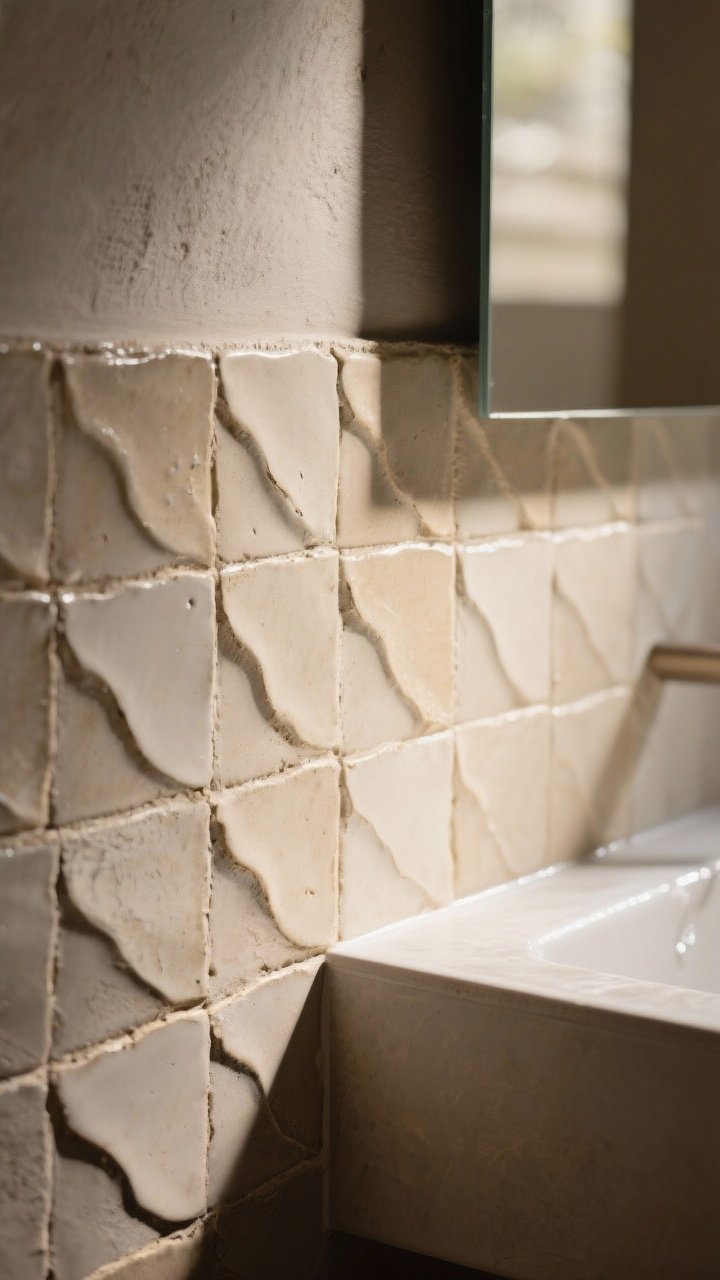
Those slightly wavy, handmade-style tiles are having a moment—and for good reason. They catch light in a way flat tiles can’t, adding instant depth and warmth to a blah kitchen.
Even in neutral tones, the texture steals the show. You’ll get that collected, European look without changing a single cabinet door.
Pro Tips
- Imperfect is perfect: Embrace tiny variations in color and edge.
- Grout glow-up: Color-match grout so the texture can shine.
- Splash zone: Seal porous tiles around the range and sink.
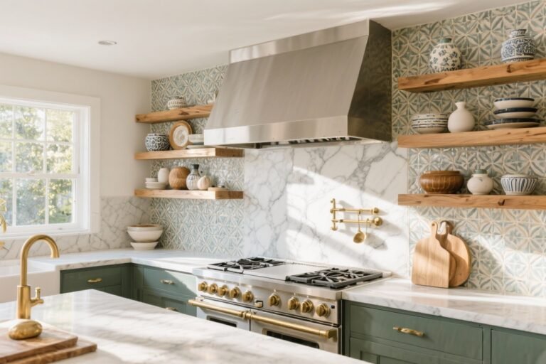
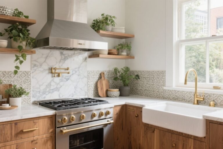
5. Bold Patterned Cement (Or Faux Cement)
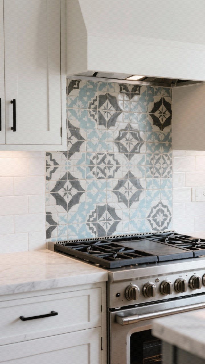
When your kitchen feels flat, a patterned cement tile can bring it to life. Think Moroccan-inspired motifs or geometric prints that stop you in your tracks. Paired with simple cabinets, it looks curated and intentional.
Worried about maintenance? Go for porcelain versions that mimic cement—same look, less sealing. Your mop will thank you.
Pro Tips
- Keep balance: If your backsplash is loud, keep hardware simple.
- Zone smarter: Use pattern just behind the range as a “feature panel.”
- Seal the real: True cement needs sealing before and after grouting.

6. Stainless Steel Sheets for Chef Energy

Want your kitchen to look restaurant-ready? Stainless steel panels scream modern and are basically indestructible. They wipe clean in seconds—great if you cook with enthusiasm (and splatter).
Bonus: they bounce light like crazy and play well with both wood and painted cabinets. It’s a minimalist look that still feels high impact.
Pro Tips
- Finish choice: Brushed hides fingerprints; mirror polish is glam but high-maintenance.
- Edge detail: Consider a slim trim for a tailored finish.
- Magnet hack: Use magnetic spice tins or hooks—hello, functional decor.
7. Pretty in Penny (Round Tiles, Big Impact)

There’s something ridiculously charming about penny round tiles. They’re playful, vintage, and surprisingly modern when paired with the right grout. Think white pennies with dark grout for contrast, or tonal-on-tonal for a soft, cloud-like effect.
They bend nicely around corners and niches, which makes them a practical choice too. And yes, they make a small kitchen feel designed.
Pro Tips
- Grout play: Dark grout = graphic; color-matched = serene.
- Edge clean: Finish edges with a schluter strip for a clean line.
- Mix metals: Pennies pair beautifully with brass, black, or chrome hardware.
8. Vertical Shiplap (But Make It Kitchen-Proof)
If you love a cozy, cottage look that still feels updated, try vertical shiplap painted in a scrubbable enamel. It adds architectural interest without looking overly farmhouse.
The vertical lines draw the eye up, which is a sneaky way to make a low-ceiling kitchen feel taller. And the painted finish keeps it bright and clean.
Pro Tips
- Paint choice: Semi-gloss or satin enamel for wipeability.
- Color crush: Soft greige, creamy white, or dusty sage all look timeless.
- Seal the seams: Caulk edges near the sink, and consider a clear topcoat behind the range.
9. Mirror or Antiqued Mirror Panels

Tiny kitchen? A mirror backsplash is basically a cheat code. It doubles your light and space instantly. If you’re worried about glare, go for antiqued mirror—it’s softer, moodier, and hides splashes like a pro.
Mirrored panels look especially chic behind open shelves or a coffee station. It’s a little glam without feeling precious.
Pro Tips
- Placement: Best away from heavy splash zones unless sealed well.
- Antiqued finish: Adds texture and hides water spots.
- Frame it: Use thin metal trim for a tailored edge and easy install.
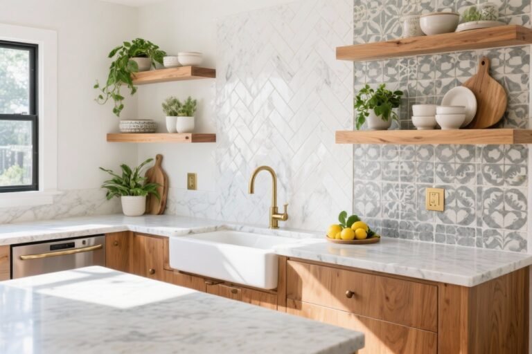
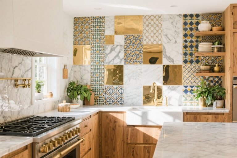
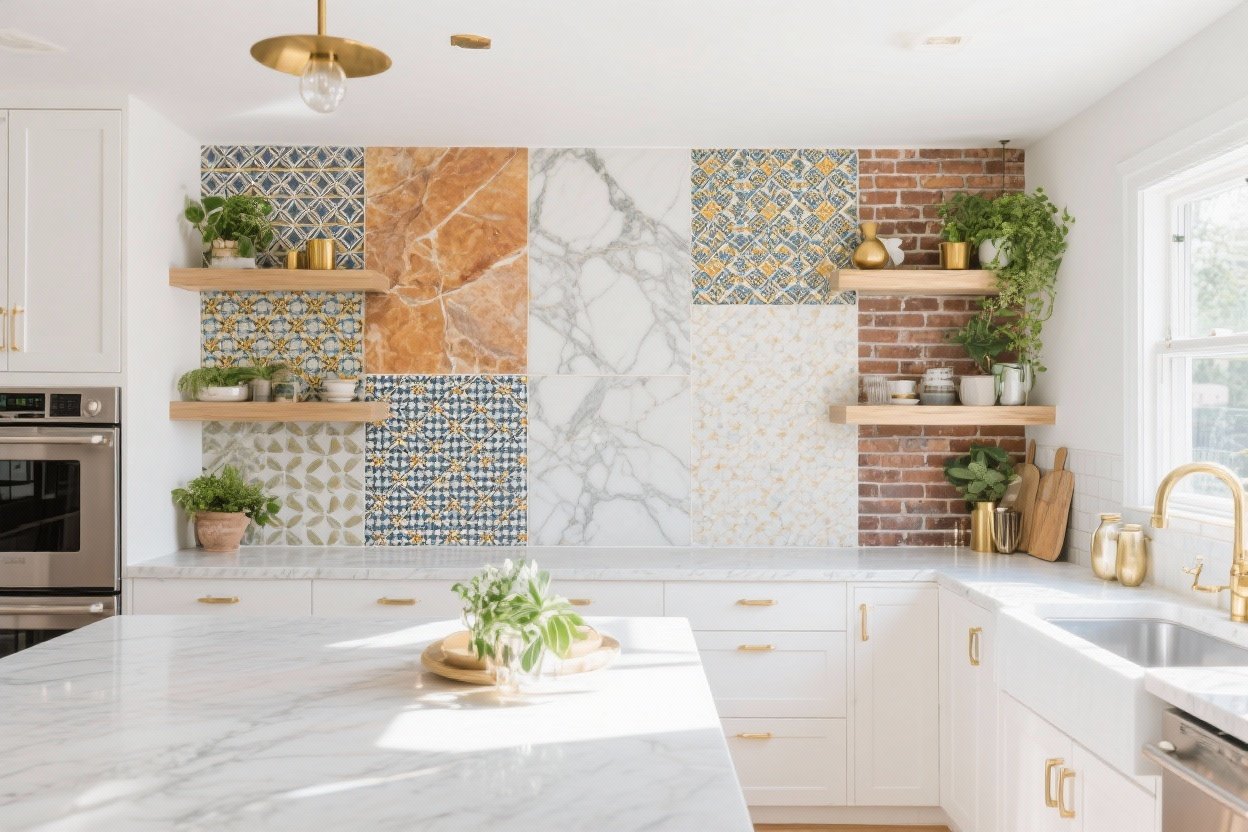
10. Mixed Materials for a Designer Look
Can’t pick just one? Mix and match. Try stone slab behind the range with tile on the perimeter, or pair glossy subway with a strip of accent mosaic. The combo adds layers—like jewelry for your kitchen.
This is the easiest way to make an older kitchen feel curated and intentional. You’re not stuck with one finish from wall to wall, which keeps the eye moving.
Pro Tips
- Unify the palette: Choose 2–3 materials that share a color or undertone.
- Vary the sheen: Matte next to gloss creates depth without chaos.
- Define zones: Use the “wow” material where you want attention (range, sink, coffee bar).
Choosing the Right Backsplash for Your Kitchen
- Cabinet color: Warm cabinets pair well with creamy whites and warm stones; cool cabinets love gray veining and crisp whites.
- Countertops: Busy counters? Choose simple backsplash. Plain counters? Go bold.
- Lighting: Glossy or textured tiles perk up low-light spaces; matte finishes calm bright kitchens.
- Maintenance: If you cook a lot, prioritize easy-wipe surfaces and fewer grout lines.
- Budget: Tile most areas; splurge on a feature wall or range section for impact.
Installation Shortcuts You’ll Thank Me For
- Template first: Dry-fit tiles and mark outlet cutouts before you start sticking anything.
- Grout color test: Make a small sample board—grout changes everything, IMO.
- Edge finishing: Don’t skip trims; they make DIY look pro-level.
- Seal smart: Seal natural stone and cement before and after grouting.
- Keep extras: Save 10% extra tile for future repairs or a mini refresh.
Your backsplash sets the tone for the whole kitchen—cozy, sleek, bold, or quietly chic. Pick the one that makes you smile every time you make coffee, and don’t be afraid to mix it up. You’re one weekend away from a kitchen that looks brand-new (and yes, your friends will ask who your designer is—FYI, it’s you).