10 Kitchen Decor Ideas That Make Your Space Feel Bigger (without Remodeling)
Small kitchen? Same. But here’s the good news: you don’t need to knock down walls to make it feel bigger. A few clever tweaks can turn a cramped cooking zone into a bright, airy space you actually want to show off. Think optical illusions, storage magic, and lighting that does more than just… light.
Ready to fake a roomier kitchen and keep your sanity? Let’s do it.
Tired of snacking when you’re not even hungry? This reset helps you stop the loop and feel back in control.
A simple reset for moments when cravings take over. Easy to use, easy to repeat, and designed to help you feel satisfied instead of stuck.
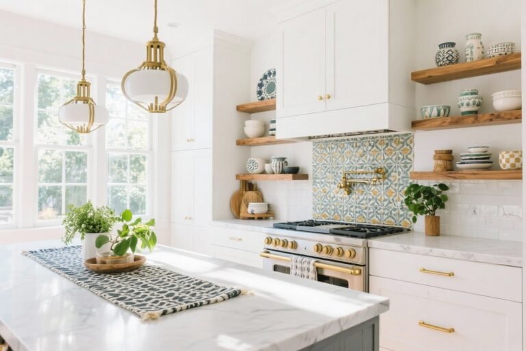
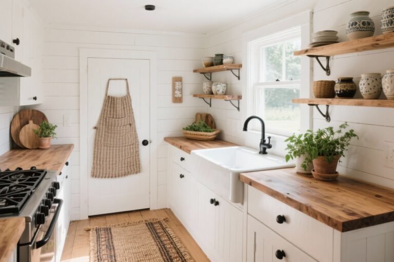
1. Go All-In On A Light, Low-Contrast Palette
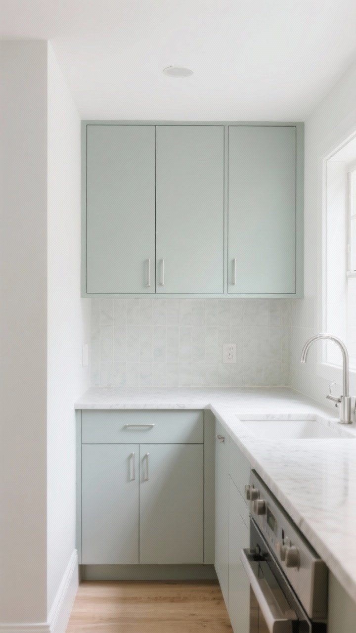
Dark, high-contrast schemes can make a kitchen feel chopped up. A light, low-contrast palette blends surfaces so your eye reads the room as one continuous space. That means softer transitions and a calmer vibe.
How To Pull It Off
- Cabinets: Paint uppers and lowers in the same light hue (soft white, greige, pale gray-green).
- Backsplash: Match tile tone to the cabinets or counters for fewer visual breaks.
- Hardware: Choose finishes that disappear a bit—brushed nickel or matte white—over bold, high-contrast knobs.
FYI: If you love color, keep saturation low and stick to a tight palette. Think “whispers,” not “shouts.”
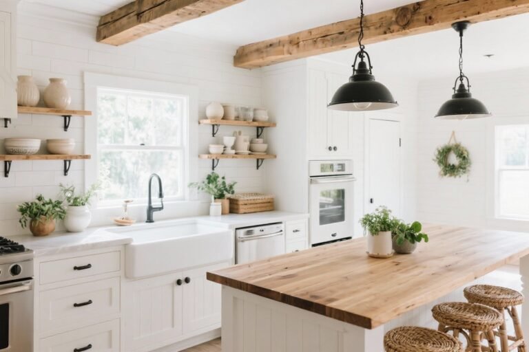
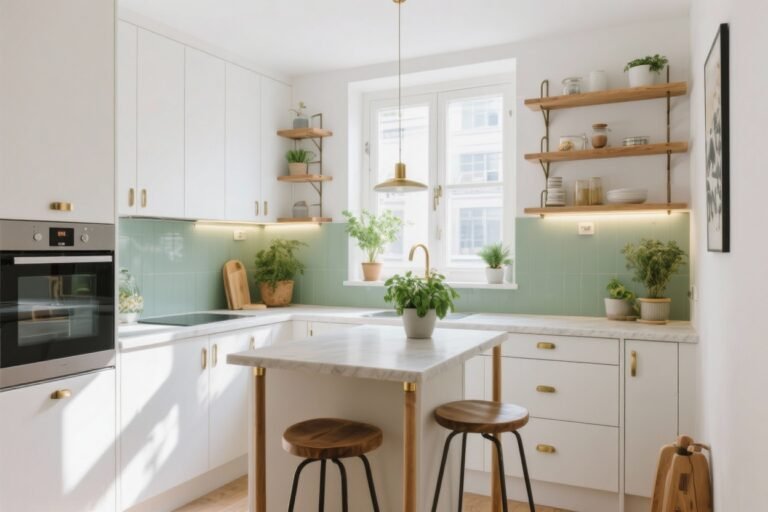
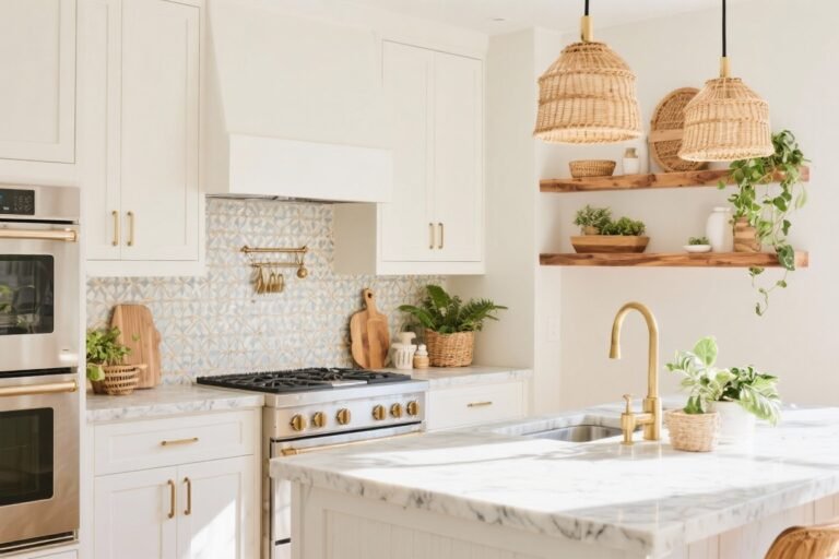
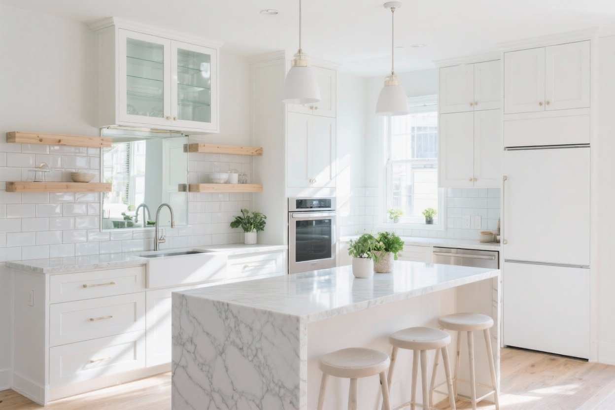
2. Swap Chunky Cabinets For Airy Storage Moments

Upper cabinets are great for storage, but they can crowd the room. Strategically mix open shelves and glass-front doors to create pockets of visual breathing room without sacrificing function.
Smart Mix-And-Match
- Open shelves: One or two runs on the lightest wall to reduce bulk.
- Glass-front uppers: Fluted or clear glass lightens the look but hides clutter better than fully open shelves.
- Closed storage below: Keep the heavy hitters (appliances, pantry goods) in base cabinets or a tall pantry.
Tip: Style shelves with a tight color story—white dishes, wood accents, and a touch of greenery—to keep it clean, not chaotic.
Transform Your Home With 7,250+ Stunning Landscaping Designs—No Expensive Designers Needed!
- 🌿 Access 7,250+ stunning landscaping designs.
- 💰 Save thousands—no pro designer needed.
- 🏡 Plans for gardens, patios, walkways, and more.
- ✨ Simple, beginner-friendly DIY layouts.
- 🛠️ Customize any design to fit your yard.
3. Max Out Vertical Lines (Your Secret Height Hack)
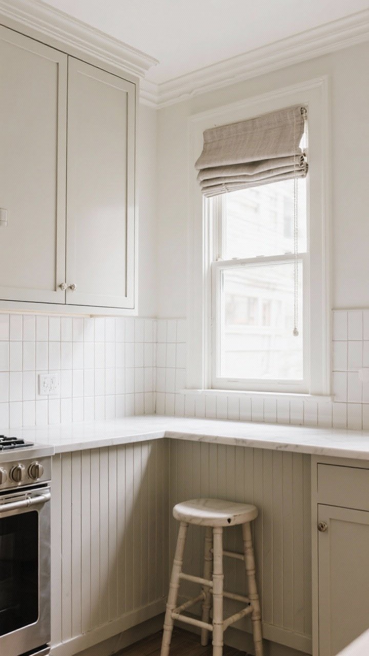
Want your kitchen to feel taller? Emphasize vertical lines. Your eye will travel up, making the ceiling feel higher and the room more open.
Easy Vertical Wins
- Backsplash tile: Run subway tile vertically or choose slim stacked tiles that draw the eye up.
- Curtains and shades: Hang Roman shades inside the frame and mount curtain rods higher than the window to elongate.
- Cabinet trim: Add simple crown molding or go full ceiling-height cabinets to reduce dead space.
Bonus: A simple ladder-back stool or ribbed paneling on an island keeps the “upward” motion going.
4. Choose Streamlined Hardware And Fixtures
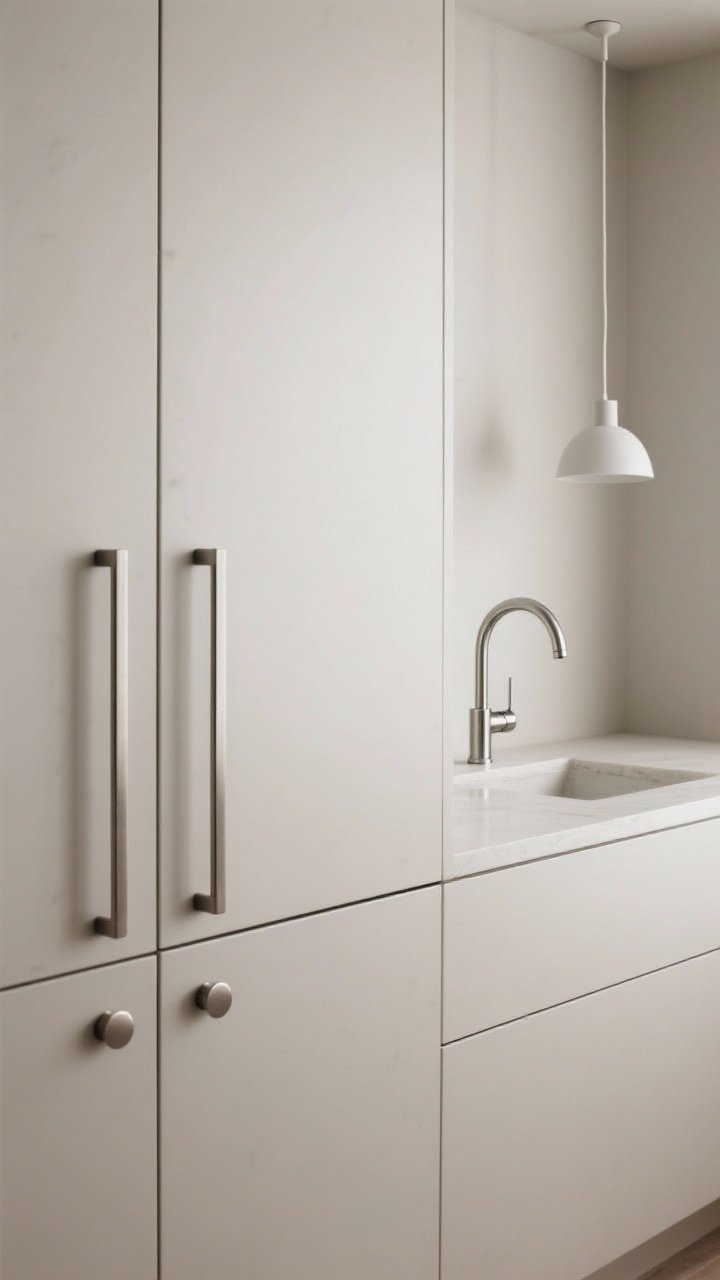
Bulky hardware and busy fixtures add visual noise. Swap in slim, simple silhouettes that look clean and modern—and take up less visual space.
Streamline Your Details
- Hardware: Thin pulls, minimal knobs, or even edge pulls for a low-profile look.
- Faucet: Go for a single-handle arc in a soft finish; avoid overly ornate designs.
- Lighting: Stick to slender pendants or small flush mounts with simple lines.
It’s like swapping chunky boots for sleek sneakers—same function, lighter footprint.
5. Let There Be Layers Of Light
Nothing shrinks a kitchen like bad lighting. You want layers: ambient (overall), task (where you work), and accent (for mood). Brighter = bigger, period.
Light It Right
- Under-cabinet LEDs: Instant depth and fewer shadows on your counters.
- Ambient glow: A soft, dimmable ceiling fixture diffuses light across the room.
- Accent lighting: Puck lights in glass-front cabinets or above open shelves = chef’s kiss.
Pro tip: Use warm-to-neutral bulbs (around 2700–3000K) so surfaces look inviting, not sterile.

6. Use Reflective Surfaces To Bounce Light Around
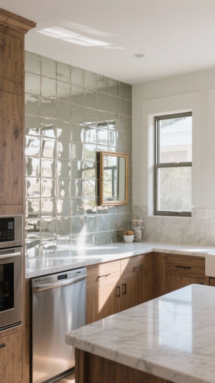
Think of reflective finishes as your kitchen’s highlighter. They bounce light and visually double the space—no renovation required.
Where To Add Shine
- Backsplash: Glossy ceramic or mirrored tile (antiqued mirror can be stunning).
- Counters: Quartz with a polished finish reflects more than honed surfaces.
- Appliances: Stainless or panel-ready fronts that blend with cabinetry.
- Accents: A small framed mirror opposite a window can fake a second view.
Keep it balanced: pair glossy elements with matte textures (wood, linen, stone) so it doesn’t feel like a disco ball.
7. Pick Furniture With Legs And Clear Sightlines
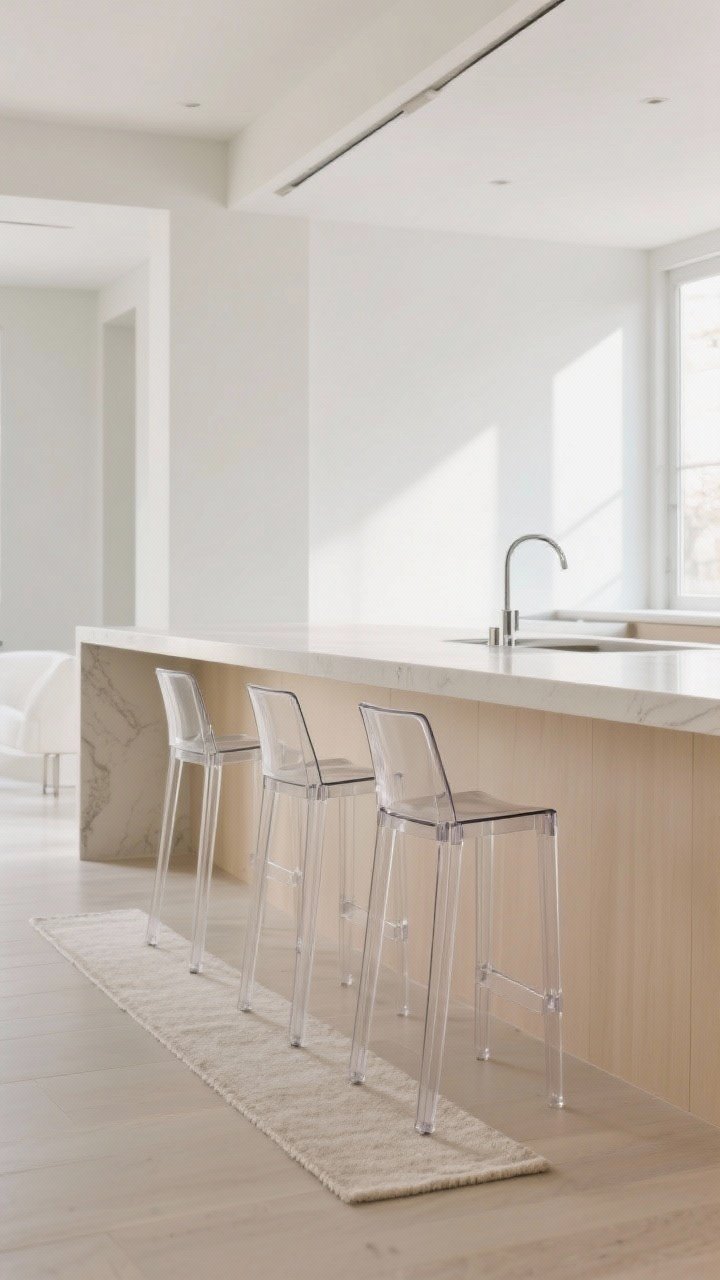
Heavy, blocky pieces anchor the room—in a bad way. Choose leggy, lifted furniture so you can see under and around it, creating the illusion of more floor space.
Space-Savvy Swaps
- Bar stools: Open backs and slender legs—bonus points for low-profile seats that tuck fully under the counter.
- Tables/islands: Skinny-leg bistro tables, waterfall-edge islands, or a narrow console as a coffee station.
- Rugs: Thin, low-pile runners that don’t visually “plop” in the middle of the room.
IMO, acrylic or glass stools are magic—they basically vanish while still being useful.
8. Get Serious About Hidden Storage (Clutter = Shrink Ray)

Visual clutter steals square footage. Use smart, hidden storage to keep counters clean and your brain calm. Out of sight, bigger in sight—trust me.
Storage Tricks That Work Hard
- Inside drawers: Knife blocks, spice tiers, peg systems for plates, and lid organizers.
- Cabinet upgrades: Pull-out pantries, corner carousels, tray dividers, and toe-kick drawers.
- Counter corners: A lidded bread box or appliance garage hides the toaster/coffee gear.
Keep only your prettiest 3–5 items out: a wood board, olive oil, maybe a plant. The rest? Tuck it away.
9. Create A Visual Flow With Flooring And Rugs
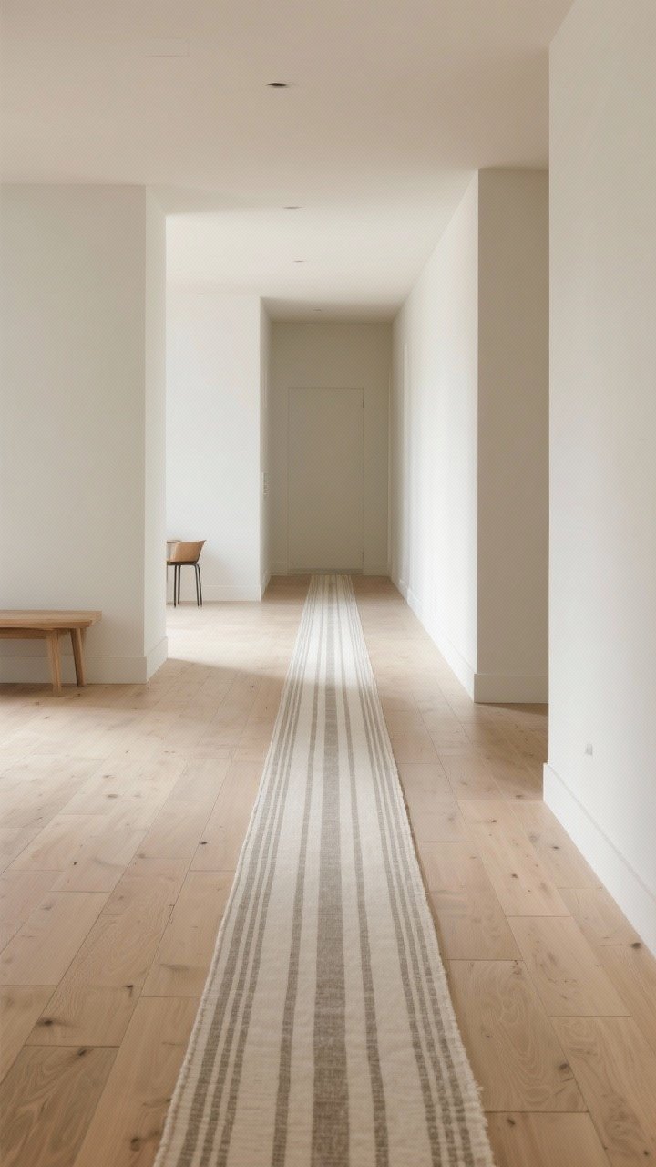
The floor is a huge canvas—use it wisely. Continuous, light-to-medium flooring that runs in one direction will stretch the room. Add a runner to guide the eye where you want it.
Flooring Moves
- Plank direction: Run floorboards or tiles lengthwise along the longest wall.
- Large-format tile: Fewer grout lines = less visual chop.
- Runners: Choose a subtle pattern or stripe; place it along the main traffic line.
If you’re renting, a washable runner is your best friend: easy clean, instant polish, zero commitment.
10. Style With Restraint And Big-Scale Moments
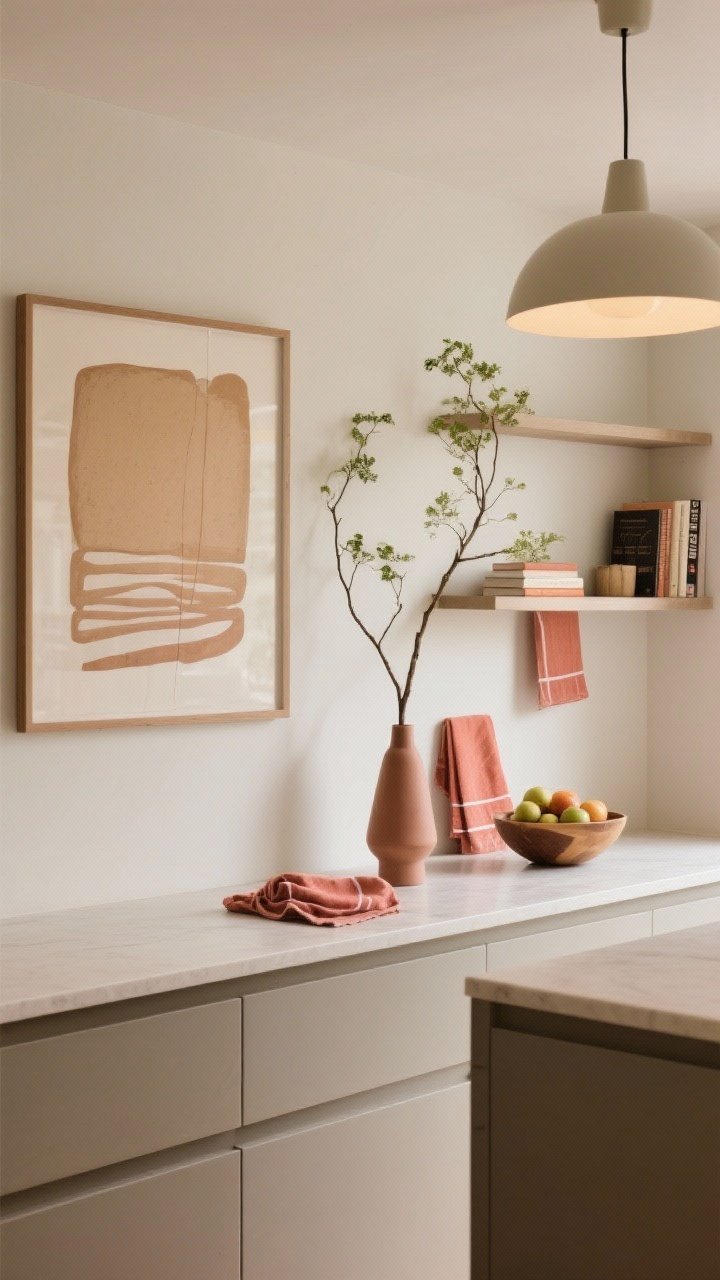
Here’s the counterintuitive part: fewer, larger accents make a room feel bigger than lots of tiny decor bits. Give your eyes space to rest, then add one or two bold moments.
Less But Better
- Wall art: One oversized piece or a simple pair, not a cluttered gallery.
- Greenery: One tall branch in a slim vase or a single trailing plant on a shelf.
- Color pops: Keep them tight—tea towels, a fruit bowl, and a cookbook spine in the same hue.
Want a hero piece? Try a statement light fixture or a bold runner. Then keep everything else quiet so it shines.
Quick Mini-Checklist
- Stick to a light, low-contrast palette.
- Boost vertical lines and layered lighting.
- Hide the clutter, streamline the hardware, and let reflective finishes work their magic.
Final thought: Designing a small kitchen is basically a magic trick—direct the eye, control the light, and edit like a pro. Do a few of these ideas this weekend, then step back and say, who even needs a bigger kitchen? FYI, your morning coffee will taste better in a space that breathes. You’ve got this.