10 Ways to Choose Kitchen Cabinets That Match Your Countertops Like a Designer
Your kitchen is where style meets spaghetti sauce. The right cabinet-and-countertop combo can make the whole space look intentional, polished, and yes—Pinterest-worthy. But pairing them can feel like blind dating materials. Will that warm oak gel with your cool-toned quartz? Will that bold marble veining play nice with matte black? Don’t stress. I’ve got 10 foolproof ways to mix, match, and nail that high-end look without second-guessing every sample.
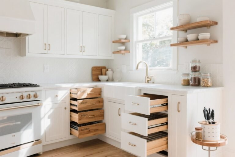
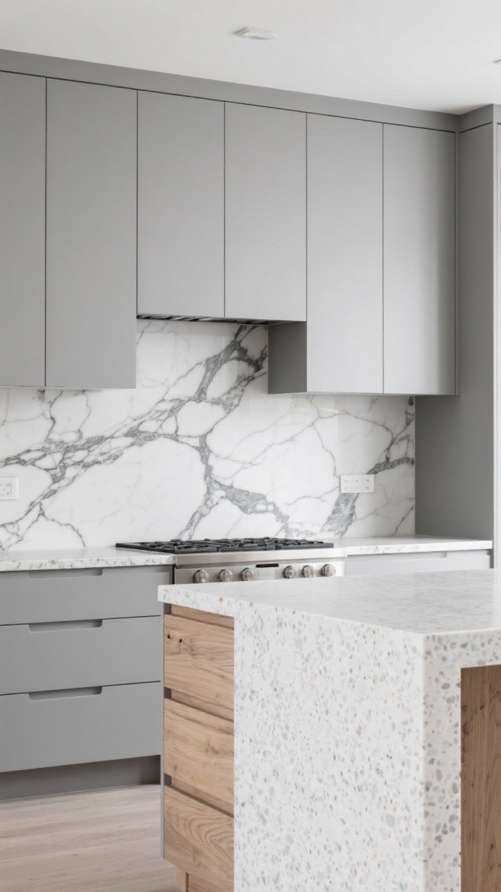
1. Start With the Boss: Pick Your Dominant Surface
One surface should lead and the other should support. Usually, the **countertop** is the star because it has pattern (veins, specks) and higher sheen, while **cabinets** are the calm, color-forward backdrop.
Tired of snacking when you’re not even hungry? This reset helps you stop the loop and feel back in control.
A simple reset for moments when cravings take over. Easy to use, easy to repeat, and designed to help you feel satisfied instead of stuck.
Why It Works
- Countertops are pricier to replace and often define the vibe (marble = classic, concrete = modern).
- Cabinets can flex with paint or new doors later, so let them play the supporting role.
So decide: are you a “bold stone, simple cabinets” person, or a “statement cabinets, quiet counters” person? You can have drama—but pick one diva at a time.
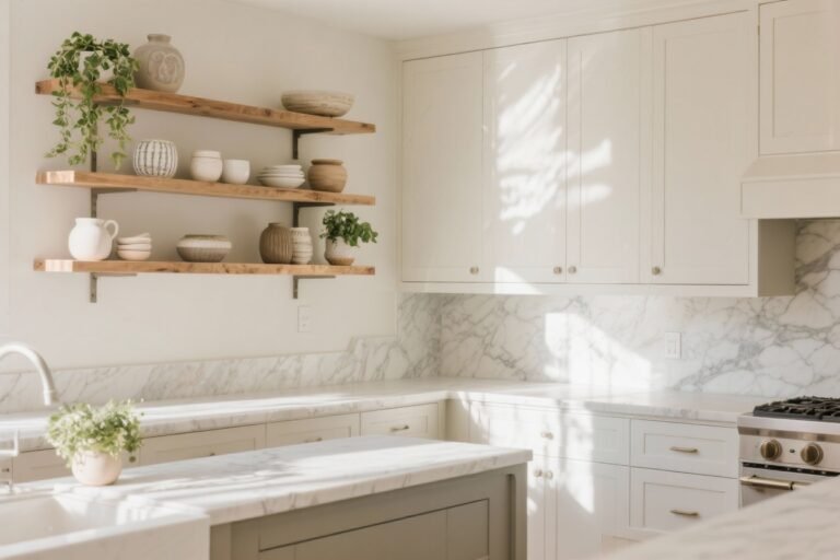
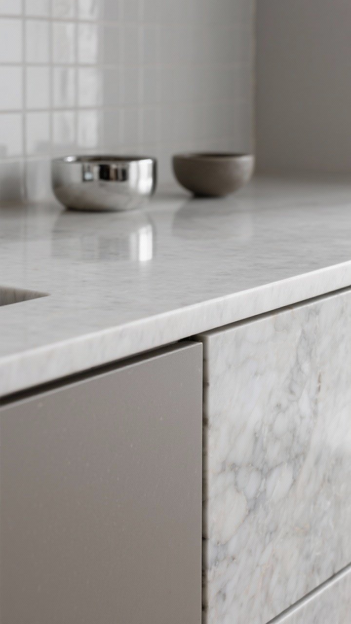
2. Match Undertones, Not Just Colors

Here’s where most people go wrong. White cabinets + white counters isn’t enough. You need to match **undertones**—the subtle warmth or coolness beneath the color.
Quick Undertone Guide
- Warm Undertones: Creamy whites, beiges, honey oak, gold flecks, brass hardware.
- Cool Undertones: Bright whites, grays, blue veining, nickel hardware.
- Neutral: Greige, taupe, soft black—plays well with both, if you balance finishes.
FYI: If your quartz has blue-gray specks, pair with a crisp white or soft gray cabinet. If your granite leans gold and brown, opt for creamy whites or wood with warmth. Instant cohesion.
3. Balance Pattern With Plain (And Vice Versa)
Design 101: If the countertop has bold veining, choose **smooth, solid cabinet fronts**. If your cabinets are detailed (shaker with beadboard, heavy grain wood), keep the **countertop quiet**.
Transform Your Home With 7,250+ Stunning Landscaping Designs—No Expensive Designers Needed!
- 🌿 Access 7,250+ stunning landscaping designs.
- 💰 Save thousands—no pro designer needed.
- 🏡 Plans for gardens, patios, walkways, and more.
- ✨ Simple, beginner-friendly DIY layouts.
- 🛠️ Customize any design to fit your yard.
Try These Combos
- Bold Marble Veins + Slab Cabinets: Sleek doors let the stone sing.
- Textured Oak + Subtle Quartz: Let the wood grain be the pattern.
- Shaker Doors + Softly Speckled Granite: Classic, balanced, timeless.
Too much pattern = visual chaos. One dancer leads. The other follows.
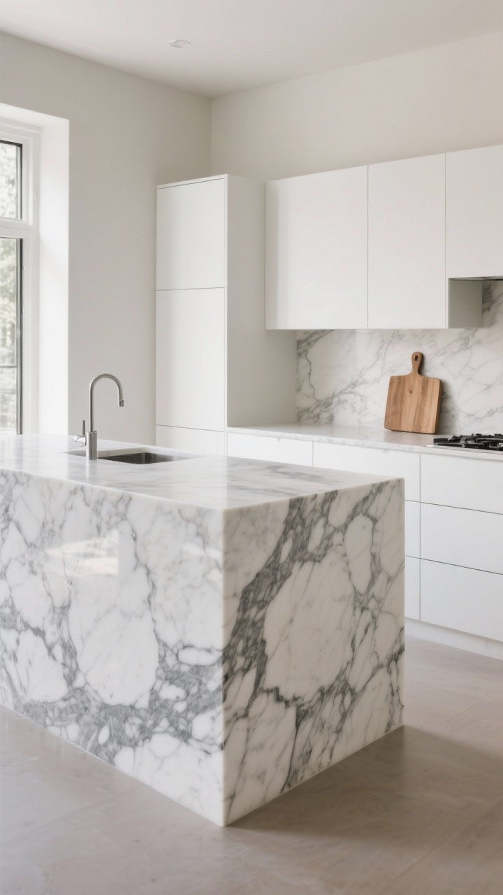
4. Nail the Sheen: Sheen Harmony Is a Thing
Gloss vs. matte can change everything. A high-gloss cabinet next to honed (matte) stone can feel off if the rest of the room isn’t bridging that contrast.
Sheen Pairing Tips
- Honed/Matte Counters: Look great with satin or matte cabinets for a modern, calm vibe.
- Polished Stone: Works with semi-gloss cabinets if you want a light-bouncing, luxe look.
- Mixed Finishes: If you mix, repeat the sheen elsewhere (tile, hardware) so it looks intentional.
Think of sheen as the soundtrack. Keep it in the same genre, or repeat the contrast strategically.
5. Sample Like a Pro (Lighting Will Betray You)
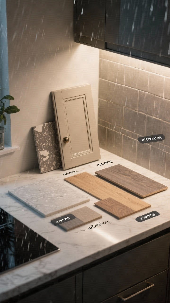
Never pick from memory—or worse, your phone. Get **physical samples** of both cabinet finish and countertop material and check them in your actual kitchen light.
Do This Before You Commit
- View in morning, afternoon, and evening lighting—watch how the undertones shift.
- Hold samples vertically and horizontally: Cabinets are vertical, counters are horizontal—light hits differently.
- Bring your flooring and backsplash samples too. It’s a team sport.
IMO, if it doesn’t look good in your worst lighting (hello, rainy day), it’s not “the one.”

6. Use the 60-30-10 Color Rule (But Make It Kitchen)
Color balance keeps things from feeling flat or chaotic. Kitchens love the **60-30-10** rule for a pulled-together palette.
How to Break It Down
- 60% Primary: Cabinets or walls—usually a neutral.
- 30% Secondary: Countertops and large accents (island, shelving).
- 10% Accent: Hardware, stools, art, or a fun faucet finish.
Example: 60% soft white cabinets, 30% warm taupe quartz, 10% matte black pulls and a black bridge faucet. It looks curated without trying too hard.
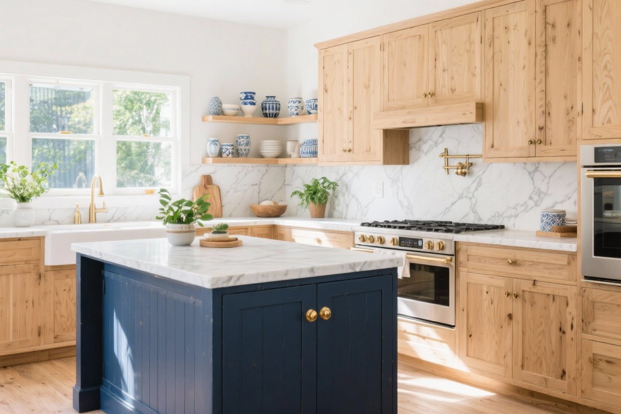
7. Coordinate With Wood Tones Like You Mean It

Wood adds warmth, but mixing tones can get messy. Aim to **match undertones**, not identical species. And repeat the tone at least twice so it looks intentional.
Wood + Countertop Pairings
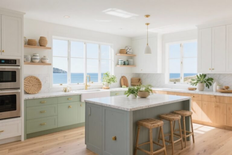
- Light Oak Cabinets + Cool Quartz: Pick a quartz with soft gray veining to balance the yellow in oak.
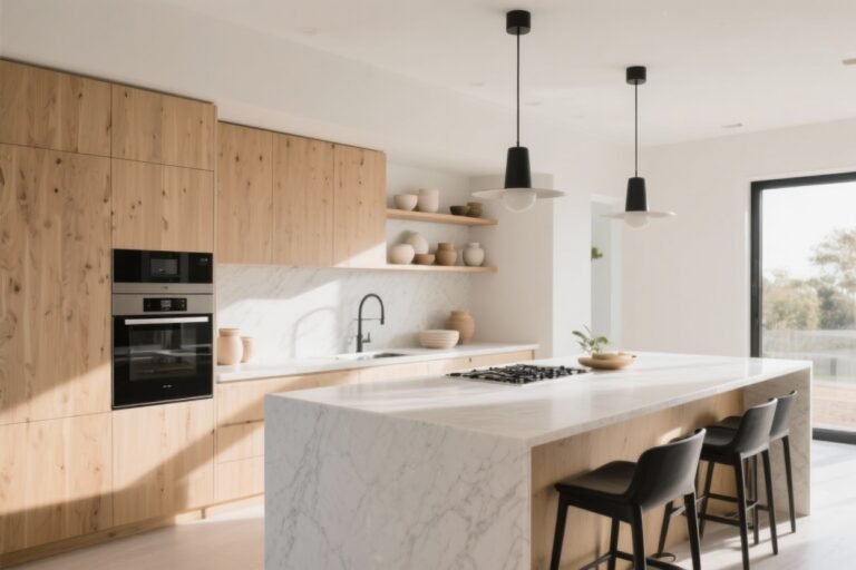
- Walnut Cabinets + Creamy Stone: Warm-on-warm feels rich and timeless.
- Mixed Woods? Keep one dominant. Use the second as an accent (island or open shelves).
Pro move: If your counters skew cool but you love warm wood, bridge with warm metal hardware and a creamy backsplash.
8. Let Hardware and Edges Do the Talking

Small details can make a mismatched pair look intentional. **Hardware finish** and **countertop edge profiles** are underrated peacemakers.
Detail Decisions That Matter
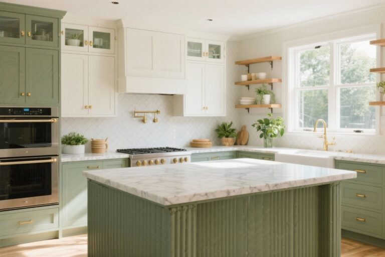
- Hardware: Brass warms up cool quartz and white cabinets. Black sharpens cream cabinets and butcher block. Nickel keeps things crisp and modern.
- Edge Profiles: Ogee or beveled for traditional cabinets; eased or square for flat-panel modern doors.
- Toe-Kick & Panels: Matching toe-kicks and end panels can visually tie counters and cabinets together.
These touches say, “Yes, we planned this,” even if you totally didn’t at first.
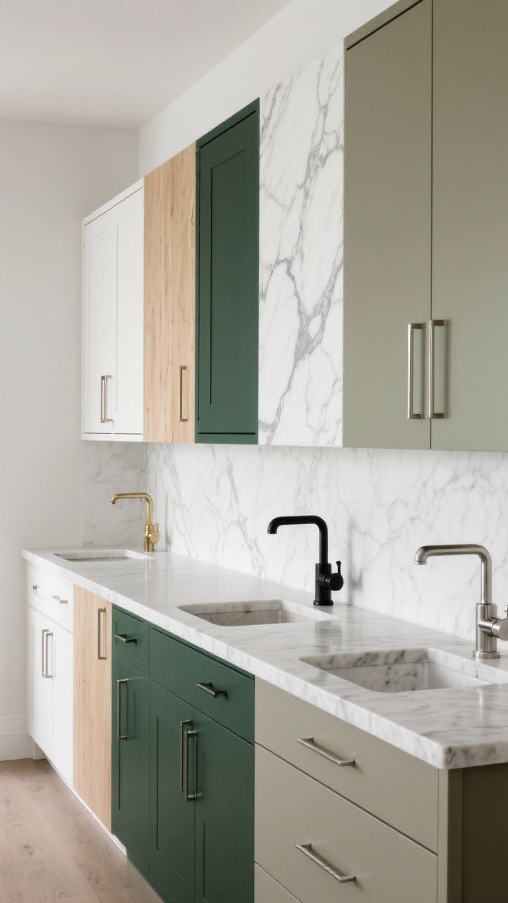
9. Plan Contrast With Purpose (Not Chaos)
Contrast is gorgeous—if you commit. Want dark cabinets with a light counter? Go for it. Just repeat each tone so it doesn’t feel like a chessboard.
Contrast That Works
- Dark Lowers + Light Uppers + Light Counter: Elevates the room and keeps it airy.
- Statement Island: Dark island, light perimeter cabinets, and a countertop that connects both with multi-tone veining.
- Two-Tone Counters? Use sparingly. If you mix stone on island vs. perimeter, repeat one of the colors elsewhere (backsplash, stools).
Repeat colors at least twice. Your eye loves patterns—and not just on the stone.
10. Think Longevity: Maintenance, Lifestyle, and Resale
Yes, looks matter. But your kitchen also has to survive knives, coffee, and the occasional red wine spill. Choose pairings you’ll love—and live with.
Reality Check
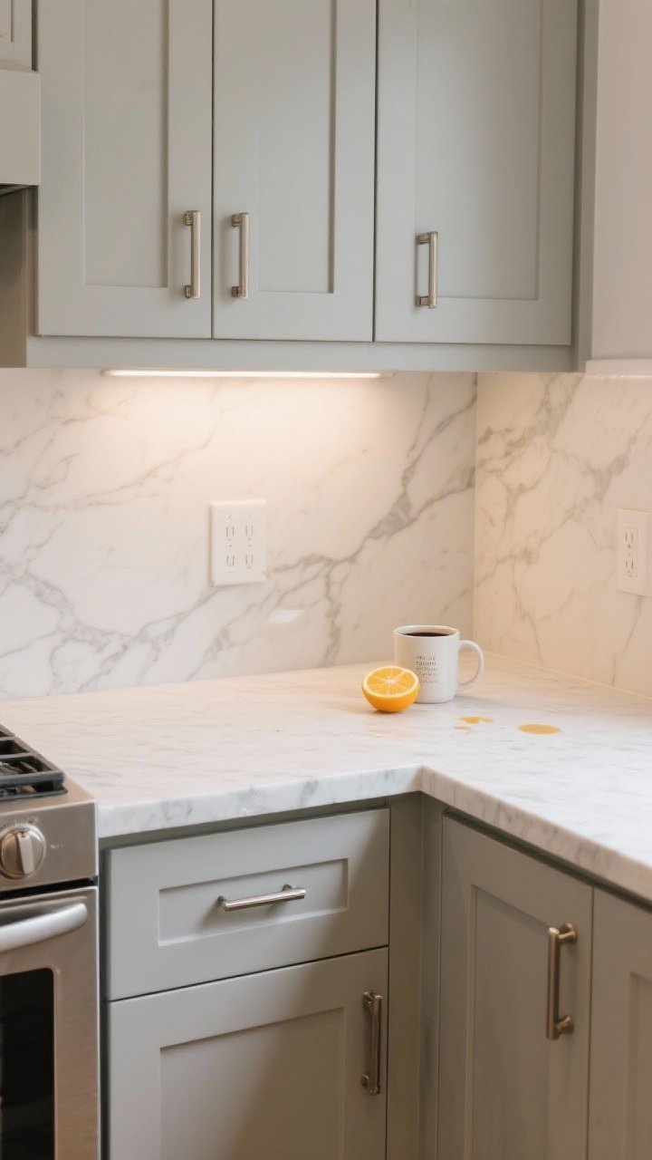
- Stain + Etch Resistance: Quartz laughs at stains, marble… cries. If you’re messy, pair marble-style quartz with any cabinet you love and call it a day.
- Touch-Friendly Cabinets: Matte and mid-tone colors hide fingerprints better than high-gloss or jet black.
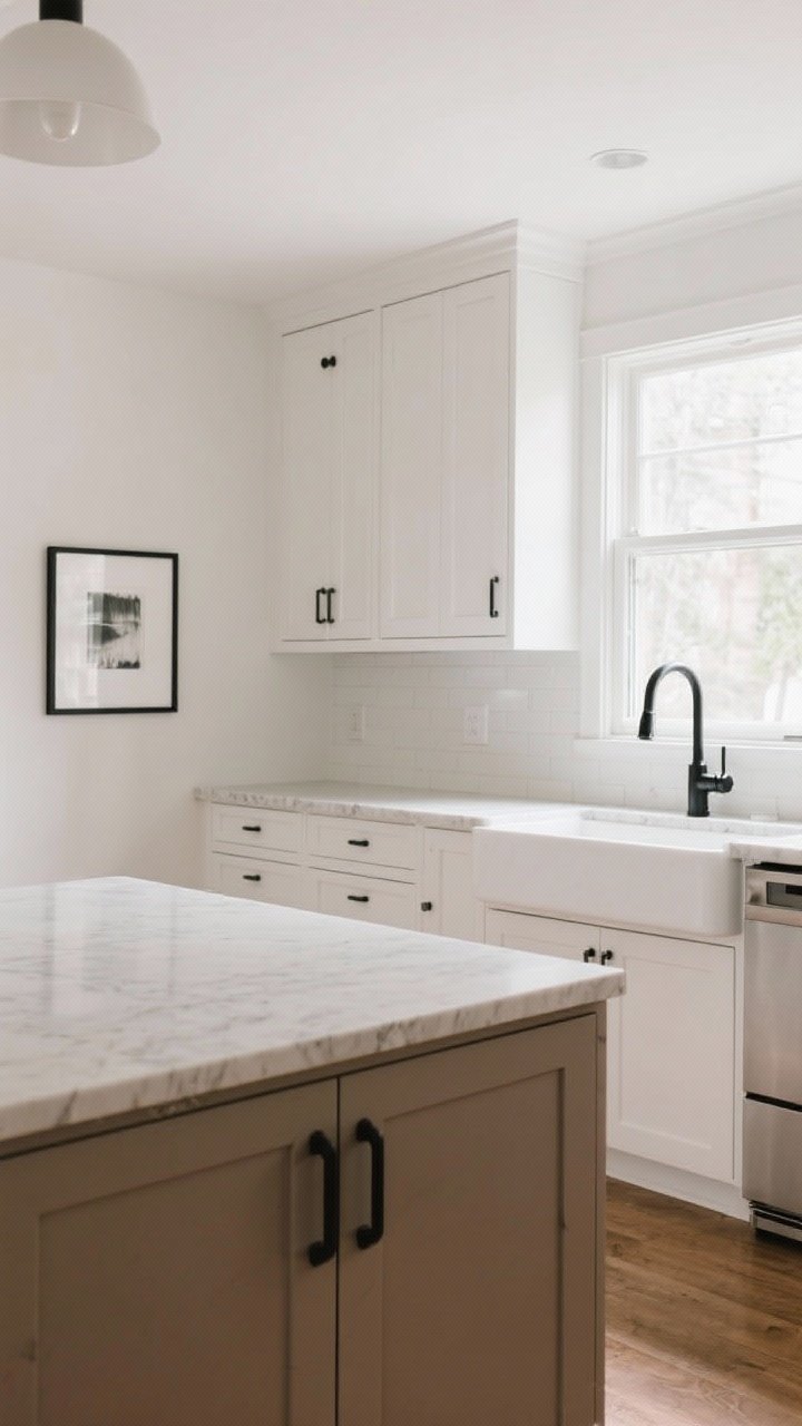
- Resale Friendly: Neutrals win. White/greige cabinets + light quartz = broadly appealing and timeless.
- Budget Savvy: Splurge on counters, save on cabinets with a great factory finish or repaintable doors.
Also, don’t ignore your backsplash. It’s the power broker between cabinets and counters. Pick it last so it bridges both beautifully.
Sample Pairings You Can Steal
- Classic: Soft white shaker + Calacatta-look quartz + polished nickel hardware.
- Modern Warm: Flat-panel white oak + creamy quartz + brushed brass hardware.
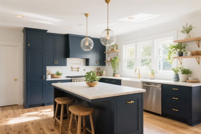
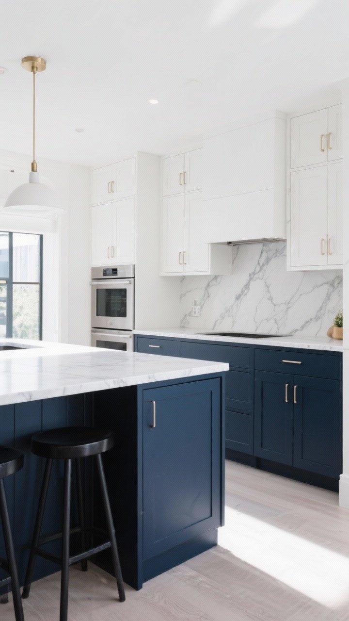
- Moody Luxe: Deep forest green + white quartz with bold gray veins + matte black hardware.
- Cozy Minimal: Greige cabinets + honed concrete-look quartz + stainless pulls.
If your heart wants drama, keep one element dramatic and let everything else chill.
Conclusion
Matching kitchen cabinets to countertops isn’t a guessing game—it’s a strategy. Choose your star, match undertones, balance pattern and sheen, and let details tie it all together. Grab samples, stare at them in your kitchen light like a detective, and trust the combos that look good at every hour. You’ll end up with a kitchen that feels intentional, stylish, and totally you. Now go make those samples your new besties, FYI—they never lie.