10 White Kitchen Ideas That Make Small Spaces Feel Bigger—no Reno Required
Small kitchen, big dreams? Same. A white palette is your secret weapon for making tight spaces feel open, airy, and ridiculously chic. The trick isn’t just “paint it white and pray”—it’s about layering finishes, light, and smart storage so the whole space reads brighter and bigger. Let’s make your mini kitchen feel like it got an expansion pack.
1. Go All-In On Tone-On-Tone Magic

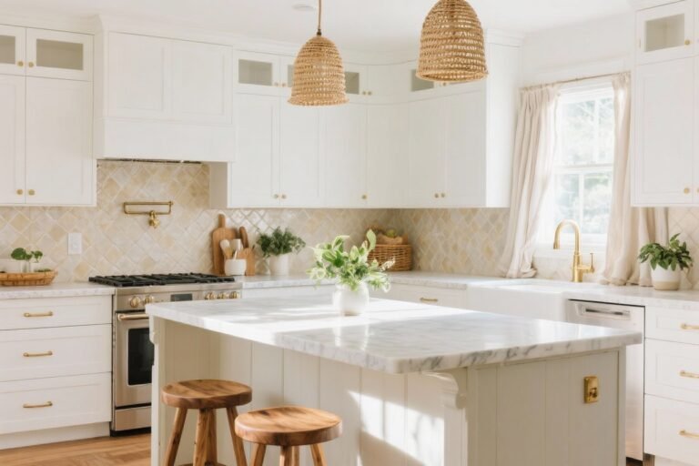
White isn’t one color—it’s a whole mood board. When you layer different whites (think warm cream, crisp cool white, soft greige), your kitchen gets depth without feeling busy. That layered look tricks the eye into reading the space as larger and more cohesive.
Tired of snacking when you’re not even hungry? This reset helps you stop the loop and feel back in control.
A simple reset for moments when cravings take over. Easy to use, easy to repeat, and designed to help you feel satisfied instead of stuck.
How To Pull It Off
- Cabinets: Soft white with a subtle warm undertone (e.g., off-white or ivory) to avoid a sterile vibe.
- Walls: A bright, neutral white to bounce light around.
- Counters/Backsplash: Go veined quartz or marble-look to add movement without clutter.
Pro tip: Test swatches in morning and evening light. Whites shift—what looks clean at noon can go dingy at dusk, FYI.
2. Ditch Upper Cabinets (Or Slim Them Down)

Want instant “bigger kitchen” energy? Remove some uppers. Open wall space floods the room with breathing room and makes ceilings feel higher. If you’re not ready to fully commit, swap a few uppers for open shelves.
Smart Storage Swaps
- Open shelves: Keep them white or match the wall color so they visually disappear.
- Shallow uppers: 10–12 inch depth instead of 14–15 to reduce bulk.
- Under-cabinet rails: Hang mugs, utensils, or small pots to free drawer space.
Keep shelf styling minimal: stacks of white dishes, a couple wood accents, and glass jars. Anything too busy shrinks the space—fast.
3. Embrace Gloss And Glass

Shiny surfaces reflect light like a dream. Use a mix of high-gloss finishes, glass-front cabinets, and even mirrored elements to bounce daylight from every angle.
Transform Your Home With 7,250+ Stunning Landscaping Designs—No Expensive Designers Needed!
- 🌿 Access 7,250+ stunning landscaping designs.
- 💰 Save thousands—no pro designer needed.
- 🏡 Plans for gardens, patios, walkways, and more.
- ✨ Simple, beginner-friendly DIY layouts.
- 🛠️ Customize any design to fit your yard.
Where To Add Shine
- Cabinet doors: High-gloss lacquer or thermofoil in clean white = modern and light-amplifying.
- Backsplash: Glossy ceramic subway tile or glass tile to reflect light.
- Appliances: Panel-ready fronts keep the look seamless; stainless can work if everything else is toned down.
Not into high-gloss everywhere? Mix finishes. A matte counter with glossy tile is the perfect balance.
4. Choose Slim, Streamlined Hardware

Clunky knobs clutter the look. In a small white kitchen, streamlined hardware feels deliberate and keeps the eye moving. Think slim bar pulls, integrated finger pulls, or even touch-latch in minimal zones.
Finishes That Nail The Look
- Polished chrome: Reflective and crisp—pairs well with cool whites.
- Brushed brass: Adds warmth and just enough contrast without overpowering.
- Matte black: A few hits for definition. Use sparingly so it doesn’t chop up the space.
Match or nearly match finishes across hardware, faucet, and lighting to keep the flow cohesive (IMO, two finishes max in small spaces).
5. Light It Like A Magazine Shoot

Lighting can make or break the “big and bright” effect. Layering is key: ambient + task + accent. White surfaces do their job best when properly lit.
Your Lighting Game Plan
- Ambient: A flush-mount or slim chandelier spills light evenly.
- Task: Under-cabinet LED strips make counters glow and kill shadows.
- Accent: A small sconce or two over open shelves adds depth and mood.
Choose bulbs around 3000–3500K for a clean, soft white. Too cool and your kitchen goes “doctor’s office.” Too warm and whites can look yellow.

6. Pick Pattern With Purpose

Yes, you can have pattern in a white kitchen—just keep it subtle and directional. Patterns should guide the eye, not distract it.
Subtle Pattern Plays
- Backsplash: Herringbone or vertical stack subway tile draws the eye up for a “taller room” effect.
- Counters: Soft, feathery veining adds elegance minus visual clutter.
- Rugs: Low-contrast runner with a thin stripe to elongate narrow kitchens.
Stick to a tight palette: white, cream, and one supporting neutral (gray, taupe, or pale sand). Minimal contrast = maximum spaciousness.
7. Hide The Mess (But Make It Easy)

Clutter instantly shrinks a small kitchen. The solution isn’t “become a minimalist monk”—it’s smart, invisible storage. Keep the white vibe pristine by hiding the everyday chaos.
Storage Upgrades That Actually Work
- Full-height pantry pullouts: Use that vertical space; spices and cans disappear behind a clean white door.
- Drawer inserts: Dividers for cutlery, spices, and lids so nothing roams free.
- Appliance garage: Tuck the toaster and blender behind a lift-up door. Counters stay open and bright.
- Toe-kick drawers: Sneaky storage for trays and baking sheets.
Even a single empty stretch of counter makes the whole room feel larger. Worth it.
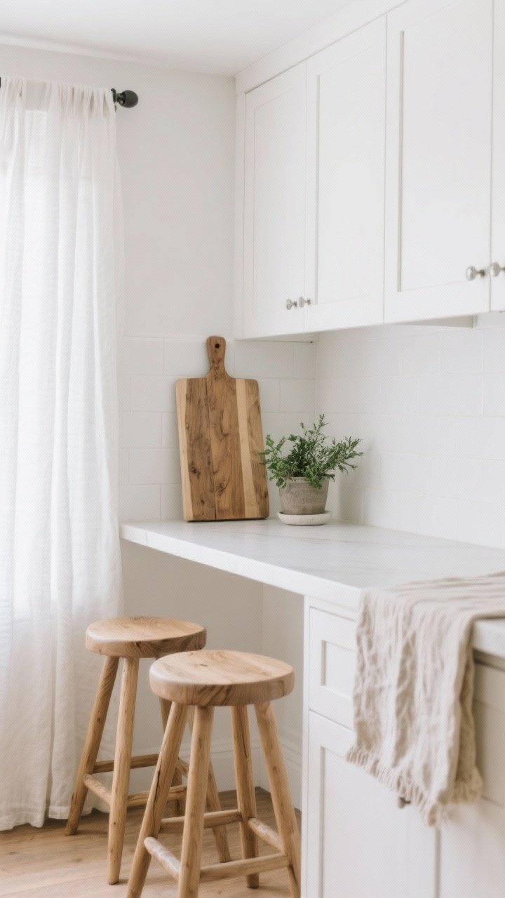
8. Bring In Warmth With Natural Accents
All white can feel cold if you don’t balance it. Add warm textures so the space feels inviting—and bigger, because the contrast adds dimension without adding visual weight.
Textural Add-Ons
- Wood tones: A butcher block board, light oak stools, or a wood bowl soften the look.
- Textiles: Linen cafe curtains or a cotton runner in soft neutrals.
- Plants: A small potted herb or trailing pothos for life and color. Green pops beautifully against white.
Keep the accents purposeful and few. Think “curated calm,” not “boho market after-party.”
9. Use Visual Continuity To Stretch The Room

The more continuous your surfaces, the bigger the space reads. Avoid hard stops and harsh transitions. A few strategic choices can elongate the room without moving a single wall.
Continuity Tricks
- Matching grout: White tile with white grout keeps lines soft and expansive.
- Waterfall edges: If you’ve got an island or peninsula, wrap the counter down the sides for a seamless look.
- Flooring flow: Run planks or tile in the longest direction of the room. Light oak or pale tile keeps things airy.
- Paint the trim: Paint baseboards and window trim the same white as walls to eliminate visual breaks.
Got a weird soffit? Paint it the wall color to make it disappear. Suddenly the ceiling looks miles higher.
10. Keep It Cleanable (Because Real Life)

A white kitchen only looks big if it stays bright. Choose finishes that handle spaghetti night, coffee splashes, and mystery fingerprints without drama. Beauty is great—easy maintenance is better.
Low-Maintenance Choices
- Cabinets: Satin or semi-gloss paint resists smudges better than flat.
- Counters: Quartz or ultra-compact surfaces with soft veining hide crumbs and wipe clean fast.
- Backsplash: Larger-format tile or slab means fewer grout lines to scrub.
- Hardware: Brushed finishes show fewer fingerprints than polished.
Set up a simple cleaning routine—microfiber cloth, mild cleaner, quick daily wipe. Two minutes now saves you from weekend scrubbing marathons, FYI.
Pulling It All Together
Here’s the vibe: a calm, bright envelope of layered whites, smooth lines, and just enough texture to keep it cozy. You don’t need a gut reno—just a few high-impact swaps, smarter lighting, and a ruthless approach to clutter. Do that, and your tiny kitchen won’t just look bigger—it’ll feel like the best room in the house.
You’ve got this. Start with one idea, then stack the rest. Before you know it, your “small” white kitchen will feel spacious, stylish, and totally you.