10 Two-tone Kitchen Cabinet Color Combos That Always Work (and Look Designer)
Let’s be honest—two-tone kitchen cabinets are like contouring for your kitchen. Done right, they sculpt the space, add dimension, and make everything look intentionally styled. Done wrong… well, let’s not. If you’re craving a kitchen glow-up without a full gut reno, these color combos never miss. I’m talking high-impact, low-regret, and totally guest-impressing.
1. Deep Navy + Crisp White: Coastal Chic Without the Seashells
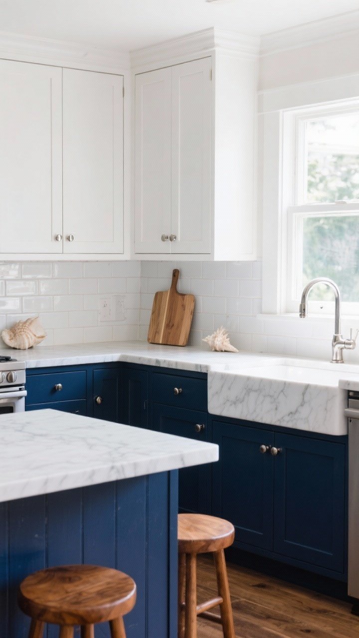
Want a kitchen that feels calm but still polished? Navy lowers with white uppers are the move. The darker base grounds the room, while the white uppers keep things airy and bright. It’s classic, nautical-adjacent, and plays well with nearly every metal finish.
Tired of snacking when you’re not even hungry? This reset helps you stop the loop and feel back in control.
A simple reset for moments when cravings take over. Easy to use, easy to repeat, and designed to help you feel satisfied instead of stuck.
Why It Works
- Contrast that flatters: Deep blue hides scuffs; white reflects light.
- Timeless appeal: It’s bold but not shouty—great for resale.
- Hardware friendly: Polished nickel, brass, or matte black all look incredible.
Pro Tips
- Try Benjamin Moore Hale Navy for lowers and Chantilly Lace for uppers.
- Add warm wood cutting boards or stools so it doesn’t skew too cool.
- Finish with a soft veined quartz countertop to bridge the colors.
2. Soft Greige + Creamy White: Quiet Luxury, Kitchen Edition
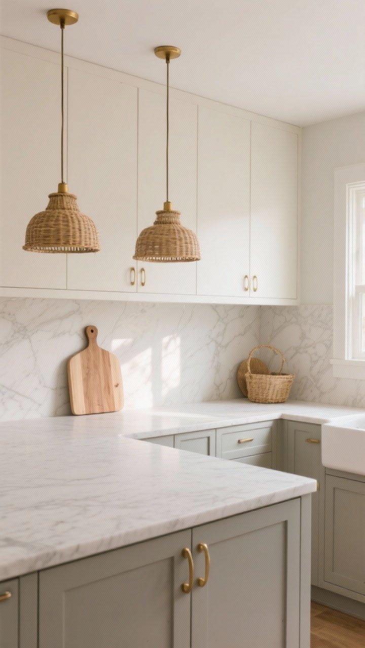
If you’re allergic to stark contrast, go tonal. Greige lowers with creamy white uppers give you depth without drama. It’s warm, serene, and ridiculously easy to style with natural textures.
Why It Works
- Tonal harmony: Subtle contrast makes your kitchen feel cohesive and high-end.
- Light-friendly: Bounces sunlight around for a soft glow.
- Trend-proof: It’s quietly stylish—IMO, the “linen pants” of color palettes.
Pro Tips
- Pick a warm white (not stark) to avoid clashing with greige.
- Layer in rattan pendants and oak accents for texture.
- Go for brushed brass or antique bronze hardware.
3. Black + Natural Oak: Modern, Minimal, Effortlessly Cool
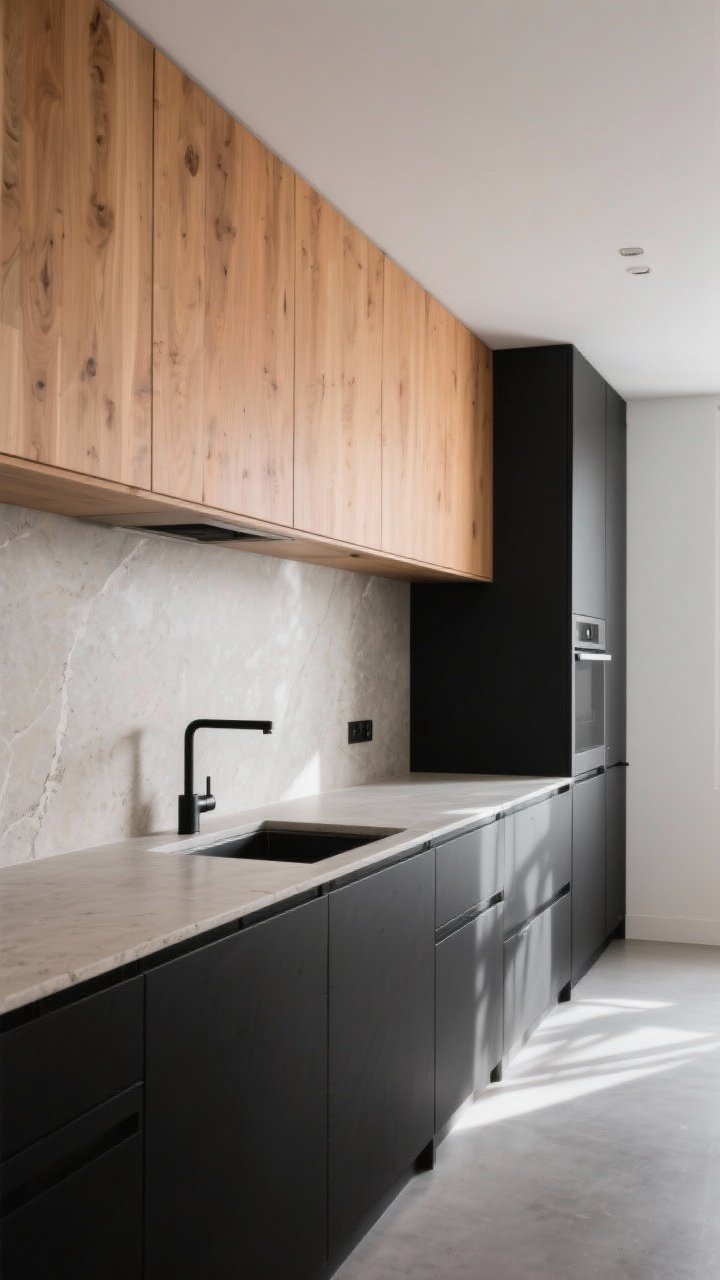
For a kitchen with edge, pair matte black lowers with natural oak uppers. The wood warms everything up so it doesn’t feel stark. The result? Moody, modern, and magazine-level chic.
Why It Works
- Material balance: The oak softens the black and adds movement.
- Function-first: Black hides everyday wear on base cabinets.
- Versatile style: Fits Scandinavian, Japandi, or urban industrial vibes.
Pro Tips
- Choose a clear matte finish on the oak to avoid orange tones.
- Keep lines clean and flat-panel for that modern feel.
- Use black or mixed-metal hardware to tie everything together.
4. Sage Green + Warm White: Fresh, Calm, and Totally Inviting
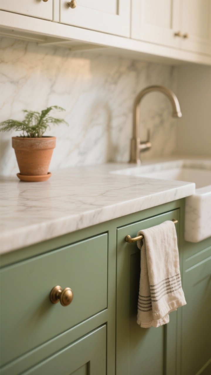
Sage is having a moment (again) because it behaves like a neutral with personality. Pair sage lowers with a warm white upper and your kitchen will feel like fresh air with cabinets.
Why It Works
- Nature-inspired: Greens bring life without screaming “color.”
- Easy styling: Looks gorgeous with terra-cotta, linen, and wood.
- Friendly in any light: Sage shifts beautifully from day to night.
Pro Tips
- Pair with brushed nickel or aged brass, depending on your vibe.
- Choose a matte or satin finish—gloss can make green read louder.
- Add creamy stone countertops to keep the palette soft.
5. Charcoal Gray + Soft Blue: Sophisticated With a Hint of Play
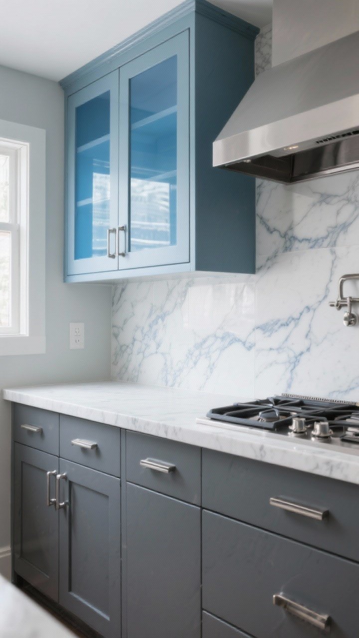
Want color, but not… too much color? Go for charcoal lowers and dusty blue uppers. The blue adds charm; the charcoal keeps it grounded.
Transform Your Home With 7,250+ Stunning Landscaping Designs—No Expensive Designers Needed!
- 🌿 Access 7,250+ stunning landscaping designs.
- 💰 Save thousands—no pro designer needed.
- 🏡 Plans for gardens, patios, walkways, and more.
- ✨ Simple, beginner-friendly DIY layouts.
- 🛠️ Customize any design to fit your yard.
Why It Works
- Balanced personality: Moody meets breezy—chef’s kiss.
- Great with marble: Veining ties both shades together effortlessly.
- Family-friendly: Darker lowers hide fingerprints like a champ.
Pro Tips
- Stick to muted blues (think stormy sky, not nursery wall).
- Use chrome hardware if you want it cooler; brass for warmth.
- Consider blue-tinted glass fronts on a couple upper cabinets to echo the tone.

6. Forest Green + Walnut: Luxe, Organic, and Mood-Board Worthy
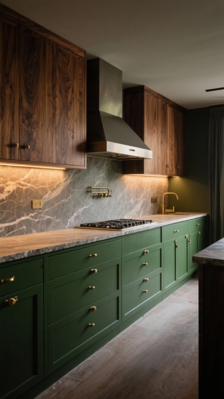
Dark green and walnut look like they met in a swanky boutique hotel and fell in love. Try forest green lowers with warm walnut uppers or accents for major depth and warmth.
Why It Works
- Rich contrast: Deep green anchors the space; walnut brings texture.
- Design-forward: Feels custom and expensive (without being try-hard).
- Dim-light friendly: Glows under warm lighting—seriously stunning at night.
Pro Tips
- Look for olive or pine-based greens—avoid anything neon-leaning.
- Use warm under-cabinet lighting to highlight the wood grain.
- Pair with natural stone or soapstone countertops for organic vibes.
7. Taupe + Black: Paris Apartment, But Make It Practical
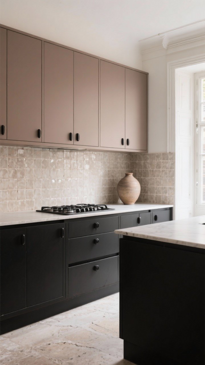
This combo is quiet, dramatic, and undeniably chic. Taupe uppers with black lowers bring European polish without feeling cold. It’s the little black dress—paired with your favorite trench.
Why It Works
- High-contrast, low risk: Taupe softens the starkness of black.
- Elevated neutrals: Elegant without being fussy.
- Great with stone: Limestone or travertine floors complete the look.
Pro Tips
- Pick a warm taupe so it doesn’t read gray and chilly.
- Use matte black hardware to streamline the palette.
- Consider a zellige tile backsplash for that artisanal shimmer.
8. Clay Terracotta + Soft Cream: Warm, Sunny, and Surprisingly Neutral
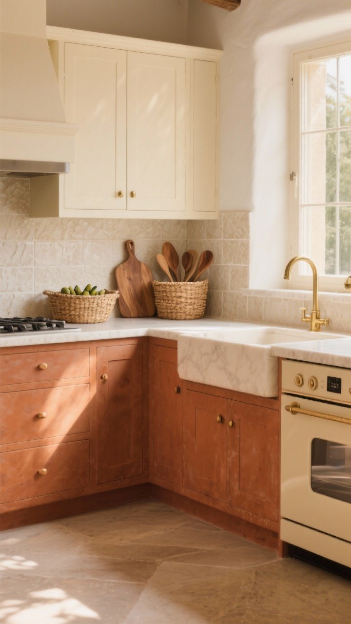
Don’t sleep on earthy tones. Terracotta lowers paired with creamy uppers create a sunlit, Mediterranean vibe that still reads neutral. It’s cheerful without being loud.
Why It Works
- Warmth overload: Cozy, inviting, and perfect with natural textures.
- Great in low light: Warmer hues help dim spaces feel alive.
- Color that behaves: Terracotta plays nicely with wood, brass, and stone.
Pro Tips
- Choose muted clay with brown undertones—avoid anything too orange.
- Pair with bisque appliances or warm whites for cohesion.
- Textured cream backsplash tiles add subtle movement.
9. Soft Black + Putty Beige: Minimalist, But Not Boring
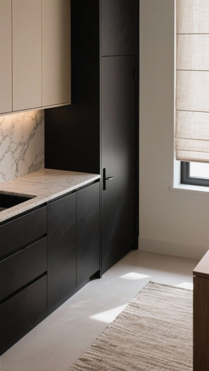
If you love modern minimalism but crave warmth, this is your match. Soft black (think off-black) lowers with putty or mushroom uppers feel refined and calm, not stark.
Why It Works
- Gentle contrast: Off-black pairs beautifully with earthy neutrals.
- Layer-friendly: Easy to decorate seasonally without clashing.
- Photogenic: Looks amazing in both natural and artificial light—FYI.
Pro Tips
- Try a silky matte finish to keep it elevated and fingerprint-resistant.
- Opt for stone with subtle veining—overly busy patterns can fight the calm vibe.
- Bring in linen window treatments or a runner rug for softness.
10. Navy + Blush Beige: Bold Meets Soft (In The Best Way)
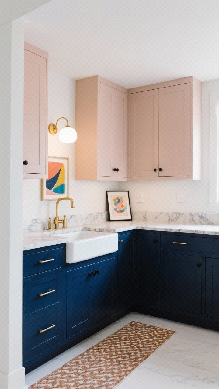
Feeling a little daring? Navy lowers with blush-beige uppers give you contrast and warmth with a hint of romance. It’s playful, but still grown-up—like a silk blouse with jeans.
Why It Works
- Color chemistry: Blue and warm neutrals are natural complements.
- Personality without risk: Blush-beige reads neutral—just cozier.
- Design flexibility: Works with brass, black, or mixed metals.
Pro Tips
- Keep the blush subtle—you want whisper, not bubblegum.
- Add art or a patterned runner to echo the warm/cool mix.
- Use warm white bulbs so the blush doesn’t go flat at night.
How To Nail Two-Tone Like A Pro
- Test in your actual light: Paint swatches on boards and move them around for a week.
- Mind the undertones: Match warm with warm, cool with cool—unless you’re intentionally mixing for contrast.
- Anchor darker shades on the bottom: Keeps the space feeling stable and open.
- Repeat tones elsewhere: Tie colors into bar stools, textiles, or backsplash accents.
- Finish matters: Satin or matte hides sins; high-gloss is stunning but unforgiving.
Hardware And Countertop Pairings (Quick Guide)
- Cool palettes (navy, charcoal, sage): Polished nickel, chrome, or soft brass for warmth.
- Warm palettes (terracotta, taupe, walnut): Aged brass, oil-rubbed bronze, or matte black.
- Countertops: Veined quartz/marble ties mixed tones together; soapstone for moody combos; butcher block to warm cooler schemes.
Layout Tips For Two-Tone Cabinets
- Keep the line clean: Consistent upper color across the room helps it feel cohesive.
- Island as accent: If you’re nervous, start with a contrasting island color only.
- Open shelves count: Natural wood shelves can be your “second tone” without painting uppers.
Here’s the tea: two-tone cabinets aren’t just a trend. They’re a smart way to add depth, personality, and legit designer vibes to any kitchen. Pick your palette, sample the paints, and commit. Your morning coffee is about to taste better—science probably can’t prove that, but your eyes will.