10 Kitchen Cabinet Color Ideas That Make Small Kitchens Look Bigger—no Renovation Needed
Small kitchen? Same. But here’s the good news: the right cabinet color can trick the eye, bounce light, and make even the tiniest galley feel airy. You don’t need to knock down walls—just grab a paintbrush and a plan. Ready to make your kitchen look way bigger than it actually is? Let’s color it smart.
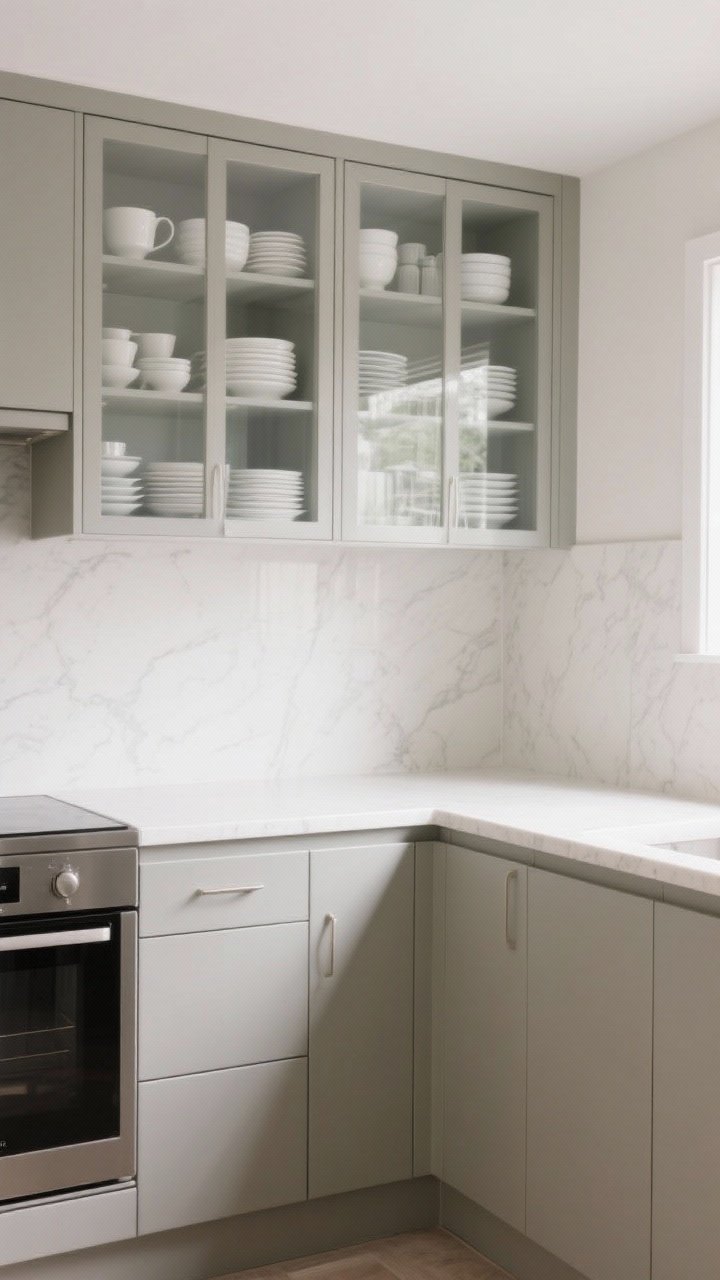
1. Soft White Everything (But Not Boring)
White cabinets are a classic because they reflect light like crazy, making your kitchen feel brighter and wider. But to avoid the sterile clinic vibe, pick a soft white with warm undertones—think creamy, not chalky.
Tired of snacking when you’re not even hungry? This reset helps you stop the loop and feel back in control.
A simple reset for moments when cravings take over. Easy to use, easy to repeat, and designed to help you feel satisfied instead of stuck.
Pro Tips
- Undertone matters: Choose warm whites (like alabaster or linen) if your lighting is cool; go cooler if your kitchen gets a lot of warm afternoon sun.
- Mix sheens: Satin on cabinets, eggshell on walls for subtle contrast and easy cleaning.
- Hardware hack: Use brushed brass or matte black to add depth so it doesn’t read as flat.
2. Greige For The Win (Gray + Beige = Magic)
Can’t decide between gray and beige? Go greige. This cozy neutral is soft enough to expand the room, but has just enough pigment to ground the space. It’s also super forgiving with countertops and floors.
Pro Tips
- Pair with light counters: White quartz or butcher block keeps things airy.
- Use glass doors up top: Greige lowers + glass uppers = instant openness.
- Lighting check: Test swatches at morning, noon, and night. Greige shifts dramatically with light.
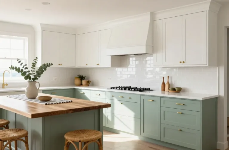
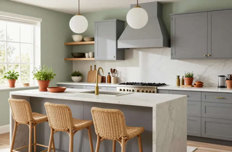
3. Pale Sage Green (Instant Calm, Instant Space)
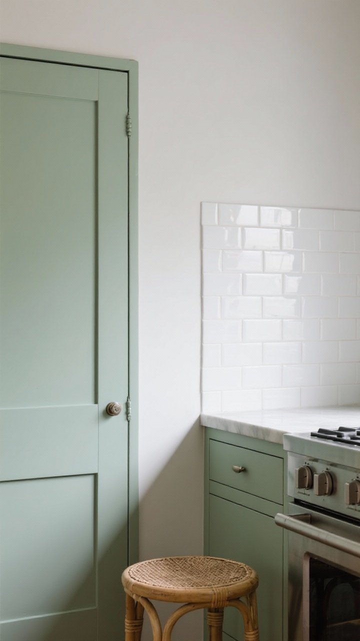
Soft sage is the cool friend who never tries too hard. It’s light enough to expand the room visually but adds a whisper of color that feels fresh and custom. Bonus: it plays nice with stainless and warm woods.
Pro Tips
- Keep it muted: Go sage with gray undertones instead of yellow to avoid a dated feel.
- Backsplash choice: White zellige or glossy subway tile bounces light and keeps the look airy.
- Natural textures: Add woven shades or rattan stools for depth without heaviness.
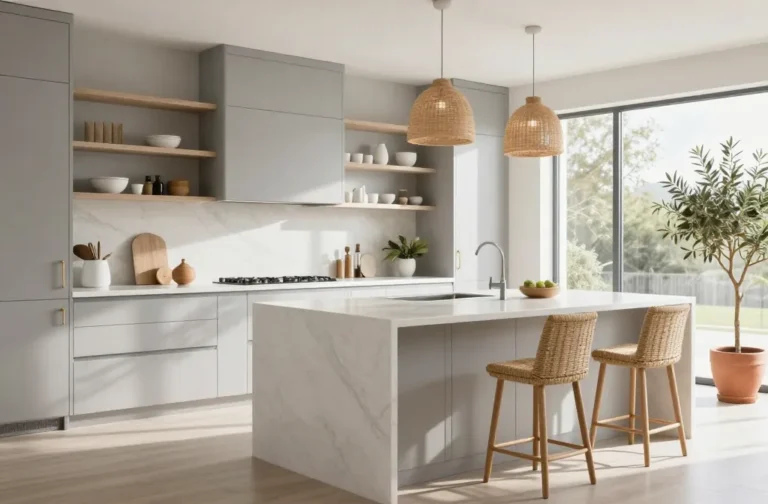
4. High-Gloss Light Gray (Shine = Space)
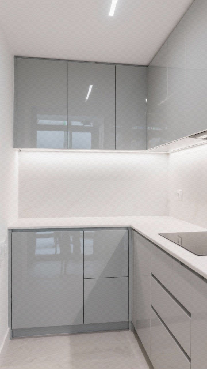
If your kitchen doesn’t get a ton of light, high-gloss finishes are your secret weapon. A pale gray in a glossy sheen reflects light like a mirror and adds a sleek, modern vibe without feeling cold.
Pro Tips
- Go slab-front if you can: Fewer lines equals less visual clutter, which makes the room feel bigger.
- Match the walls: Paint walls one shade lighter than the cabinets for a seamless “blown-out” effect.
- Keep hardware minimal: Thin pulls or finger grooves keep things visually light.
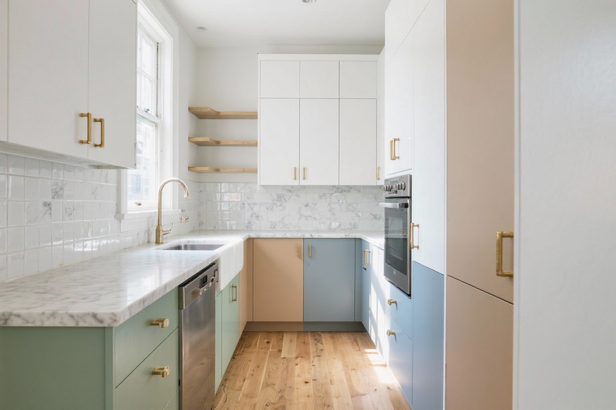
5. Two-Tone: Light Uppers, Deeper Lowers
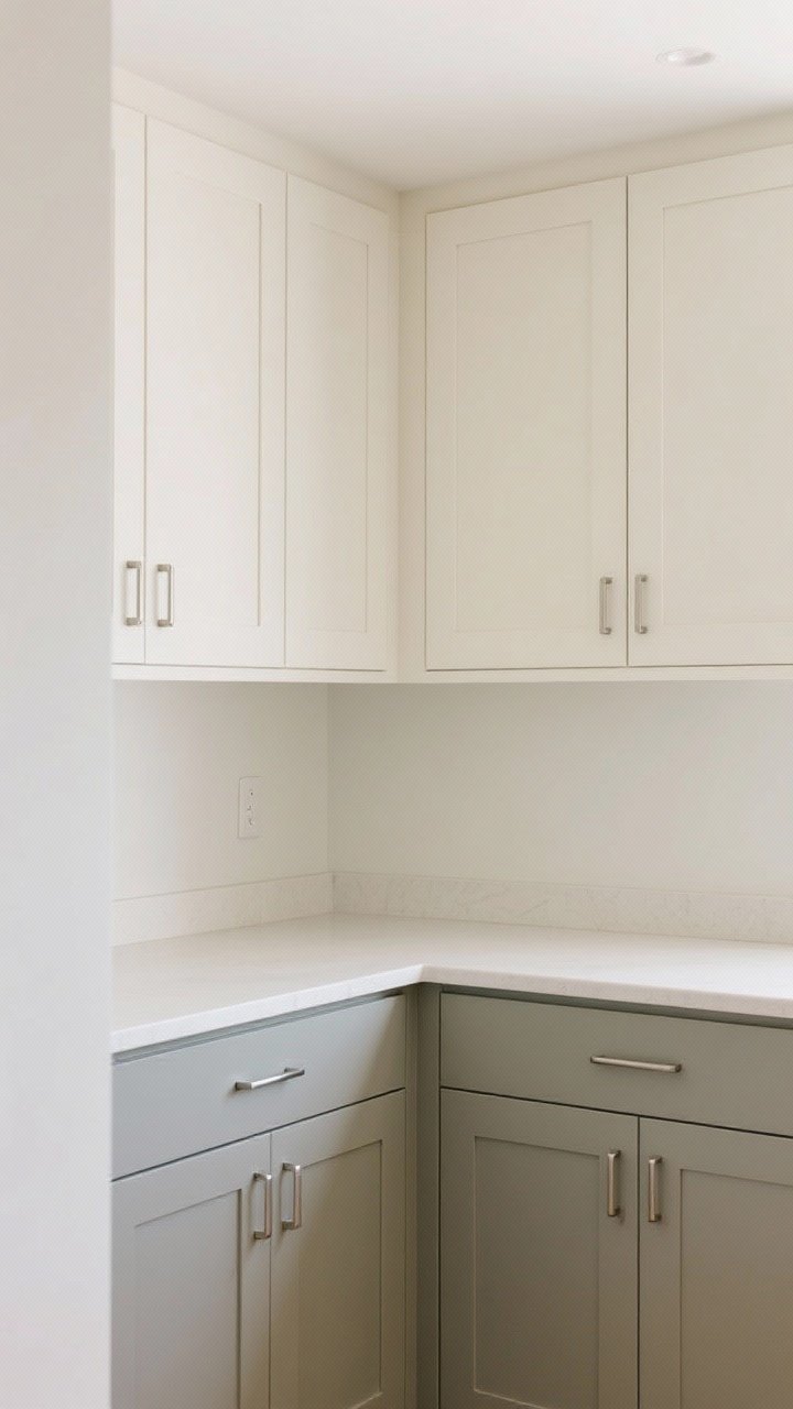
Want depth and openness? Do a two-tone look. Keep uppers in a very light color (white, cream, or pale gray) and go slightly deeper on the lowers (greige, taupe, or dusty blue). The result: your eye goes upward, ceilings feel taller, and the room breathes.
Transform Your Home With 7,250+ Stunning Landscaping Designs—No Expensive Designers Needed!
- 🌿 Access 7,250+ stunning landscaping designs.
- 💰 Save thousands—no pro designer needed.
- 🏡 Plans for gardens, patios, walkways, and more.
- ✨ Simple, beginner-friendly DIY layouts.
- 🛠️ Customize any design to fit your yard.
Pro Tips
- Keep contrast gentle: Aim for 2–3 steps of difference on the paint deck, not black-and-white drama.
- Tie it together: Use matching hardware for cohesion.
- Counter continuity: One continuous countertop color keeps the look calm, not choppy.

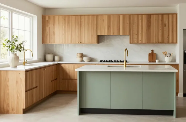
6. Airy Taupe With Warm Wood Accents
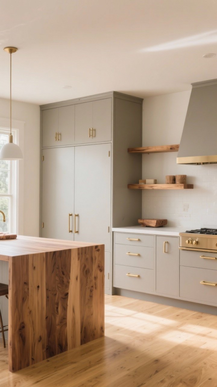
Taupe is the underrated MVP of small kitchens. It’s warmer than gray, lighter than brown, and it pairs beautifully with wood shelves or a butcher block top. The overall effect is soft, elevated, and quietly spacious.
Pro Tips
- Sheen strategy: Satin or semi-gloss on taupe will catch light without showing every fingerprint.
- Keep floors lighter: Honey oak or white oak floors extend the color story and visually enlarge the footprint.
- Metal mix: Warm taupe + champagne bronze = chef’s kiss.
7. Misty Blue-Gray For Coastal Airiness
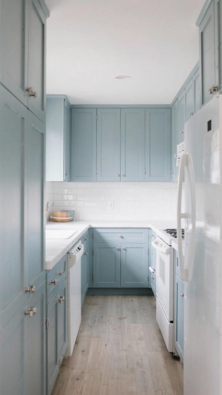
Think “ocean fog,” not “baby blanket.” A misty blue-gray feels breezy and pushes the walls outward because cool tones recede. It’s especially good in narrow galley kitchens where you want that open, airy vibe without defaulting to white.
Pro Tips
- Glossy backsplash: Gloss > matte for small spaces; it bounces light back into the room.
- Keep decor low-contrast: Soft whites and light woods keep the palette cohesive.
- Appliance blend: Pair with white or panel-ready appliances for an uninterrupted look.
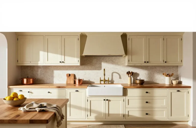
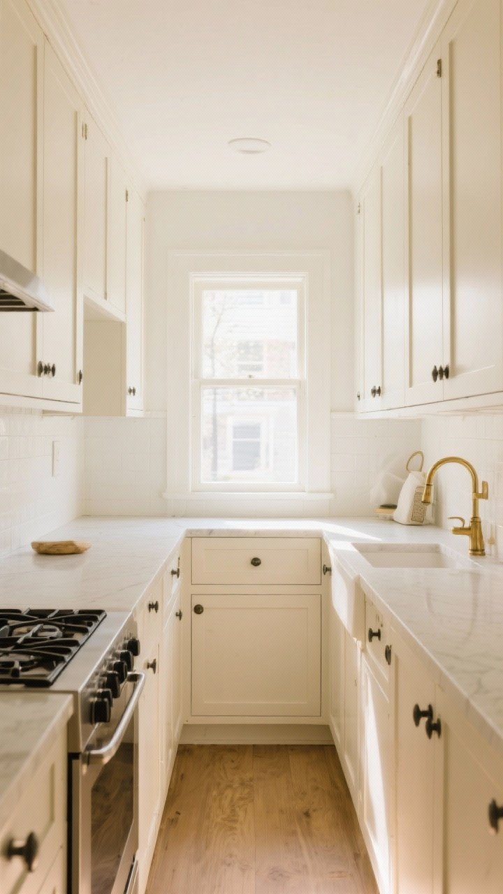
8. Creamy Beige With Matching Walls (Monochrome Magic)
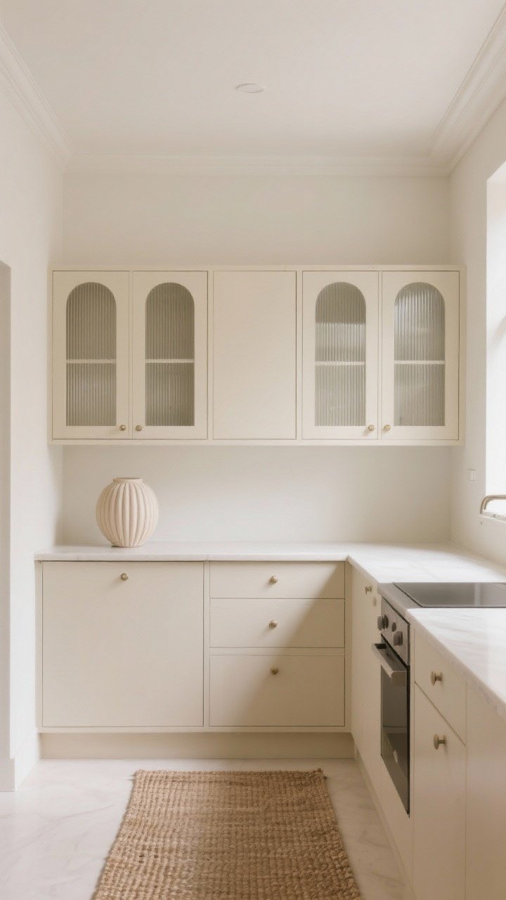
Want your kitchen to feel twice as big, instantly? Paint the cabinets and walls the same creamy beige. This monochrome trick removes visual stops and makes the space read like one big, airy envelope.
Pro Tips
- Shift the sheen: Same color, different sheens—semi-gloss on cabinets, eggshell on walls—for subtle dimension.
- Ceiling trick: Go one shade lighter on the ceiling to lift it visually.
- Texture over color: Add interest with ribbed glass doors, woven mats, or a fluted vase.
9. Matte Black Lowers With White Uppers (Yes, Really)
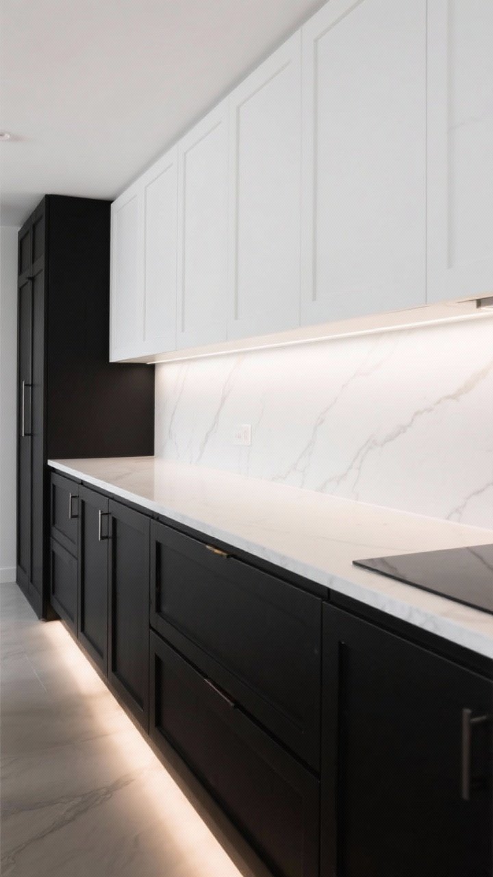
You can absolutely use black in a small kitchen—just keep it strategic. Matte black on lowers grounds the space while crisp white uppers keep it light up top. The contrast adds drama without shrinking the room because your sightline stays bright.
Pro Tips
- Thin profiles: Slim shaker rails or slab fronts keep the black from feeling bulky.
- Counter coordination: White or very pale counters help bridge the uppers and lowers.
- Lighting is non-negotiable: Add under-cabinet LEDs so the black reads elegant, not heavy.
10. Barely-There Blush (Whisper, Don’t Shout)
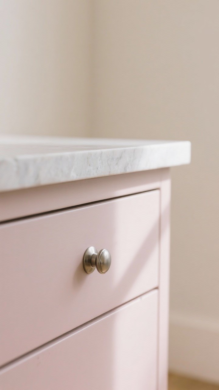
Hear me out: a super-subtle blush on cabinets can feel neutral but warmer than white. In small spaces, that slight rosy undertone bounces a flattering glow and makes things feel soft and open—like a filter for your kitchen.
Pro Tips
- Keep it desaturated: Look for blush with taupe or gray in it to avoid pink panic.
- Go tone-on-tone: Pair with cream walls and light stone for a serene, expanded feel.
- Metal moment: Polished nickel or soft brass adds a luxe note without overpowering.
Bonus Styling Tips To Maximize The “Bigger” Effect
- Minimize contrast clutter: Too many dark accessories chop up the space. Keep the palette tight.
- Match the toe-kick: Painting toe-kicks the same color as cabinets elongates the base visually.
- Panel your dishwasher: A panel-ready front blends with cabinets and buys back visual square footage.
- Use long vertical lines: Tall cabinet doors or stacked uppers draw the eye up (hi, taller ceiling).
- Reflective surfaces: Add a mirror, glossy tile, or metallic accents to amplify light.
How To Choose Your Perfect Shade (Without Losing Your Mind)
- Swatch big: Paint sample boards at least 12×12 inches and move them around the room.
- Check lighting: Test in daylight, evening, and with under-cabinet lights on. Colors shift—hard.
- Coordinate undertones: If your counters are cool (white/gray), pick cool-leaning paint; warm counters (creams, browns) need warm paint.
- Finish matters: Semi-gloss is durable and light-reflecting. Matte looks chic but shows wear. Satin is the happy medium, IMO.
Quick Paint Prep (Because Finish > Color)
- Degloss and clean: Degrease, sand lightly, and vacuum dust. Paint won’t stick to kitchen grime—FYI.
- Prime properly: Use a high-adhesion primer, especially on slick or previously finished cabinets.
- Roll + brush combo: Foam roller for flats, angled brush for rails and edges. Two to three thin coats beat one thick one.
Bottom line: you don’t need a massive kitchen to make a massive impact. With the right cabinet color, you can fake more light, more height, and more space—no demo required. Pick a palette that suits your vibe, test it in your lighting, and go for it. Your small kitchen is about to look big-time.