10 Best Kitchen Cabinet Colors for a Bright, Airy Kitchen You’ll Love
Ready to make your kitchen feel bigger, brighter, and seriously more photogenic? Cabinet color is your secret weapon. The right shade can bounce light around, calm visual clutter, and make your space feel open—even if it’s more “cozy apartment” than “chef’s palace.”
Below are the 10 best kitchen cabinet colors for that breezy, airy vibe. Expect practical tips, shade suggestions, and a few design hacks your future self will thank you for.
Tired of snacking when you’re not even hungry? This reset helps you stop the loop and feel back in control.
A simple reset for moments when cravings take over. Easy to use, easy to repeat, and designed to help you feel satisfied instead of stuck.
1. Cloud White: The Timeless Brightener

Let’s start with the classic. Cloudy, soft whites instantly lift a space without feeling sterile. They’re forgiving with natural light and help small kitchens look bigger by blurring edges and reducing visual heaviness.
Why It Works
- Reflects light like a pro, even on gloomy days.
- Pairs with any backsplash or hardware—so easy to update later.
- Feels clean and calm, not cold.
Pro Tips
- Try shades like Benjamin Moore Cloud White or Sherwin-Williams Alabaster.
- Use a satin or semi-gloss finish for easy wipe-downs and more light bounce.
- Add warm brass or matte black hardware to keep it from feeling too “doctor’s office.”
2. Soft Greige: Warm, Airy, And Grown-Up
If you want a bright kitchen that still feels cozy, greige is your BFF. It’s a whisper of gray with a touch of beige—neutral but never boring.
Why It Works
- Warmer than stark white, so it feels inviting.
- Hides smudges better than pure white (hello, real life).
- Plays nicely with both warm and cool metals.
Pro Tips
- Look at BM Revere Pewter or SW Accessible Beige.
- Pair with warm wood floors and white countertops for a balanced, airy combo.
- Test samples at different times of day—greige can shift with light.
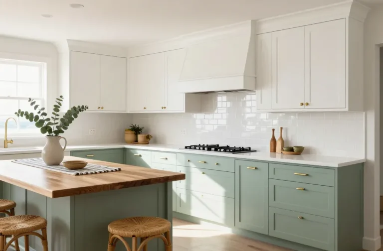
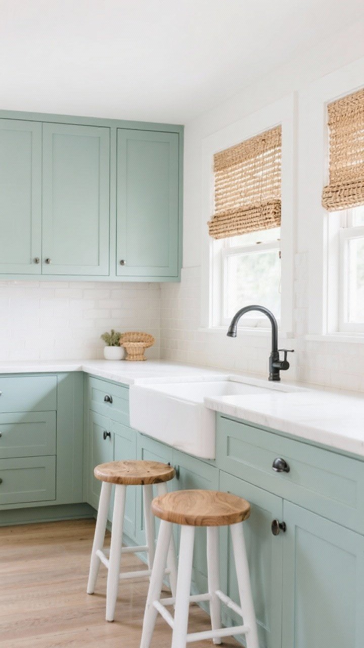
3. Pale Sage: The Fresh, Spa-Like Green
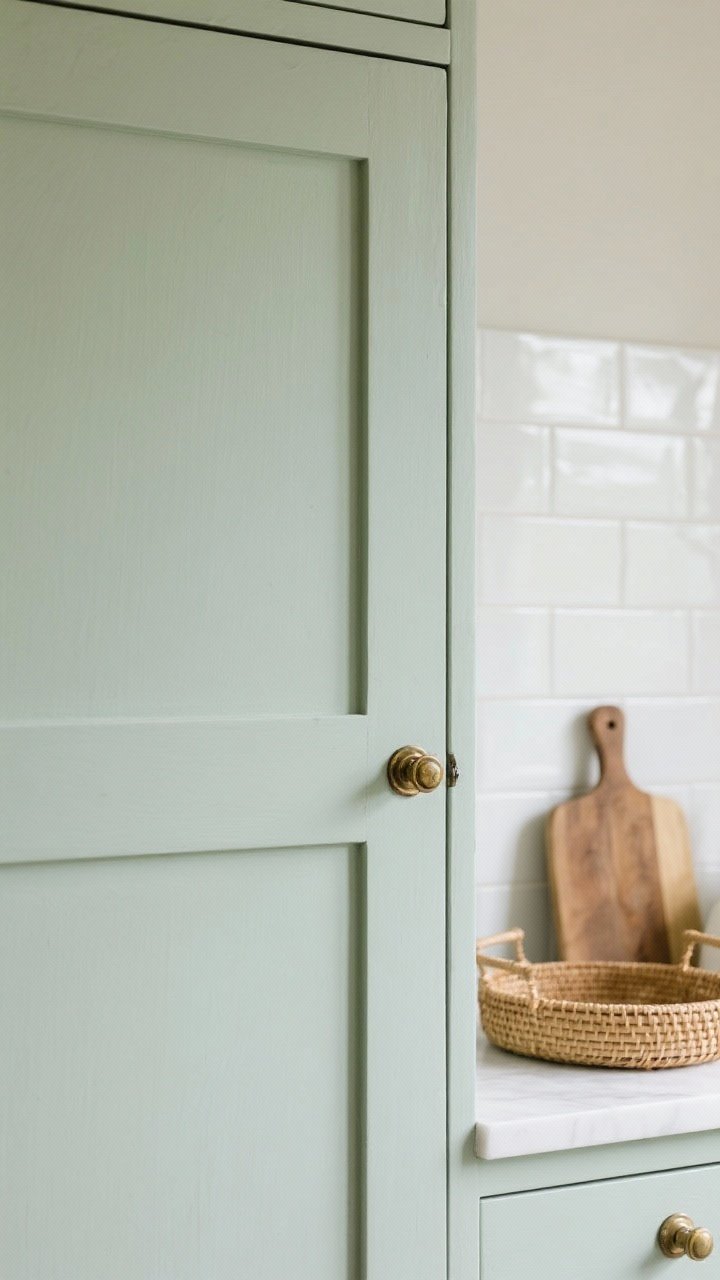
Want airy but not neutral? Pale sage is soft, calming, and quietly chic. It brings the outdoors in without shouting about it.
Why It Works
- Green sits comfortably in any lighting situation—natural or artificial.
- Adds subtle color that still feels light and open.
- Pairs beautifully with natural textures like rattan and oak.
Pro Tips
- Try Farrow & Ball Pigeon (lighter side) or SW Sea Salt.
- Use antique brass hardware to warm it up.
- Mix with an off-white backsplash to keep things airy, not minty.
4. Misty Blue: Coastal Without The Seashells
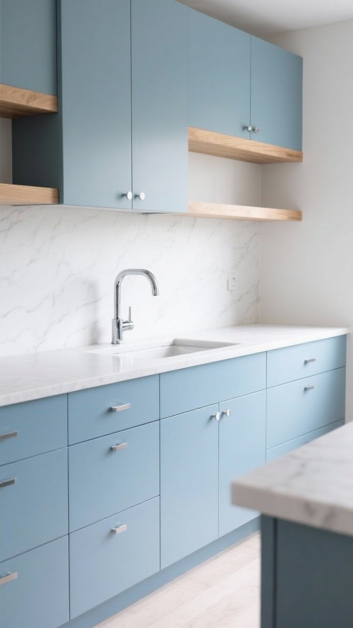
Misty, barely-there blues give your kitchen that sea-breeze feeling without going full beach rental. It’s crisp, clean, and peaceful.
Transform Your Home With 7,250+ Stunning Landscaping Designs—No Expensive Designers Needed!
- 🌿 Access 7,250+ stunning landscaping designs.
- 💰 Save thousands—no pro designer needed.
- 🏡 Plans for gardens, patios, walkways, and more.
- ✨ Simple, beginner-friendly DIY layouts.
- 🛠️ Customize any design to fit your yard.
Why It Works
- Blue naturally cools and recedes, making spaces feel larger.
- Works well with both chrome and polished nickel.
- Perfect for modern coastal, Scandinavian, or classic styles.
Pro Tips
- Check out BM Nimbus or SW Misty.
- Pair with white quartz counters and light oak shelves.
- Keep undertones consistent—avoid blues with heavy purple or green shifts.
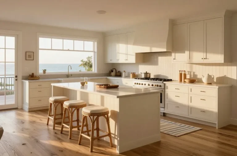
5. Warm Cream: Sunlit And Soft
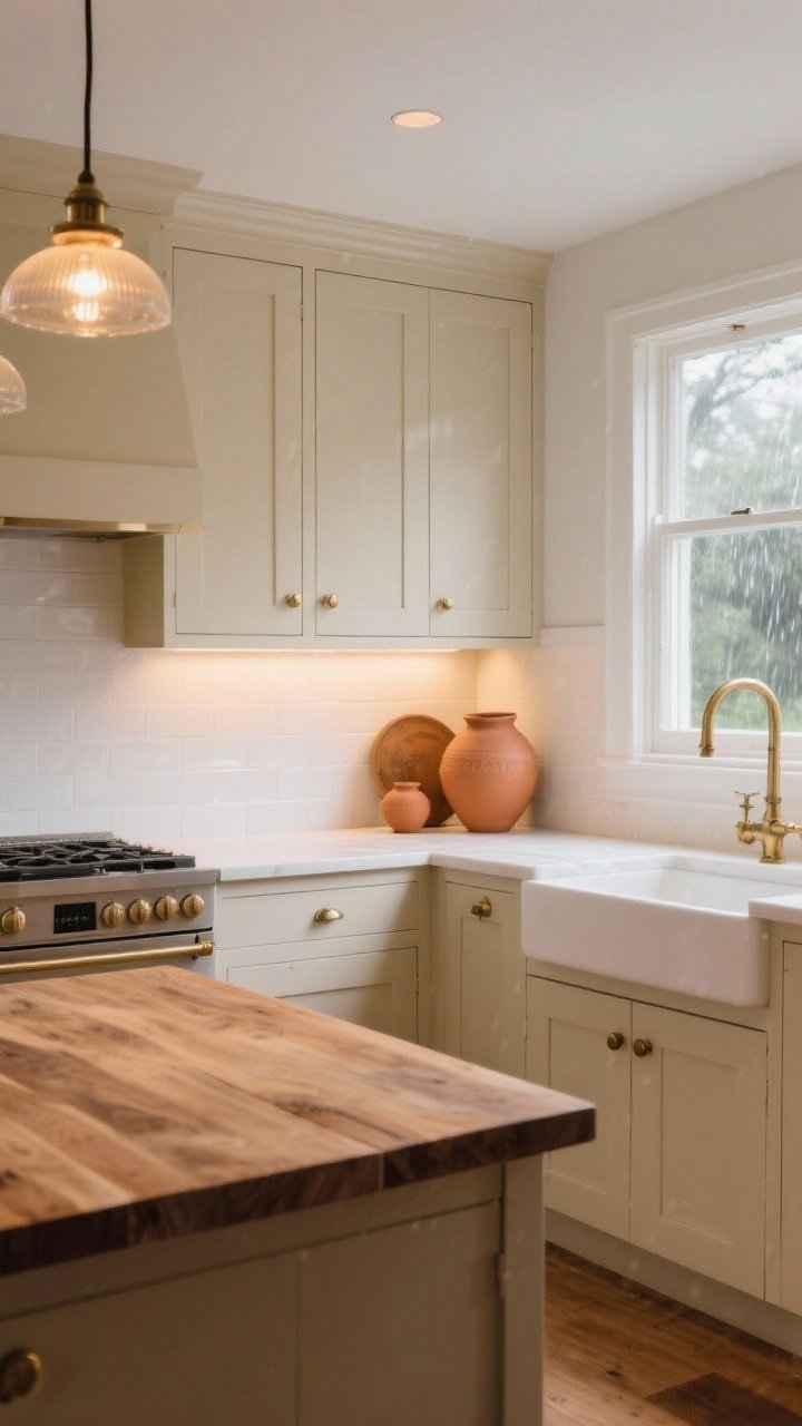
When you want warmth and brightness, creamy off-whites deliver. They mirror morning light and make kitchens feel welcoming—even on rainy days.
Why It Works
- Looks amazing with terracotta, butcher block, and unlacquered brass.
- Less stark than cool whites, so it hides everyday wear.
- Elevates traditional and farmhouse kitchens without feeling dated.
Pro Tips
- Try BM Swiss Coffee or F&B White Tie.
- Use warm LED bulbs (2700–3000K) to keep the tone consistent.
- Balance with white walls or backsplash so it doesn’t read yellow.

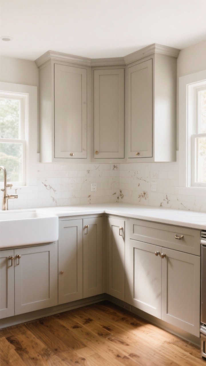
6. Light Taupe: Understated And Luxe
For a designer look that still feels breezy, go light taupe. It’s subtle, elegant, and looks expensive without trying too hard—like a cashmere sweater for your cabinets.
Why It Works
- Grounds the space while keeping it bright.
- Great for hiding fingerprints (parents, you’re welcome).
- Pairs with marble veining and fluted details like a dream.
Pro Tips
- Look into BM Edgecomb Gray or SW Agreeable Gray (lightened 25%).
- Add textured backsplash or zellige tiles for depth.
- Use soft black or aged brass hardware for contrast.
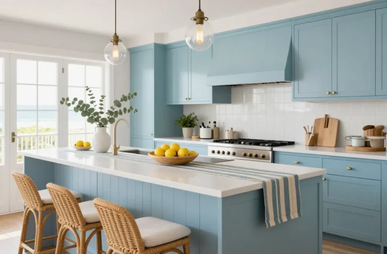
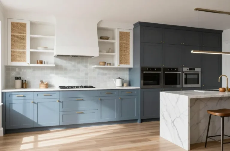
7. Powder Blue-Gray: Airy With Just Enough Drama
Blue-gray is calm, cool, and collected. It gives you color without cluttering the eye—perfect if you’re allergic to all-white kitchens but still want the brightness.
Why It Works
- Feels modern but not cold.
- Helps stainless appliances blend in.
- Reflects light subtly without glare.
Pro Tips
- Try F&B Light Blue or BM Boothbay Gray.
- Keep counters light and simple to maintain the airy vibe.
- Consider two-tone: blue-gray lowers, white uppers for lift.
8. Pale Butter Yellow: Sunshine Without The Sunglasses
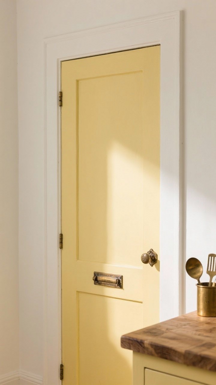
Hear us out: a soft, butter-yellow cabinet can be stunning and uplifting. Not canary, not neon—just a warm whisper of happiness that makes mornings better.
Why It Works
- Adds warmth and light, especially in north-facing rooms.
- Pairs with warm metals and butcher block like they were made for each other.
- Feels French-country or cottage-core in the best way.
Pro Tips
- Test F&B Hay (lightened) or BM Windham Cream.
- Keep walls crisp white to avoid yellow overload.
- Use aged brass or iron pulls to ground the look.
9. Desaturated Teal: A Gentle Pop That Still Feels Light
Teal can be bold, but a desaturated, pale teal is airy and fresh. It’s like a deep breath for your kitchen—colorful without crowding the room.
Why It Works
- Cool undertones recede visually, making space feel open.
- Pairs with white oak, rattan, and woven shades for a relaxed vibe.
- Works with polished nickel or matte black hardware.
Pro Tips
- Look at BM Quiet Moments or SW Retreat (cut 50%).
- Use on lower cabinets or an island to keep the top half light.
- Anchor with white counters and a neutral backsplash.
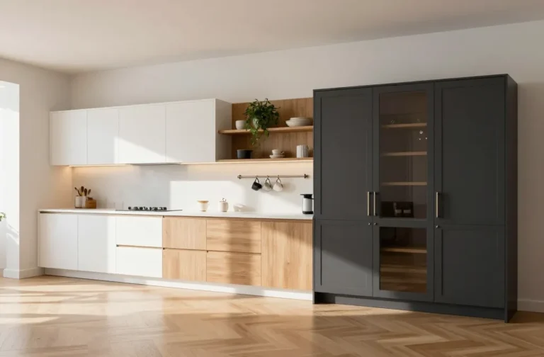
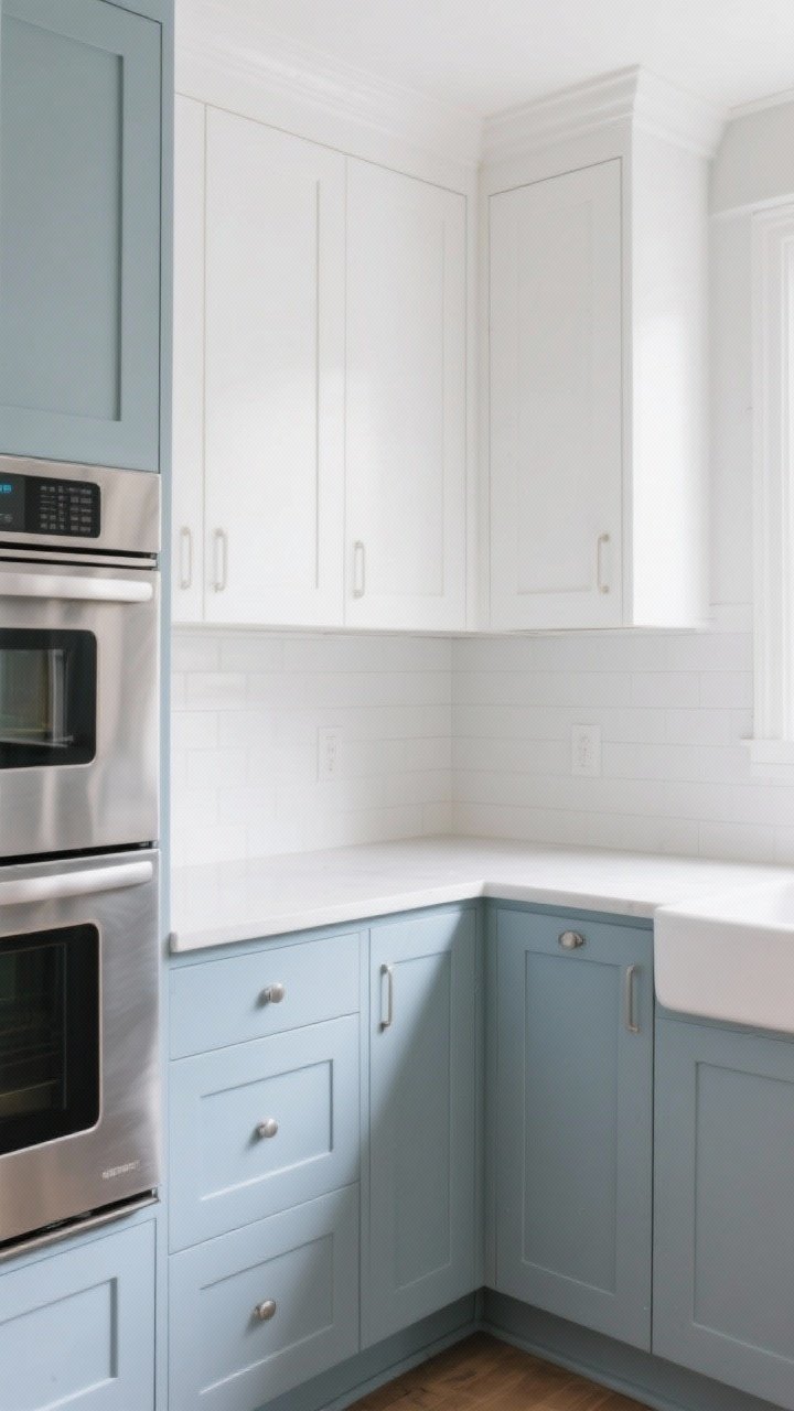
10. Soft Black (Yes, Really): High Contrast, Surprisingly Airy
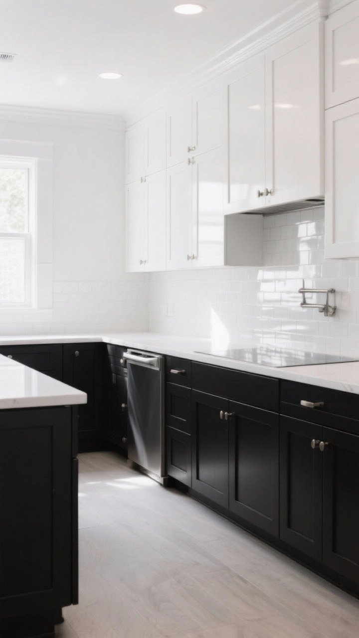
Plot twist: soft black can make a kitchen feel brighter when used strategically. The contrast makes white walls and counters pop, creating a sharp, light-forward look.
Why It Works
- Creates depth, which tricks the eye into seeing more space.
- Looks amazing with lots of natural light or strong ambient lighting.
- Elevates simple layouts into “custom” territory.
Pro Tips
- Try BM Wrought Iron or SW Iron Ore—they’re softer than true black.
- Go two-tone: soft black lowers, white uppers to keep things open.
- Add glossy backsplash and reflective hardware to bounce light.
Lighting Matters (A Lot)
FYI, your lighting can make or break cabinet color. Cool bulbs can turn cream gray, and warm bulbs can make greige look beige-beige. Not ideal.
- Use 2700–3000K LEDs for a natural, welcoming glow.
- Layer light: ceiling, under-cabinet, and pendants to avoid shadows.
- Always paint sample boards and move them around the room for a day or two.
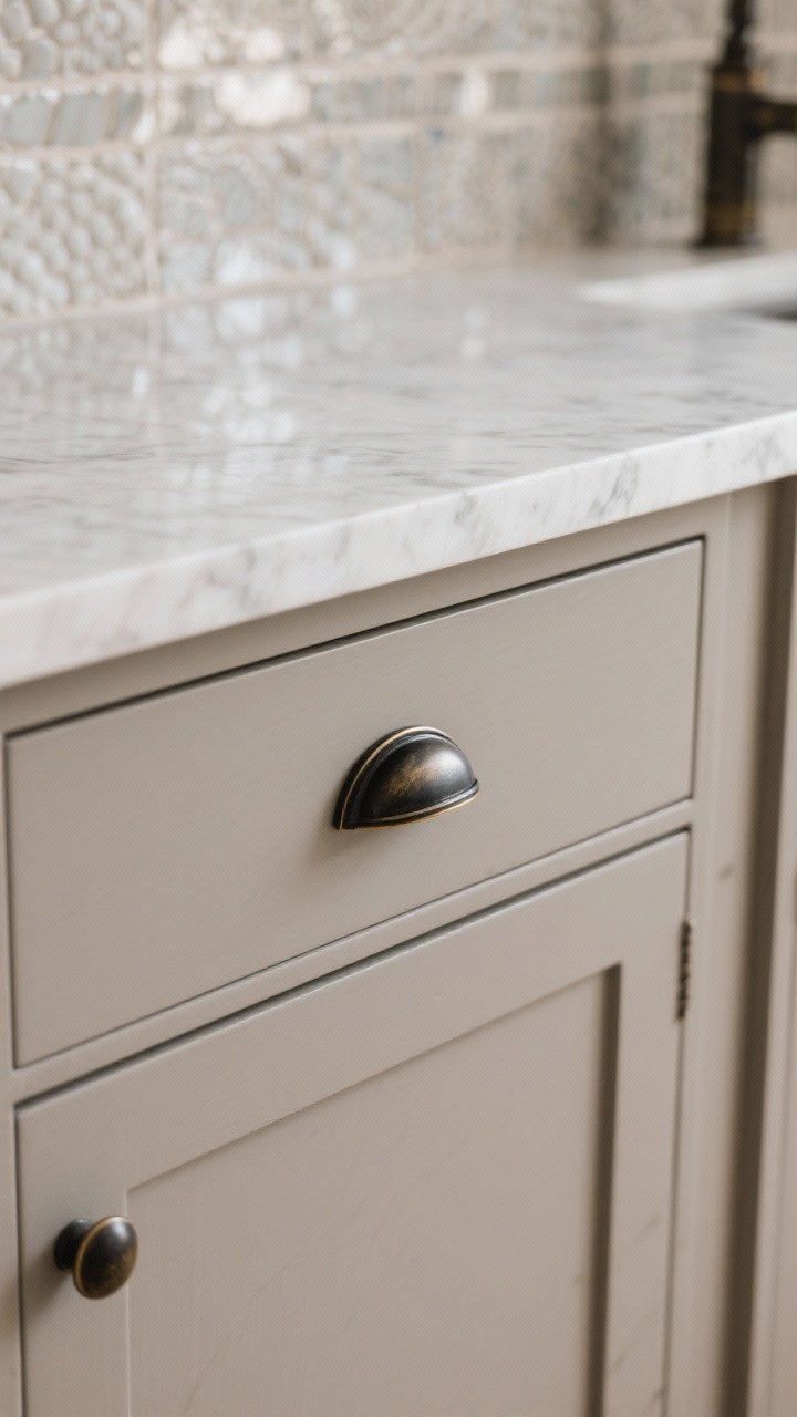
Finish, Hardware, And Styling
- Finish: Satin or semi-gloss is ideal. Flat hides texture but scuffs easily.
- Hardware: Warm brass adds coziness; chrome/polished nickel adds sparkle; matte black adds contrast.
- Backsplash: Keep it light and slightly glossy to reflect light back into the room.
- Counters: White or pale quartz keeps the airiness, while light butcher block warms things up.
Two-Tone Magic
Still on the fence? Try two-tone cabinets. Darker lowers, lighter uppers (or just a colored island) maintain that open feel while adding personality.
- Cloud White uppers + Sage lowers = soft and fresh.
- Warm Cream uppers + Light Taupe lowers = warm and sophisticated.
- Misty Blue island + White perimeter = instant focal point without heavy color.
Quick Prep Checklist (So Your Paint Job Lasts)
- Degrease like your life depends on it (because it kinda does—for paint adhesion).
- Lightly sand and wipe down.
- Use a bonding primer meant for cabinets.
- Apply thin coats, let cure properly, and consider a sprayer for a smoother finish.
IMO, the most “can’t miss” shades for a bright, airy kitchen are Cloud White, Soft Greige, and Sage. They’re versatile, renter-friendly (if you can paint), and they’ll still look good five years from now when you swap hardware again—because obviously you will.
You’ve got options. Pick the shade that matches your light, your vibe, and your maintenance tolerance. Then cue the compliments, because your kitchen’s about to glow.