10 Kitchen Decor Ideas That Look Expensive but Aren’t (your Wallet Will Live)
You don’t need a designer budget to make your kitchen look luxe—you just need a strategy. The secret? A few smart swaps, a couple of illusion tricks, and some high-low styling. Let’s level up your space without blowing your grocery money.
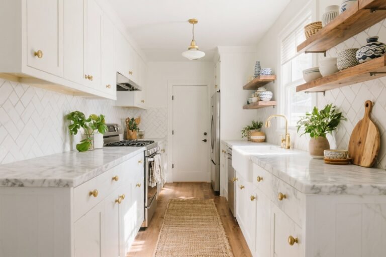
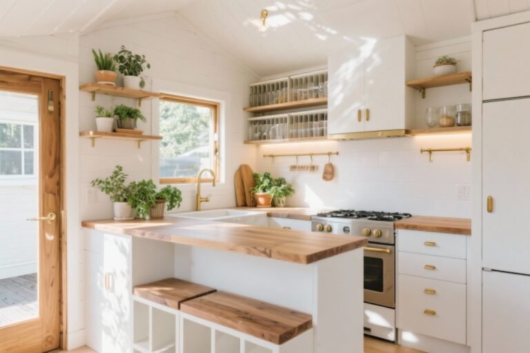
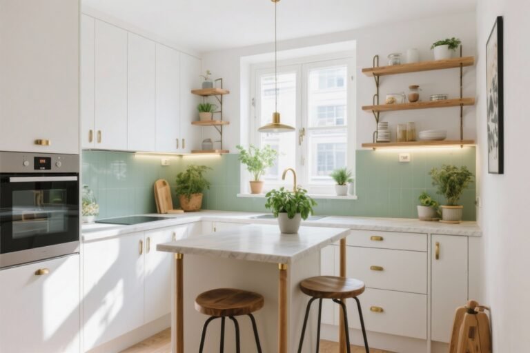
1. Upgrade Hardware, Upgrade Everything
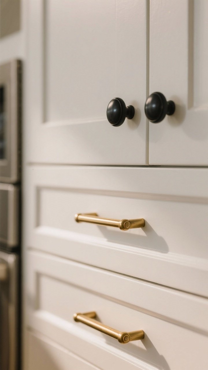
Swapping cabinet hardware is the fastest glow-up in the game. Think of it like jewelry for your cabinets—small pieces, huge impact. Go for finishes like brushed brass, matte black, or warm nickel for a tailored vibe.
Tired of snacking when you’re not even hungry? This reset helps you stop the loop and feel back in control.
A simple reset for moments when cravings take over. Easy to use, easy to repeat, and designed to help you feel satisfied instead of stuck.
What to Choose
- Bar pulls on drawers look sleeker than tiny knobs.
- Mixed metals are fine—just keep it to two max for cohesion.
- Choose solid-feeling hardware; avoid hollow, tinny pieces.
Pro tip: Align all the handles perfectly and keep the spacing consistent. It’s the kind of detail your eye reads as “custom.”
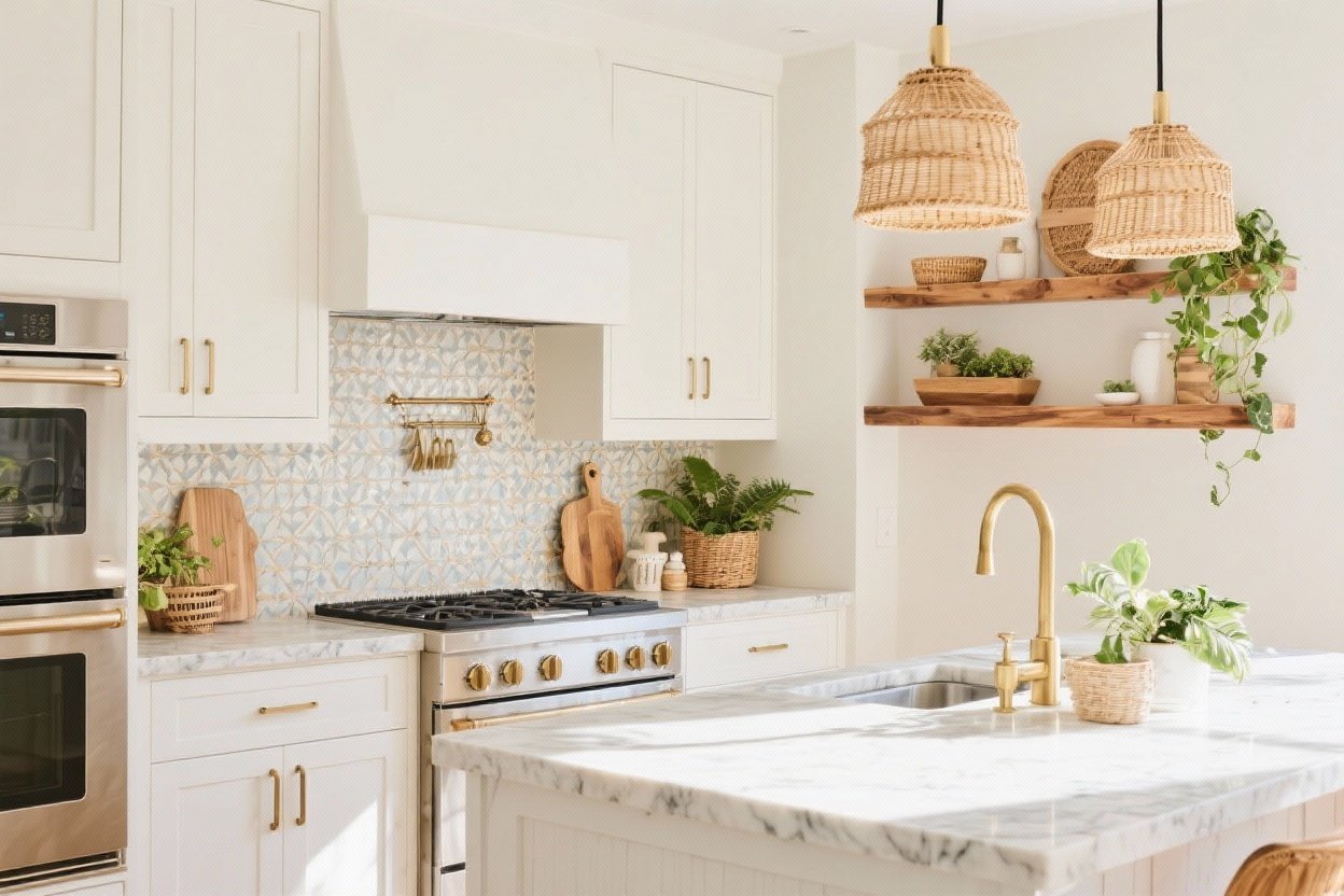
2. Fake a Custom Backsplash (Peel-and-Stick, But Make It Chic)
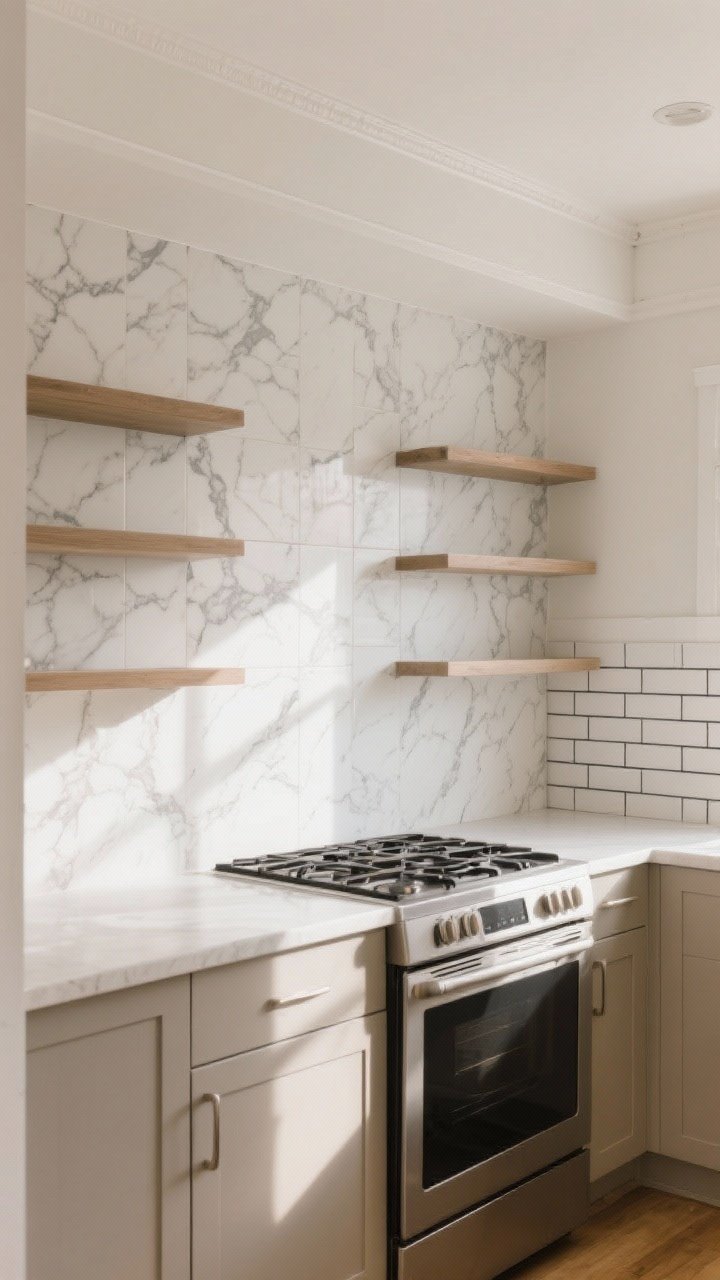
You can go from “meh” to “magazine” in an afternoon with peel-and-stick tiles. Today’s versions have realistic grout lines and stone textures—no one has to know they’re rentals-friendly.
Where It Shines
- Marble-look sheets add a high-end splash without the price.
- Subway tile with a dark grout line fakes a pro install.
- Solid slab look for a modern, minimal moment.
Run your backsplash all the way up behind open shelves or to the ceiling behind the stove. Tall = fancy. FYI, a crisp caulk line at the edges is what sells the illusion.
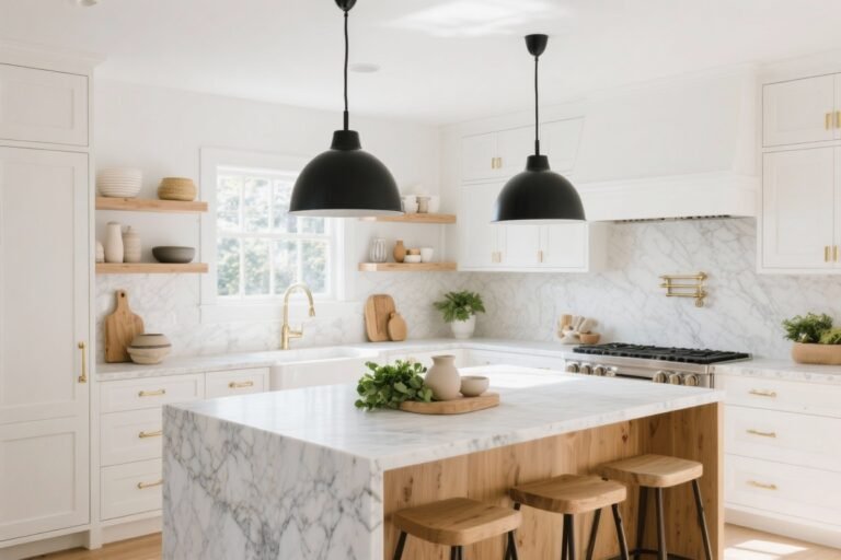
3. Style Your Countertops Like a Chef’s Kitchen
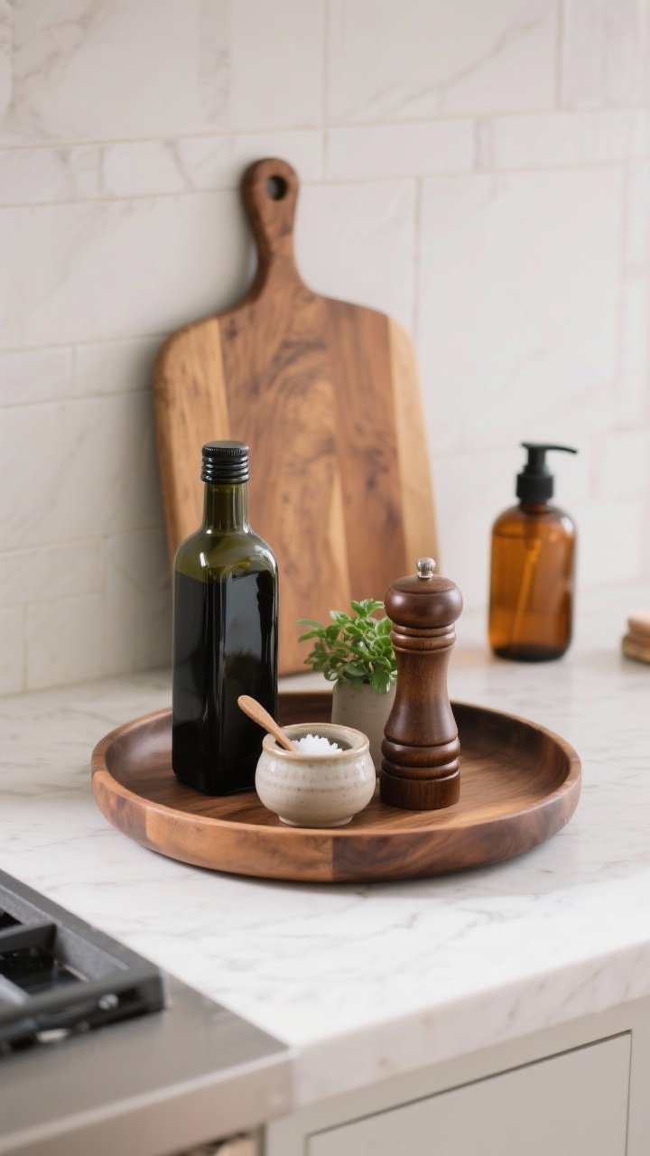
Clutter is the enemy of luxury. Curate what lives on your counters and everything instantly reads more upscale. Bonus: you’ll actually have space to cook.
Transform Your Home With 7,250+ Stunning Landscaping Designs—No Expensive Designers Needed!
- 🌿 Access 7,250+ stunning landscaping designs.
- 💰 Save thousands—no pro designer needed.
- 🏡 Plans for gardens, patios, walkways, and more.
- ✨ Simple, beginner-friendly DIY layouts.
- 🛠️ Customize any design to fit your yard.
Keep It Intentional
- Corral essentials on a trayscape: oil, salt cellar, pepper mill, and a tiny plant.
- Decant dish soap into a reusable glass pump, and stash the neon sponge.
- Use a board as decor: lean a large wood cutting board for warmth and height.
Limit yourself to one decorative cluster per counter zone. It looks styled, not crowded.
4. Swap Bulbs and Shades for Soft, Luxe Lighting

Lighting is a dead giveaway of a budget kitchen—but it’s also the easiest fix. Warm bulbs, layered fixtures, and a dimmer turn “overhead glare” into “restaurant mood.”
Light Like a Designer
- 2700K LED bulbs for flattering warmth.
- Plug-in sconces or a pendant over the island to add a focal point.
- Under-cabinet strips (battery or plug-in) for that expensive glow.
Add a dimmer switch. It costs little, but it reads high-end. Your pasta will thank you.
5. Paint Adds Drama (Without Drama)
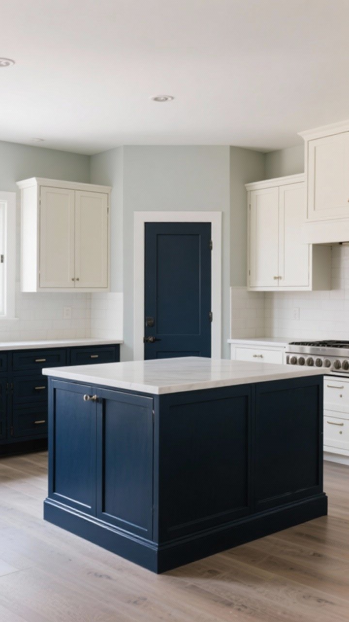
Paint is the makeover MVP. You can transform cabinets, walls, or an island with a quart and a Saturday afternoon. Go rich and saturated for drama or airy and bright for “spa kitchen” vibes.
Smart Color Moves
- Two-tone cabinets: dark lowers, light uppers—instant custom look.
- Moody island: navy, charcoal, or deep green = focal point.
- Color drenching: paint walls, trim, and door the same shade for a designer feel.
Finish matters: satin or semi-gloss for wipeability on cabinets, eggshell for walls. Don’t skip primer—your future self will be grateful.

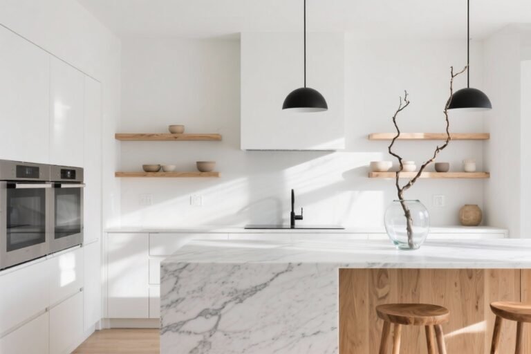
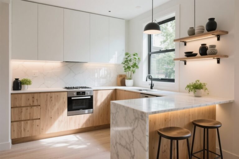
6. Open Shelving That Doesn’t Look Messy
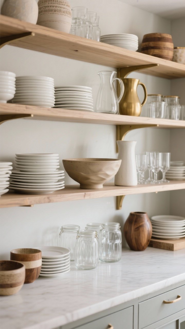
Open shelves can scream “Pinterest” or “yard sale.” The difference? Editing and repetition. Keep colors tight and materials consistent so it feels intentional, not chaotic.
How to Style It
- Stick to a neutral palette with 1–2 accent colors.
- Use sets: stacks of white plates, matching glasses, uniform jars.
- Mix textures: wood, ceramic, glass, maybe a little brass.
Anchor each shelf with one larger item (a serving bowl or pitcher), then layer smaller pieces. Leave breathing room—empty space looks luxe, IMO.
7. Go High on Textiles: Runners, Towels, and Seat Cushions
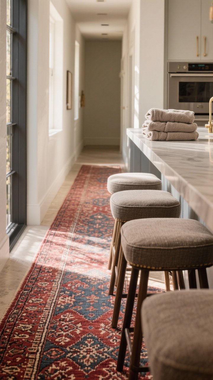
Soft stuff adds instant polish and warmth. A stylish runner or Roman shade can totally upgrade a basic kitchen. Plus, it’s renter-friendly and washable—chef’s kiss.
Textile Tips
- Washable rug runner in a Turkish or Persian pattern hides spills and looks high-end.
- Thick, neutral towels (no cheesy quotes) make the space feel mature.
- Seat cushions or slipcovers in performance fabric = elevated and practical.
Keep textiles in the same color family so the room looks cohesive, not patchwork.
8. Decant and Display (But Not Like a Grocery Aisle)
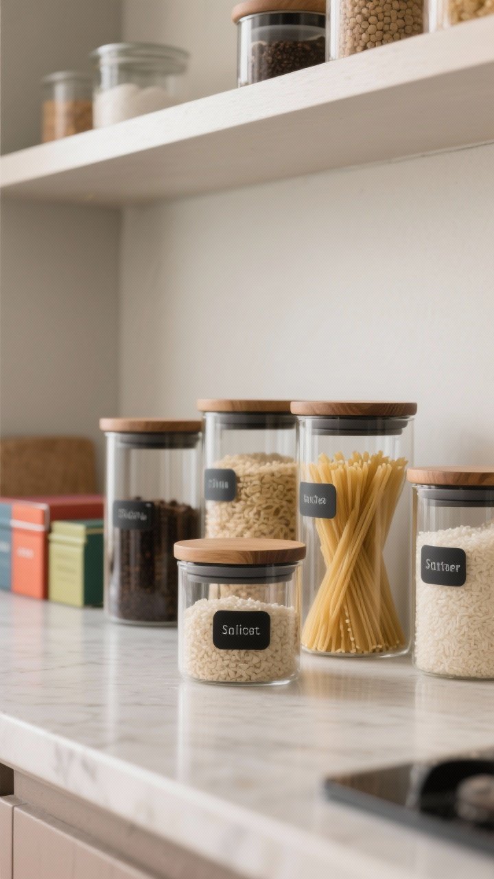
Clear containers can be chic—if you’re selective. Think of them as decor that earns its keep. When everything is in uniform jars, it reads like a boutique pantry.
Decant the Right Things
- Daily-use items: coffee, tea, pasta, rice, baking basics.
- Uniform containers in glass with wood or black lids.
- Minimal labels in the same font or clear label tape.
Only display what you’ll use frequently so it stays fresh. Hide the rainbow cereal boxes behind cabinet doors—chaos belongs offstage.
9. Add Statement Art (Yes, In The Kitchen)
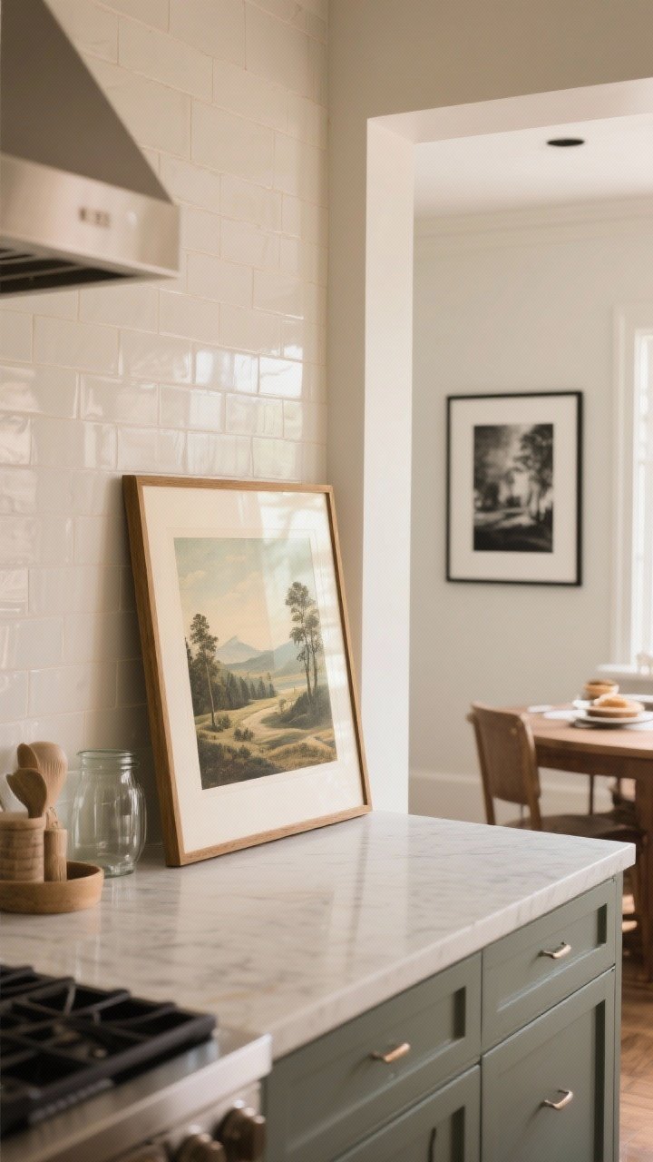
Art in the kitchen is unexpected—and that’s why it looks expensive. A framed print or canvas above a counter feels curated and personal.
What Works Well
- Vintage landscapes or food illustrations for a cozy bistro vibe.
- Black-and-white photography for modern kitchens.
- Oversized frames with wide mats to fake gallery quality.
Lean art against the backsplash for a casual look, or hang it near the breakfast nook. Use a frame with real glass or acrylic—cheap frames look, well, cheap.
10. Layer Wood and Metal Accents Like a Stylist
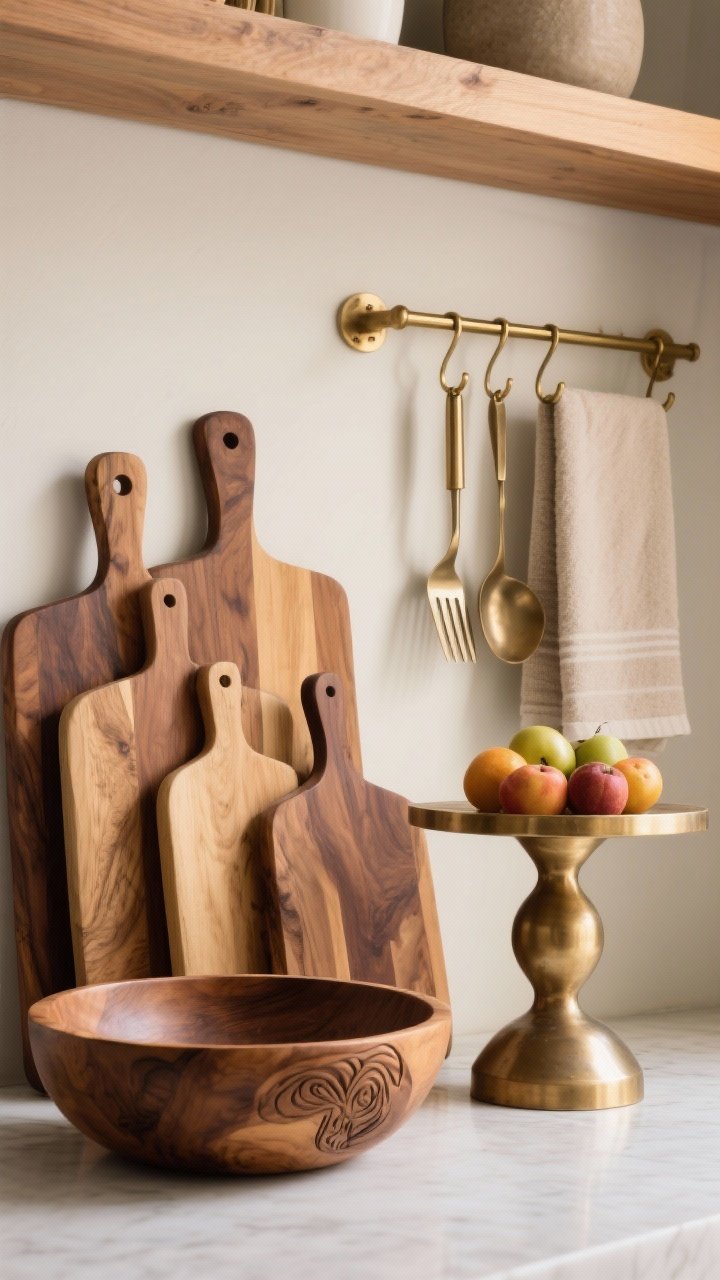
The mix of organic wood and sleek metal screams “custom.” It’s the contrast that makes a budget kitchen feel layered and intentional.
Easy Ways to Layer
- Wood boards and bowls for warmth and texture.
- Metal cake stand or fruit bowl as a sculptural moment.
- Brass rail or hooks with pretty utensils or towels.
Keep your metals in the same family (warm or cool) so it looks cohesive. Then let wood soften the edges. It’s the high-low combo that always works.
Bonus Mini-Tips to Amplify the Luxe Vibe
- Hide appliances you don’t use daily. Clear counters = instant upgrade.
- Swap outlet covers to match your backsplash or wall color.
- Use a matching bin or basket under the sink for cleaners—organization reads expensive.
- Fresh herbs in simple pots beat fake greenery every time.
That’s the playbook: thoughtful swaps, edited styling, and a few “is this custom?” illusions. You don’t need a remodel—you just need a plan. Start with one idea this weekend and watch your kitchen go from fine to “who did your design?”