
10 Beige-to-white Kitchen Ideas That Look Effortlessly Elegant
You want a kitchen that feels calm, bright, and insanely chic—without looking sterile. Enter the beige-to-white palette: soft, sophisticated, and totally livable. It’s timeless, but not boring. Cozy, but still elevated. Ready to make your kitchen feel like a Pinterest board that came to life? Let’s get into it.
1. Layer Textures Like a Pro

When your palette runs from beige to white, texture is everything. It adds depth so the space feels warm and curated—not flat. Think smooth quartz, matte cabinetry, linen shades, and a touch of rough-hewn wood. That mix keeps your kitchen visually interesting while staying neutral.
Tired of snacking when you’re not even hungry? This reset helps you stop the loop and feel back in control.
A simple reset for moments when cravings take over. Easy to use, easy to repeat, and designed to help you feel satisfied instead of stuck.
Try This Combo
- Countertops: Honed white quartz or marble-look quartz for a soft sheen.
- Cabinets: Matte shaker doors in warm white or pale ivory.
- Backsplash: Handmade-look ceramic tiles in almond or off-white.
- Textiles: Linen runners, waffle dish towels, or woven chair cushions.
FYI: Honed finishes show less glare and feel less “kitchen showroom,” more lived-in luxury.
2. Go Two-Tone With Subtle Contrast

Two-tone cabinetry gives you that designer look without screaming for attention. Keep the bottom cabinets a soft **beige** (think mushroom or oatmeal) and the uppers a cozy **warm white**. It grounds the space while keeping your sightlines airy.
Color Pairings That Work
- Base: Greige or light taupe
- Uppers: Creamy white with a hint of yellow or pink undertone
- Island: Slightly deeper beige for a subtle focal point
Pro tip: Use the same undertone family across paints and finishes so the palette feels cohesive, not patchy.
3. Choose Stone That Softens, Not Shouts

Stone is the star of a beige-to-white kitchen—but keep it serene. Look for veining that’s gentle and warm: calacatta-look quartz, creamy quartzite, or even a light **travertine** moment if you’re bold. Skip icy gray veining if you want warmth.
Transform Your Home With 7,250+ Stunning Landscaping Designs—No Expensive Designers Needed!
- 🌿 Access 7,250+ stunning landscaping designs.
- 💰 Save thousands—no pro designer needed.
- 🏡 Plans for gardens, patios, walkways, and more.
- ✨ Simple, beginner-friendly DIY layouts.
- 🛠️ Customize any design to fit your yard.
Smart Stone Moves
- Use honed or leathered finishes for a tactile feel.
- Consider a shorty slab backsplash that wraps the counter up 4-6 inches for clean lines.
- Or go full slab backsplash behind the range for “quiet luxury” drama.
Oh, and seal porous stones. Elegance is cool; stains are not.
4. Warm Metals Make It Glow
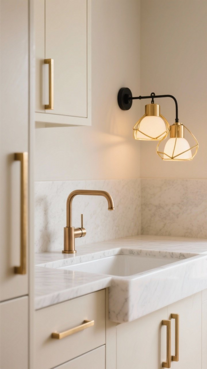
Hardware and lighting can make or break the vibe. For beige-to-white kitchens, warm metals are your best friends. Think brushed brass, champagne bronze, or soft gold. Not shiny, not loud—just mellow and glowy.
Where To Use What
- Cabinet hardware: Slim pulls in brushed brass or champagne bronze.
- Faucet: Matches or complements hardware—don’t overmix finishes.
- Lighting: Warm metal frames or detailing on pendants and sconces.
IMO, matte black can still work—use it sparingly for contrast on a sconce or barstool frame.
5. Add Gentle Curves for Softness

Curves are having a moment—and they’re perfect for softening a minimalist palette. Rounded corners, arched alcoves, curved island overhangs, even round pendants—all of it eases the edges and amps the calm.
Easy Curve Ideas
- Arched niche above a coffee station or range.
- Rounded island corners to soften traffic flow.
- Curved-back stools upholstered in boucle or linen.
One or two curves go a long way; you’re building serenity, not a theme park.

6. Play With Soft Pattern (Yes, You Can)

Neutral doesn’t mean plain. Bring in subtle pattern to keep the eye engaged—just keep it quiet. A micro-check runner, zellige tile with soft color variation, or reeded glass on cabinet doors does wonders.
Pattern Ideas That Stay Calm
- Backsplash: 2×8 ceramic in a stacked or herringbone layout.
- Glass fronts: Reeded or fluted for texture without clutter.
- Rugs: Beige-and-cream stripe or check for easy layering.
Keep patterns tonal. If it looks bold up close but melts away from five feet, you nailed it.
7. Lean Into Natural Wood (Light and Lovely)

Natural wood gives your neutrals soul. Choose light oak, ash, or maple for flooring, shelves, or the island base. The goal is warmth without going yellow or orange.
Where Wood Works Best
- Open shelves: Floating white-oak shelves above a simple backsplash.
- Flooring: Wide-plank oak in a matte or oil finish.
- Island: Wood base with stone top for material contrast.
Match wood tones across elements so it feels intentional—two shades max unless you’re a pro finisher.
8. Light It Like a Boutique

Great lighting is the secret sauce. Mix ambient, task, and accent lighting so your beige-to-white palette glows instead of blends into meh. And yes, dimmers on everything. Non-negotiable.
Your Lighting Game Plan
- Ambient: Recessed LEDs with warm temp (2700–3000K).
- Task: Under-cabinet lights for counters and sink areas.
- Accent: Pendants over the island, a picture light over art, or a small sconce by open shelving.
Use frosted bulbs and linen shades to keep the light soft. No interrogation-room vibes, please.
9. Edit Your Styling (But Make It Personal)

Clutter kills a neutral kitchen. Keep surfaces mostly clear, then layer a few thoughtful pieces in warm natural materials. You want lived-in, not staged.
Styling That Feels Effortless
- Ceramics: Stoneware bowls in sand and cream.
- Boards: A stack of blonde wood cutting boards leaning casually.
- Greenery: Olive branches or eucalyptus in a simple vase.
- Textiles: Beige linen hand towels on a hook, not tossed on the counter.
Limit countertop items to daily-use essentials and one or two pretty groupings. That’s it. Breathe.
10. Get the Undertones Right (The Real MVP)

Here’s the deal: beige and white can turn cold or weirdly yellow if the undertones clash. Test everything together—paint chips, tile samples, stone, wood, even your lighting temps. It’s a neutral symphony, and you’re the conductor.
Undertone Cheat Sheet
- Warm whites: Pair with beiges that have yellow or pink undertones.
- Greige/stone beiges: Work with whites that lean creamy, not stark.
- Lighting: Use warm bulbs (2700–3000K) to keep the palette cozy.
Paint large sample boards and move them around the room at different times of day. Your future self will thank you.
Quick Shopping List
- Honed white or creamy quartz counters
- Matte beige lower cabinets, warm white uppers
- Warm metal hardware and faucet (brushed brass/champagne)
- Handmade-look ceramic backsplash in off-white
- Light-oak shelves or island base
- Linen shades, soft runner, woven accents
- Layered lighting with dimmers
There you have it: a beige-to-white kitchen that’s soft, elegant, and seriously livable. Keep it layered, keep it warm, and keep it personal. When your coffee tastes better just because the space feels calm—you’ll know you nailed it.


