10 Kitchen Backsplash Ideas That Add Luxury Without Overdoing It
You don’t need a gold-plated espresso machine to make your kitchen feel luxe. A smart backsplash can do the heavy lifting—quietly. Think elevated materials, chic finishes, and subtle drama that whispers “custom” instead of shouting “look at me!” Ready to upgrade without going overboard? Let’s get into ten ideas that nail that sweet spot.
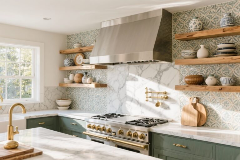
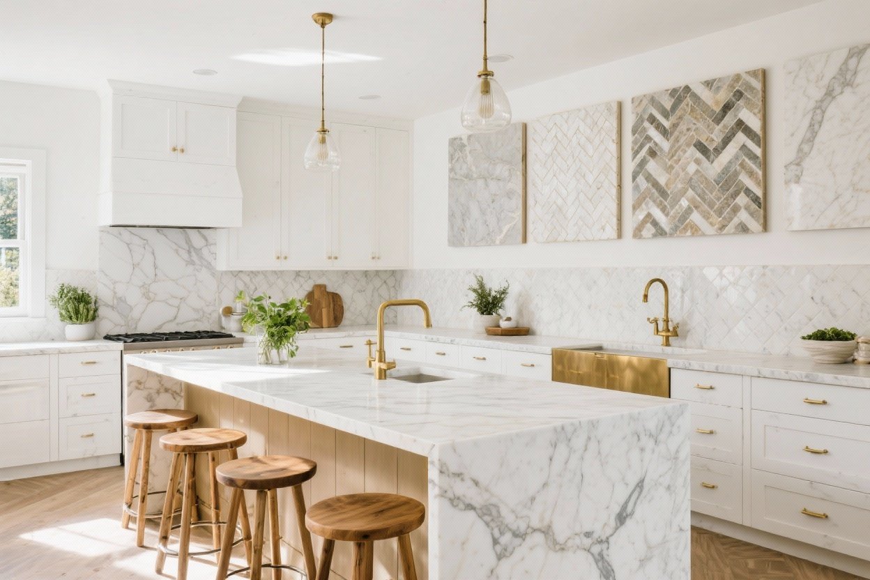
1. Veined Marble That Looks Custom (Without the Drama)
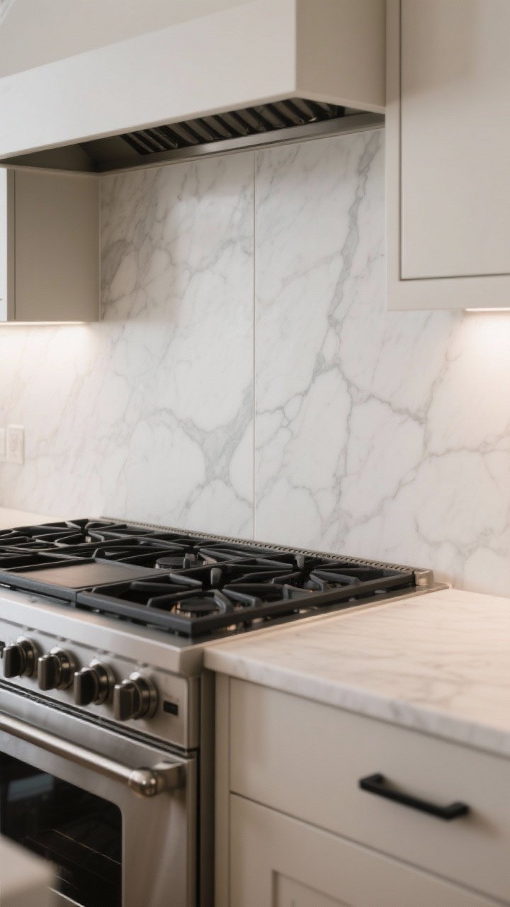
Marble is the ultimate luxury flex, but keep it refined. Opt for a softly veined marble like Carrara or a honed Calacatta-look porcelain for durability. The trick is choosing restrained movement—elegant veins that flow without screaming.
Tired of snacking when you’re not even hungry? This reset helps you stop the loop and feel back in control.
A simple reset for moments when cravings take over. Easy to use, easy to repeat, and designed to help you feel satisfied instead of stuck.
Why It Works
It adds depth and natural pattern, and the honed finish cuts glare while hiding smudges. Bonus: larger slabs mean fewer grout lines, which instantly reads cleaner and more high-end.
Pro Tips:
- Use bookmatched slabs behind a range for a tailored moment that still feels quiet.
- Pair with matte hardware to keep the look grounded, not glossy overload.
- Seal, seal, seal—especially behind a cooktop. Or go for a marble-look porcelain for easy maintenance.
2. Slimline Zellige With a Soft Sheen
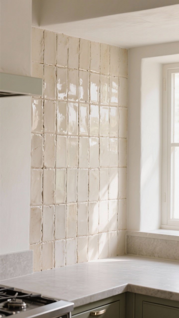
Handmade zellige tiles add that lived-in luxury you can’t fake. Go for slim rectangular tiles in a soft neutral—think pearl, bone, or smoke—for a gentle shimmer that catches the light just right.
Why It Works
Each tile is slightly imperfect, which reads artisan and expensive—in a good way. The glaze reflects light, so your kitchen feels brighter without resorting to high gloss everywhere.
Transform Your Home With 7,250+ Stunning Landscaping Designs—No Expensive Designers Needed!
- 🌿 Access 7,250+ stunning landscaping designs.
- 💰 Save thousands—no pro designer needed.
- 🏡 Plans for gardens, patios, walkways, and more.
- ✨ Simple, beginner-friendly DIY layouts.
- 🛠️ Customize any design to fit your yard.
Pro Tips:
- Stack them vertically for a fresh, architectural line.
- Keep grout tone-on-tone to let the texture do the talking.
- Use a honed countertop to balance the zellige sheen. Contrast = sophistication.
3. Quiet Metallics: Brushed Brass or Champagne Steel
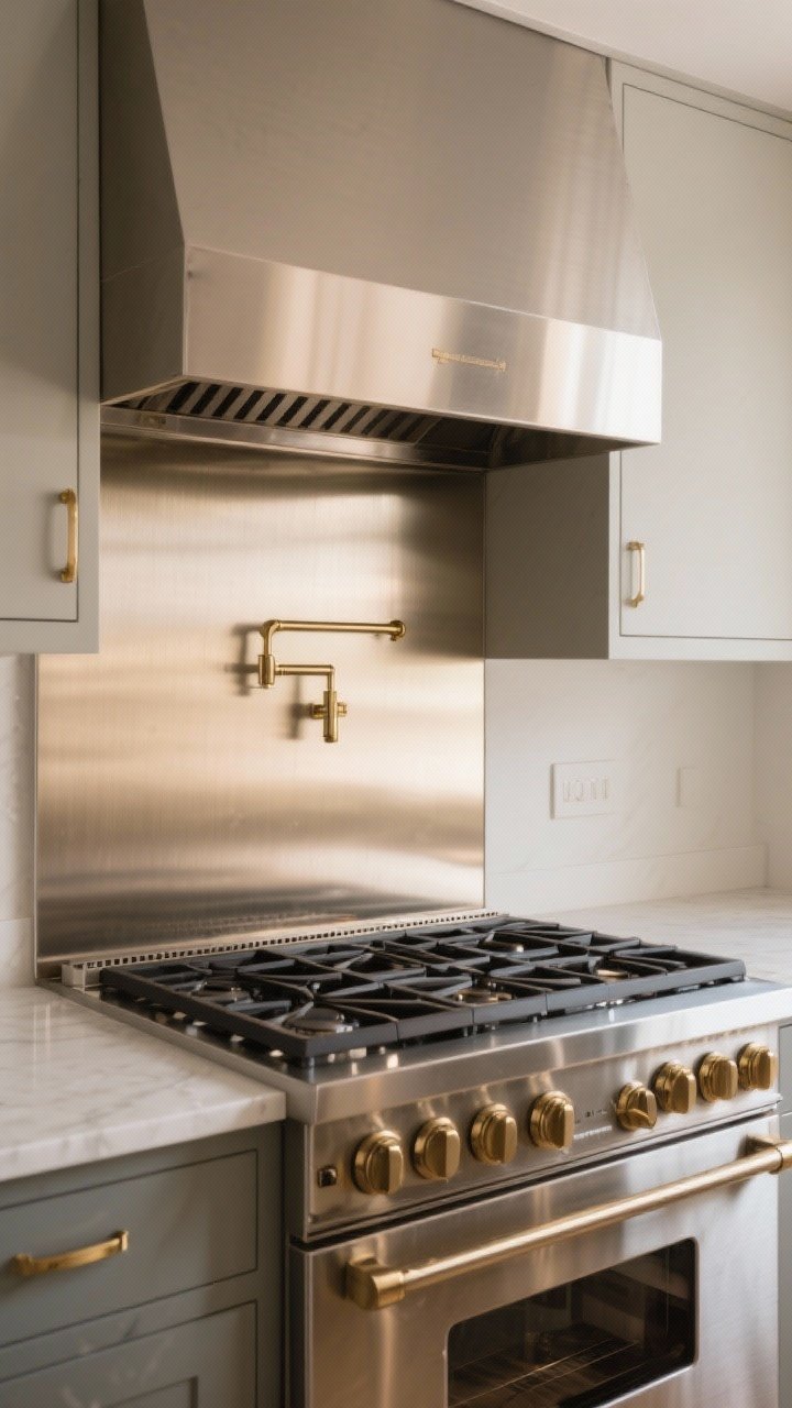
Hear us out: metal backsplashes can be very chic when they’re brushed, not mirror. Champagne-toned stainless or brushed brass panels add warmth without bling. This is the “silk blouse” of backsplash moves—subtle and expensive-looking.
Why It Works
It layers in luxurious warmth and reflects just enough light to feel airy. Plus, it ages nicely—minor patina adds character.
Pro Tips:
- Use one accent zone (behind the range) instead of the entire wall for balance.
- Match to hardware undertones for cohesion—cooler metals with nickel, warmer with brass.
- Choose fingerprint-resistant finishes if you cook a lot. Your future self says thanks.
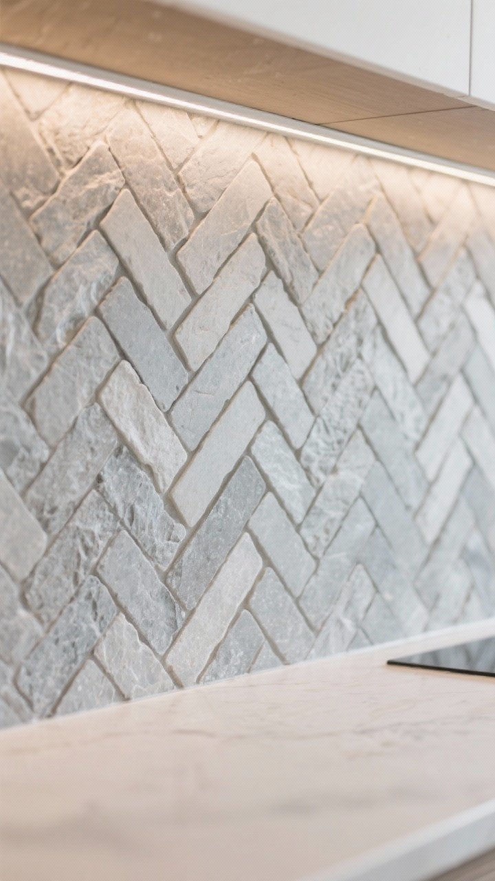
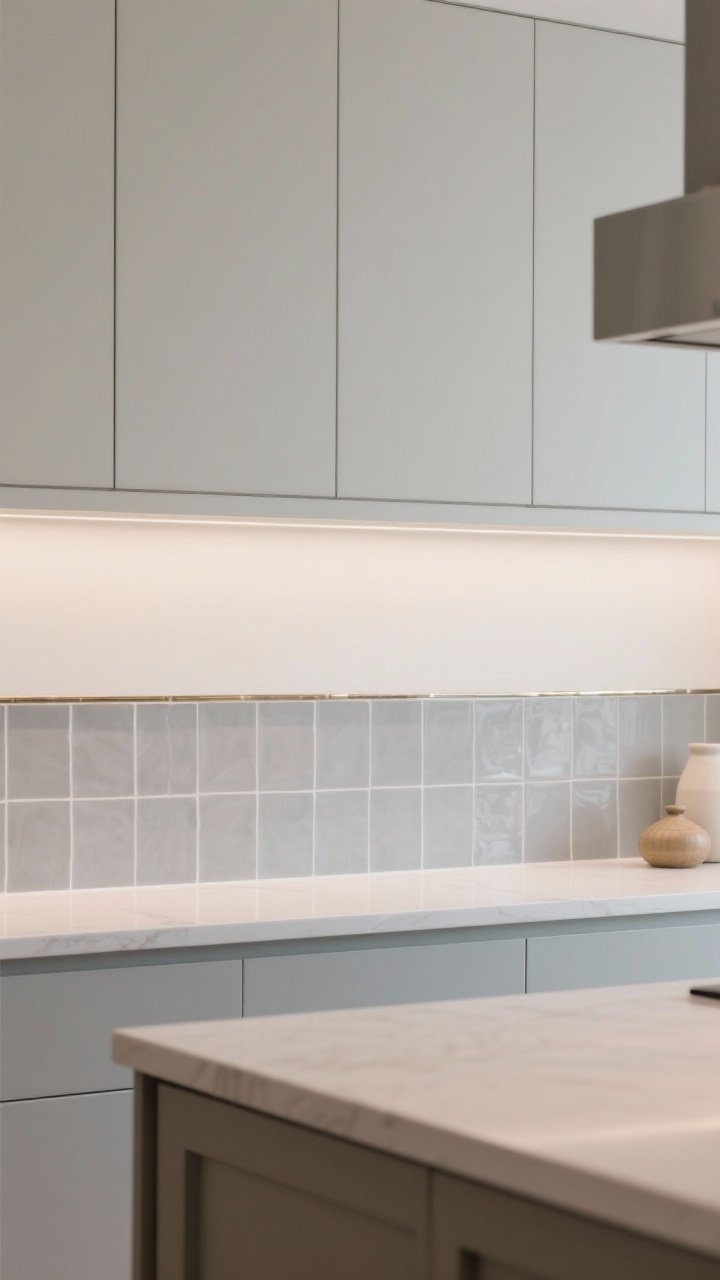
4. Subtle Stone Mosaics in Monochrome
Want texture and detail without visual chaos? Try a monochrome stone mosaic—herringbone, basketweave, or micro-hex in the same tone family as your counters.
Why It Works
The pattern adds artisanal richness, but the single-color palette keeps things calm. It’s like wearing a textured cashmere sweater instead of a sequined top.
Pro Tips:
- Keep grout slightly darker than the stone to avoid a busy grid.
- Choose honed or tumbled finishes for a softer, natural look.
- Edge it with a stone pencil trim for a polished, built-in vibe.
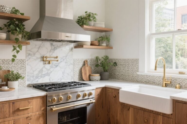
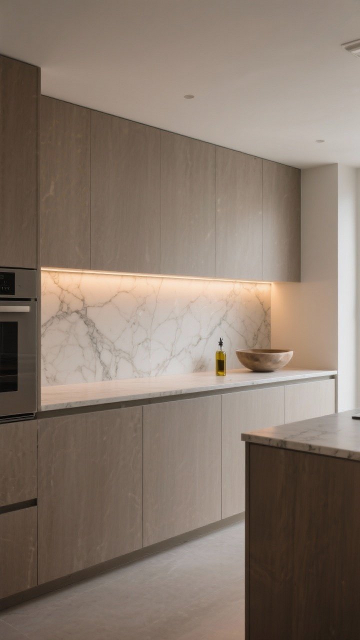
5. Slab Backsplash With a Low Ledge
Take your countertop up the wall—but only a bit. A short slab backsplash (8–12 inches) with a slim ledge looks custom and doubles as a styling perch for oils or a small vase. It’s understated luxury that’s actually practical. Wild, right?
Why It Works
Continuity equals calm. A matching slab visually expands the space and avoids busy transitions. The ledge adds function and frames your work zone.
Pro Tips:
- Keep the edge profile simple—eased or beveled for a clean, modern line.
- Coordinate with under-cabinet lighting to highlight the stone’s veining.
- Style minimally: one sculptural bowl > ten spice jars, FYI.

6. Satin-Finish Porcelain That Mimics Stone

If actual marble makes you nervous, porcelain is your chic, low-maintenance friend. Choose satin or honed porcelain tiles with subtle stone veining for that refined, believable look.
Why It Works
It’s durable, budget-friendlier, and the right finish avoids the “fake shine.” Plus, porcelain handles splatters like a champ.
Pro Tips:
- Go for large-format tiles to reduce grout lines and increase that seamless vibe.
- Sample first—look for randomized veining to avoid repetition.
- Use a silicone color-matched caulk where tile meets the counter for a pro finish.
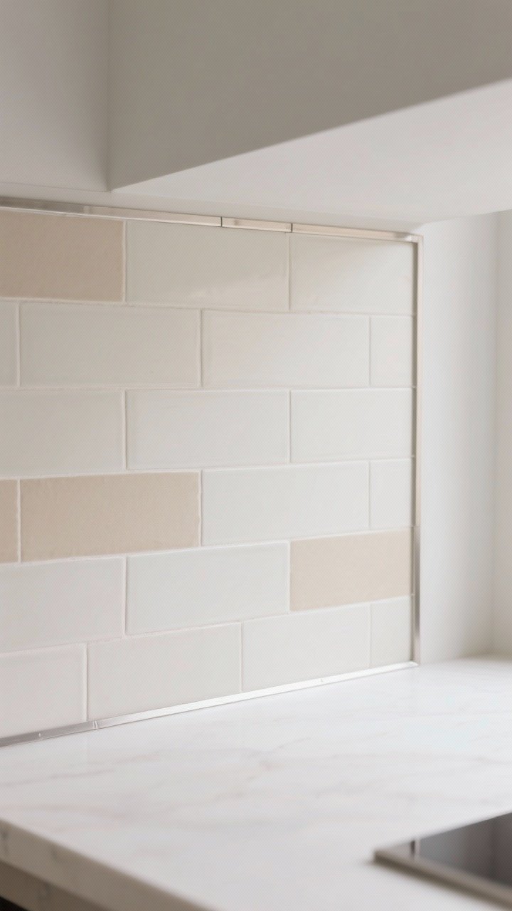
7. Linear Stacked Tile in a Tight Palette
Stacked tile is quietly modern. Choose slim, rectangular tiles in soft neutrals—cream, sand, greige—and stack them in tidy rows (horizontal or vertical) for a minimalist-but-luxe look.
Why It Works
The straight lines create architectural rhythm without feeling busy. It’s graphic, but gentle—especially if you keep grout close in color.
Pro Tips:
- Use a matte or eggshell finish to keep it sophisticated.
- Try a 1/3 offset if you want movement without full subway vibes.
- Stop the tile at a clean line using schluter edging in a matching metal tone.
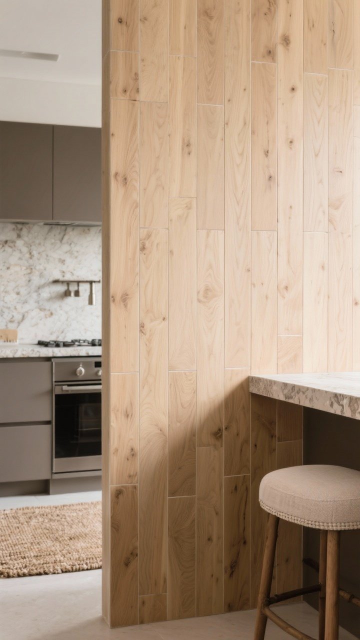
8. Natural Wood-Look Tile (Yes, For Backsplash)
Wood on a backsplash? Real wood can be high maintenance, but wood-look porcelain delivers warmth and texture with zero stress. Choose a light oak or ash tone and keep the pattern simple.
Why It Works
It brings organic warmth—the “spa” moment your kitchen didn’t know it needed. And it plays nicely with stone counters and matte fixtures.
Pro Tips:
- Run planks vertically for a fresh, Scandinavian vibe.
- Select tiles with low pattern repeat for realism.
- Soften with linen-textured barstools or natural fiber rugs to tie it all together.
9. Micro-Slab Window Splash
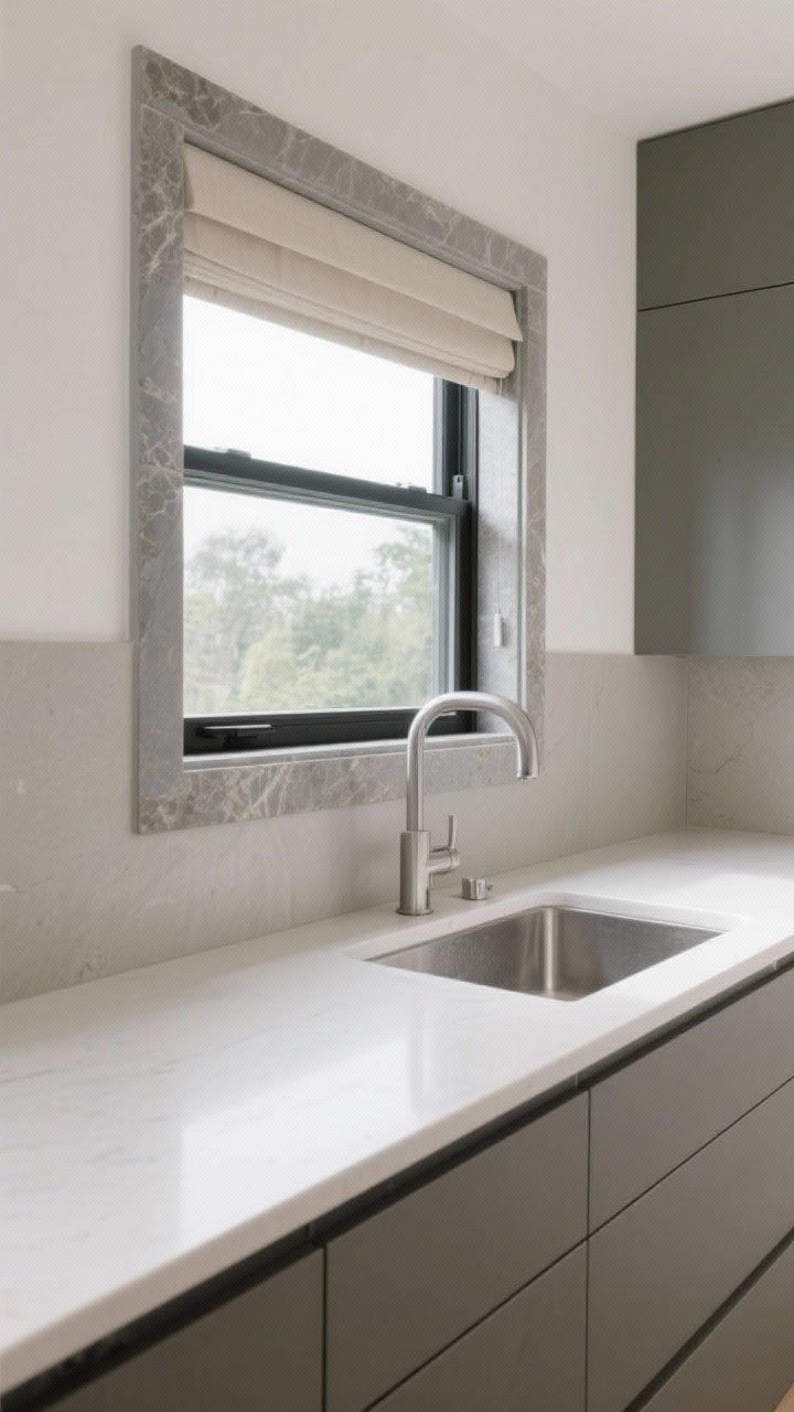
If you’ve got a window over the sink, treat it like a design feature. Wrap the bottom and sides with a matching slab return so the stone frames the view. This detail screams custom millwork without actually being millwork.
Why It Works
It’s architectural and serene. The consistent material reads high-end, especially when it aligns with counter seams and cabinet lines.
Pro Tips:
- Keep reveals even and minimal for that bespoke look.
- Use water-resistant caulk and ensure proper slope near the sill.
- Pair with simple roman shades or no window treatment to let the stone shine.
10. Two-Tone Tile With a Gentle Break
Color can be luxe—just keep it soft. Try two harmonious tones (think dove gray and warm white) with a clean transition: a slim metal trim or a single row of pencil tile to define the shift.
Why It Works
The palette adds interest without chaos. It also helps balance open shelving or a dramatic range hood by anchoring zones subtly.
Pro Tips:
- Place the break at a logical height—bottom of the hood, underside of cabinets, or window sill.
- Repeat one color in your island or accessories to tie it together.
- Keep finishes consistent—matte with matte—to avoid a patchwork effect, IMO.
How to Choose the Right Luxe-But-Low-Key Backsplash
Quick sanity check before you commit:
- Start with undertones: Warm cabinets and brass? Choose warm stones and creams. Cool metals and gray counters? Lean greige or soft white with gray veining.
- Mind proportion: High ceilings? Take tile higher or go slab. Cozy kitchen? Keep patterns fine and grout subtle.
- Texture over gloss: Luxe usually reads as tactile, not shiny. A little sheen, not mirror brightness.
- Edit the palette: Two to three hard finishes max (counter, backsplash, hardware). That’s your harmony sweet spot, FYI.
Installation Details That Make It Feel Expensive
- Edge treatments: Use schluter in matching metal or stone pencil trims. Raw edges = instant downgrade.
- Outlet strategy: Consider under-cabinet plugmold or color-matched outlet covers so the backsplash stays the star.
- Tight grout lines: 1/16″ to 1/8″ for a clean, refined finish. Use high-quality, stain-resistant grout.
- Lighting: Under-cabinet LEDs make texture and veining pop. Dimmer switch = day-to-night mood shift.
Maintenance Matters (Because You Actually Cook)
- Seal natural stone annually or as recommended. Wipe spills quickly, especially tomato and wine.
- Porcelain and ceramic are your easiest-care options—soap and water are usually enough.
- Metal panels prefer gentle, non-abrasive cleaners. Microfiber cloths are your friend.
Bottom line? Luxury doesn’t have to be loud. Choose materials with beautiful texture, stick to a calm palette, and sweat the small installation details. Do that, and your kitchen will feel tailored, timeless, and quietly expensive—no flashy tricks required.