10 Kitchen Backsplash Ideas That Pair Perfectly With Quartz Countertops
You picked quartz (nice choice). It’s gorgeous, tough, and basically the low-maintenance friend we all need. Now let’s find a backsplash that does it justice—something that complements the veining, plays up the sheen, and doesn’t fight for attention. Below are ten seriously good ideas that pair beautifully with quartz, whether your counters are crisp white, moody charcoal, or marble-look dreamy.
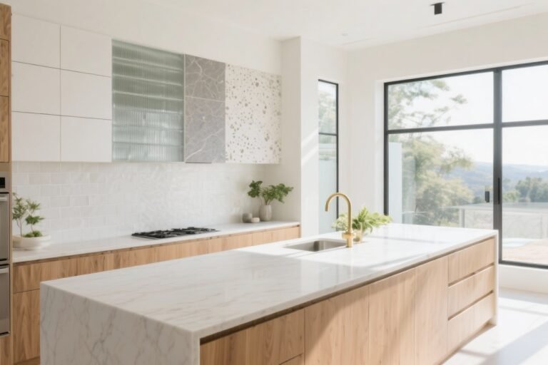
1. Marble-Look Porcelain: Luxe Without the Stress
If your quartz has subtle veining, a marble-look porcelain backsplash is like its chic cousin—related, but not twinning. You get the veined elegance without babying real marble.
Tired of snacking when you’re not even hungry? This reset helps you stop the loop and feel back in control.
A simple reset for moments when cravings take over. Easy to use, easy to repeat, and designed to help you feel satisfied instead of stuck.
Why It Works
- Visual harmony: Soft gray veining in porcelain mirrors the movement in quartz without competing.
- Wipe-and-go: Porcelain is ridiculously easy to clean (FYI: spaghetti night is safe).
- Budget-friendly luxe: You’ll get that high-end look for less.
Pro Tips
- Pick veining that’s lighter than your countertop for balance.
- Use large-format tiles or slabs to cut down on grout lines and keep it sleek.
- Match your grout to the veining for a cohesive look.
2. Vertical Stacked Subway: Modern, Tall, Effortless
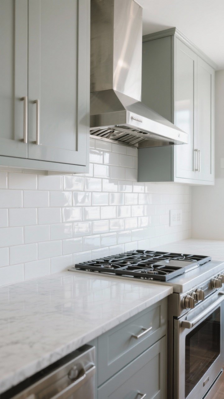
Subway tile, but make it fashion: stack it vertically for a fresh, modern line that elongates the room. It’s still classic—just with better posture.
Why It Works
- Crisp lines pair nicely with the smooth surface of quartz.
- Height boost: Vertical orientation draws the eye up (hello, taller kitchen).
- Timeless twist: Keeps your kitchen from feeling trendy-trendy or too safe.
Pro Tips
- Go for glossy white against white or gray quartz for maximum light bounce.
- Use rectangles in 2×8 or 3×12 for a sleeker look than standard 3×6.
- Consider warm white tiles if your quartz has creamy undertones.
3. Zellige Tiles: Imperfect, Textured, Totally Stunning
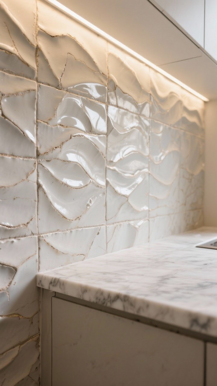
Want that artisanal vibe? Zellige tiles are handmade, slightly wavy, and have a deliciously glossy glaze that plays with light. Against quartz, the texture sings.
Why It Works
- Texture contrast: Quartz is smooth; Zellige adds depth and dimension.
- Light magic: The glaze creates movement, especially under under-cabinet lighting.
- Color flexibility: Neutrals keep it calm; saturated hues make it pop.
Pro Tips
- Choose off-white, greige, or soft sage to complement veined quartz.
- Keep grout super tight and color-matched to let the tile shine.
- Run tiles to the ceiling behind the range for a feature moment.
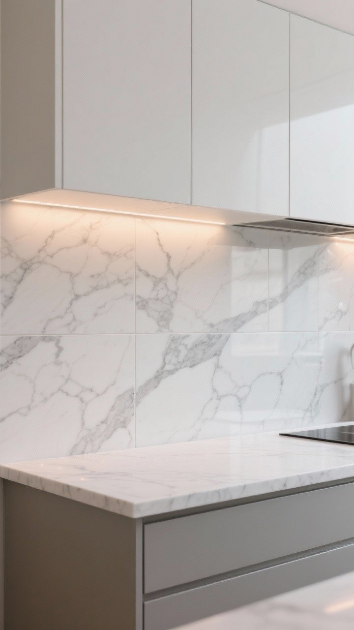
4. Slab Backsplash: Seamless and Seriously Chic
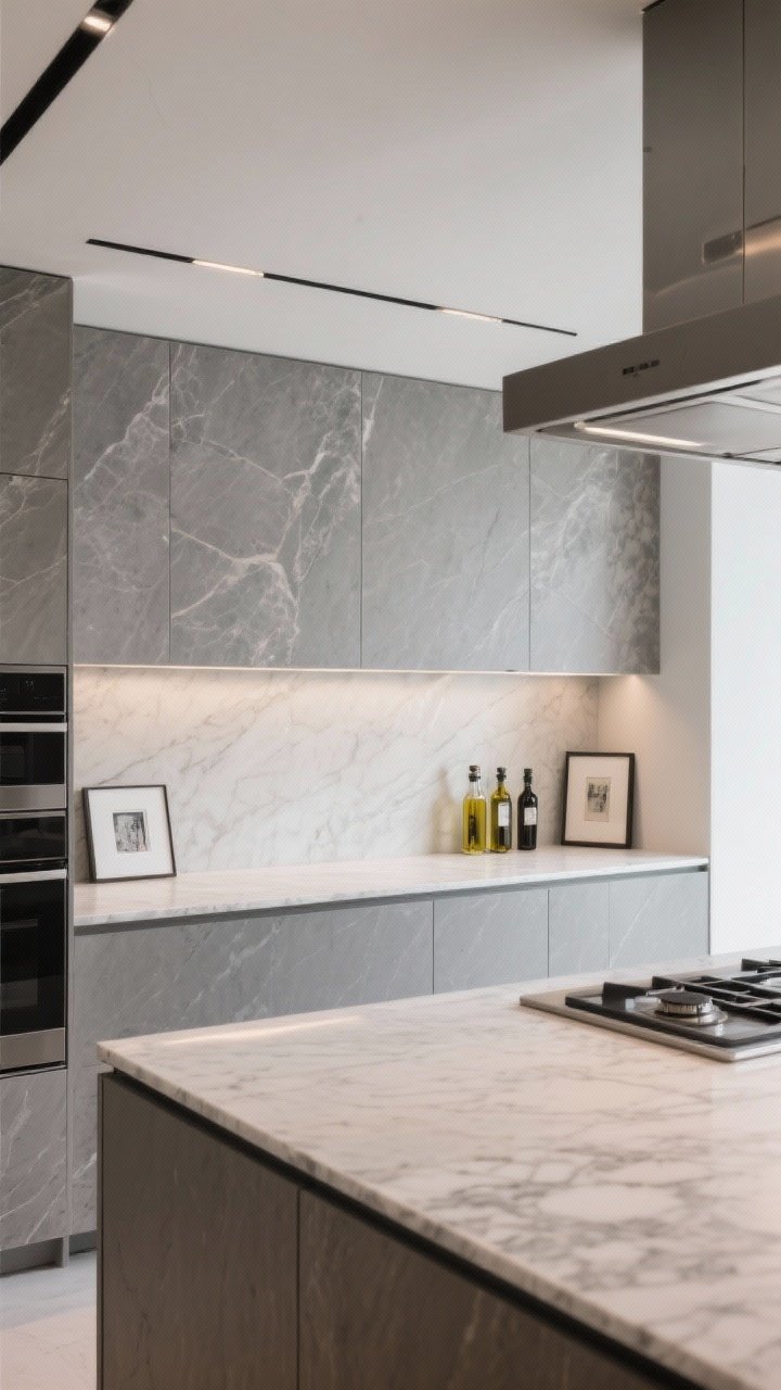
For ultra-modern vibes, go for a full slab backsplash. You can match your quartz or pick a complementary stone-look slab. Fewer grout lines, more drama.
Why It Works
- Seamless look: Makes small kitchens feel bigger and cleaner.
- Elevated design: High-impact with minimal visual noise.
- Easy maintenance: One swipe and done.
Pro Tips
- If your countertop is busy, choose a quiet slab for the wall.
- Consider a short shelf integrated into the slab for oils and art (yes, kitchen art).
- Run the slab to the hood line for a custom, editorial look.
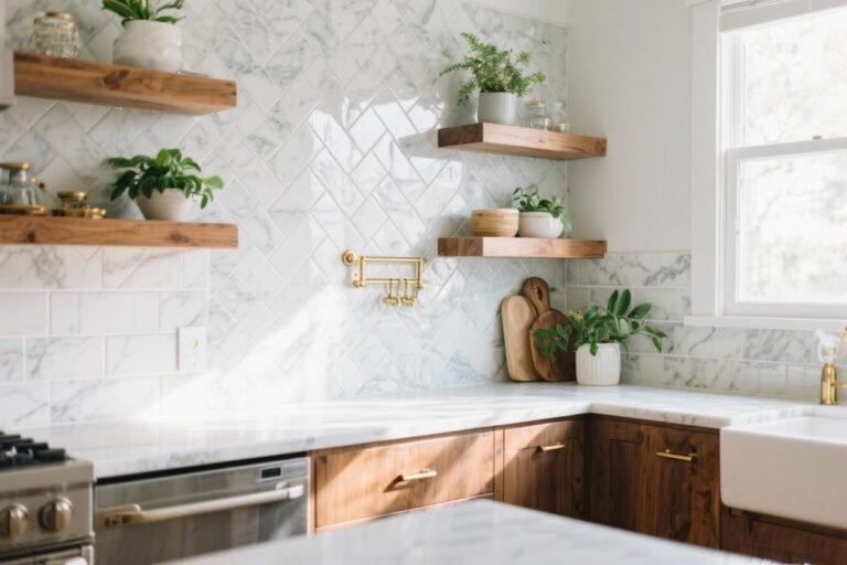
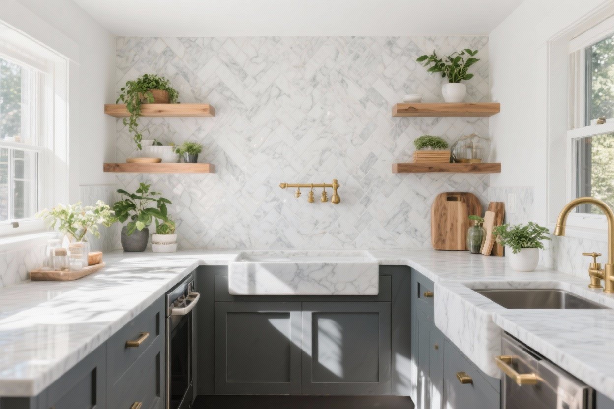
5. Herringbone Tile: Classic Pattern, Fresh Energy
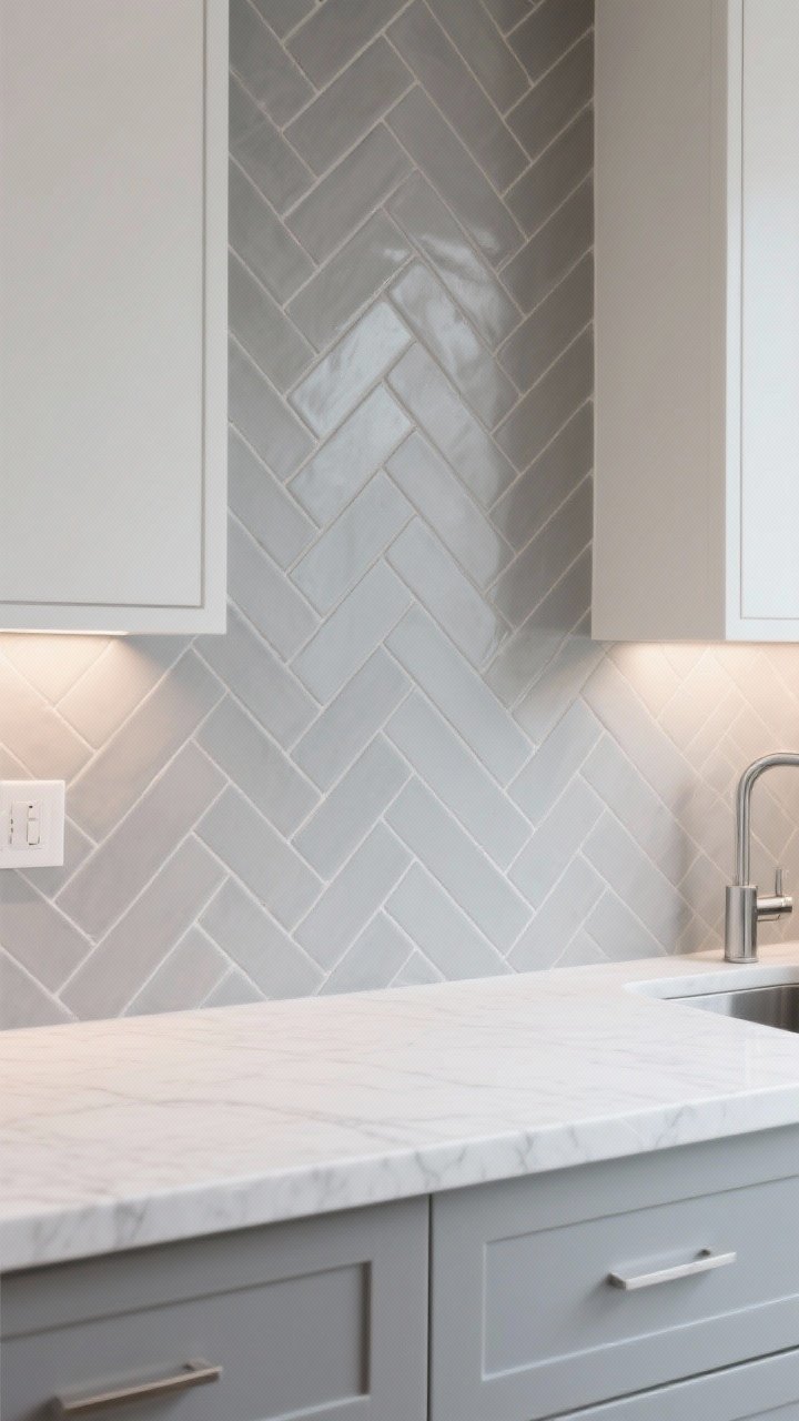
Herringbone gives instant movement and charm. When paired with quartz, it adds just enough personality without shouting.
Transform Your Home With 7,250+ Stunning Landscaping Designs—No Expensive Designers Needed!
- 🌿 Access 7,250+ stunning landscaping designs.
- 💰 Save thousands—no pro designer needed.
- 🏡 Plans for gardens, patios, walkways, and more.
- ✨ Simple, beginner-friendly DIY layouts.
- 🛠️ Customize any design to fit your yard.
Why It Works
- Pattern without chaos: The zig-zag contrasts beautifully with quartz’s calm surface.
- Endlessly customizable: Works in matte, gloss, ceramic, or stone.
- Transitional-friendly: Blends with modern, farmhouse, and traditional styles.
Pro Tips
- Use slim tiles (think 1×6 or 2×8) for an updated feel.
- Keep the color neutral if your counters are bold.
- Try straight herringbone (parallel to the counter) for a subtle twist.

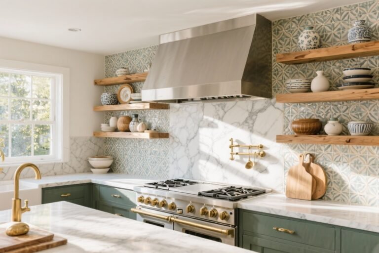
6. Warm Metal Accents: Brushed Brass or Stainless Inlay
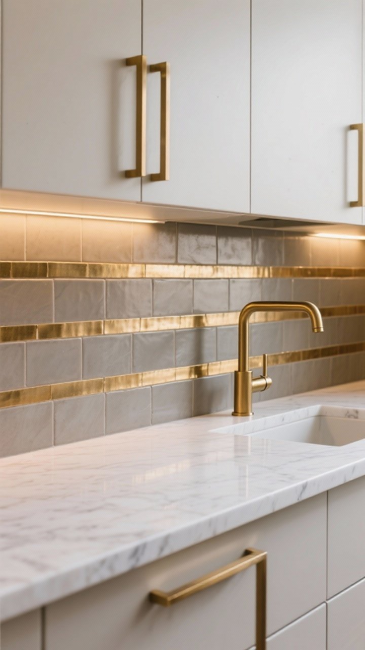
Want something unique but still clean? Add metal inlay strips between tile rows or choose metal mosaic accents. It’s like jewelry for your kitchen.
Why It Works
- Pairs with quartz sheen: Quartz’s subtle sparkle loves a little metallic partner.
- Modern glam: Adds polish without veering into nightclub territory.
- Mix-friendly: Works with matte tiles, glass, or stone.
Pro Tips
- Pick brushed brass with warm quartz; stainless with cool gray or white.
- Use metal sparingly—as borders or niche accents—to avoid overkill.
- Match your hardware tone for a cohesive story.
7. Matte Black Tile: Bold Contrast, Minimal Fuss
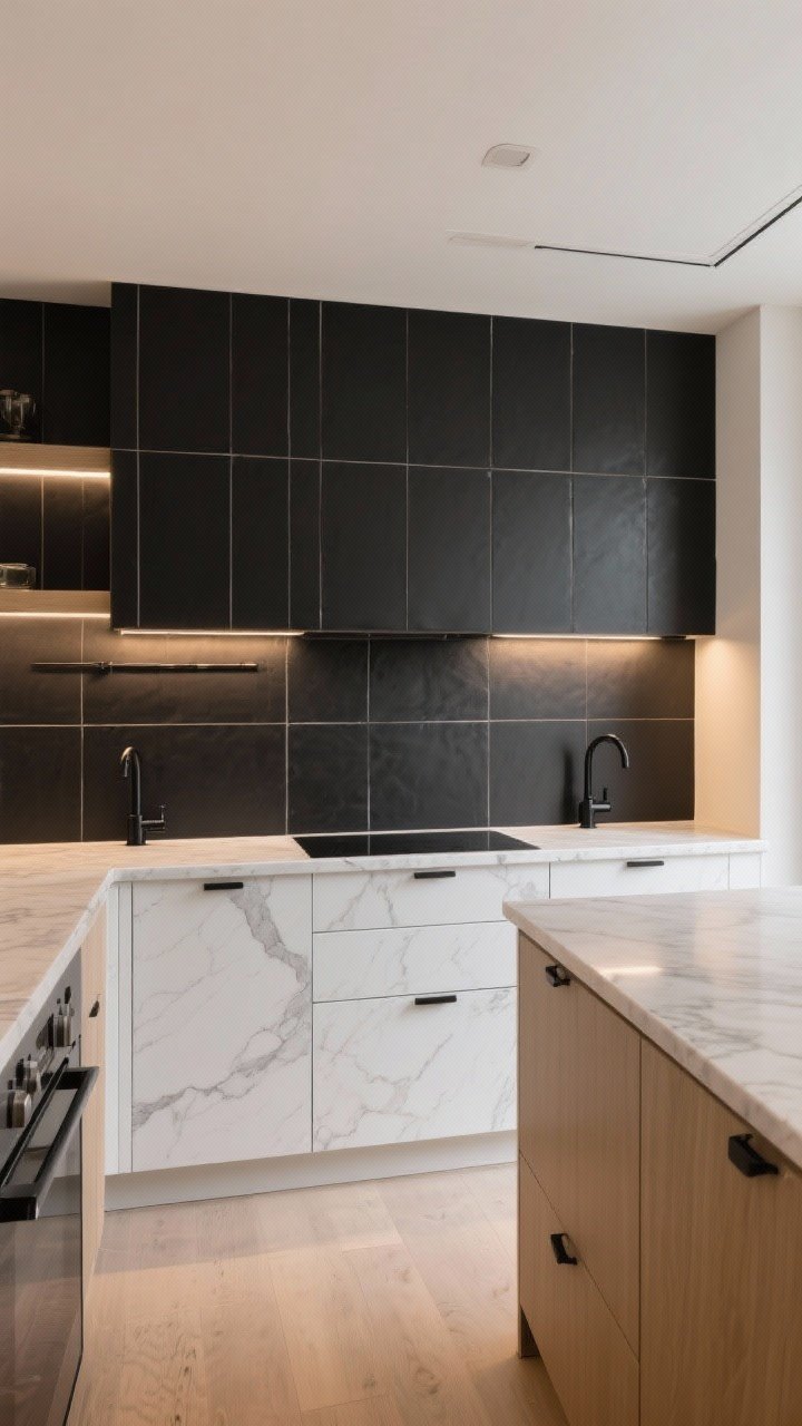
Black tile and light quartz? Chef’s kiss. The contrast is crisp and modern, and matte finishes hide smudges (bless).
Why It Works
- High-contrast drama: Makes white or marble-look quartz pop.
- Texture play: Matte tile + polished quartz = rich visual layers.
- Grounds the space: Especially great with light cabinets and floors.
Pro Tips
- Choose rectified edges for tight grout lines and a modern look.
- Pair with black fixtures to make it feel intentional.
- Keep lighting warm to soften the contrast and add coziness.
8. Terrazzo-Style Porcelain: Playful Speckles, Grown-Up Mood
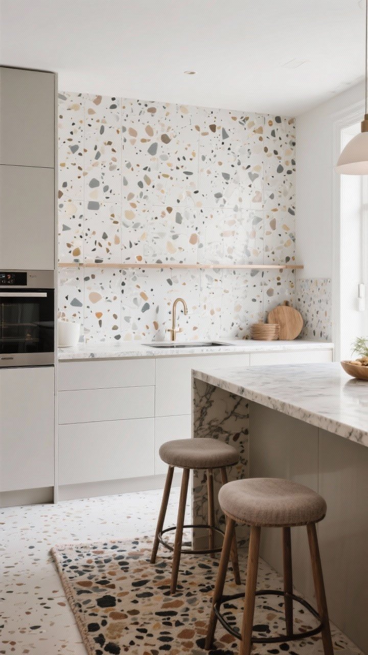
Terrazzo-style tile brings color and fun without feeling busy. The tiny speckles echo quartz’s subtle flecks—instant chemistry.
Why It Works
- Pattern scales well: Small chips keep it calm; larger chips add personality.
- Coordinates with quartz: Choose a terrazzo with flecks that match your counter tones.
- Durable and cleanable: Porcelain is a workhorse.
Pro Tips
- Pick a low-contrast palette if your quartz has movement.
- Use matte terrazzo for a contemporary, European vibe.
- Tie in speckle colors with barstools, rugs, or art so it all clicks.
9. Textured White: Beadboard, Fluted, or 3D Ceramic
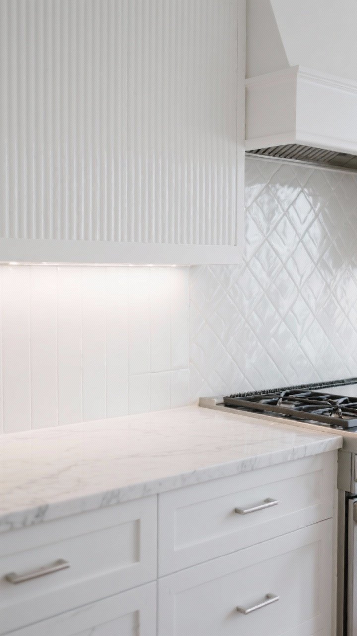
White-on-white is anything but boring when you add texture. Think beadboard, fluted panels, or 3D ceramic tiles for subtle shadows and depth.
Why It Works
- Soft contrast: Texture pops against quartz without color noise.
- Light-friendly: Ridges catch light beautifully—especially with under-cabinet LEDs.
- Flexible style: Beadboard skews cottage, fluted feels modern, 3D tiles read luxe.
Pro Tips
- Seal painted beadboard with a scrubbable finish behind the range.
- Choose tone-on-tone whites for a layered, designer look.
- Balance texture with simple hardware and streamlined fixtures.
10. Glass Sheet or Back-Painted Glass: Sleek, Glossy, Easy
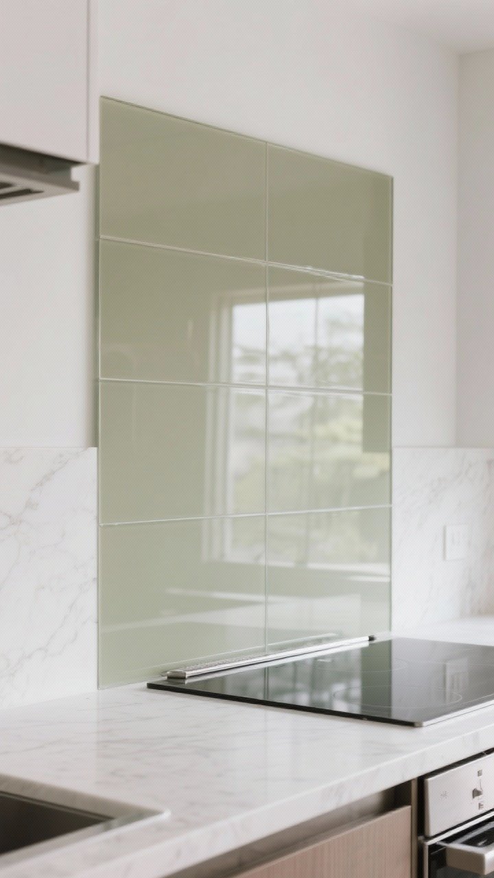
For a super clean aesthetic, install a single sheet of glass or back-painted glass panels. It’s glossy, reflective, and pairs beautifully with quartz’s polish.
Why It Works
- Mirror-like shine: Bounces light around and opens up the room.
- Zero grout: You’ll love cleanup after curry night, IMO.
- Custom color: Match paint to your cabinetry or pull a hue from your veining.
Pro Tips
- Use low-iron glass for true color without the greenish tint.
- Opt for a soft gray, mushroom, or muted eucalyptus for subtle sophistication.
- Confirm heat tolerance around the range; sometimes a metal strip is needed near high heat.
How to Choose the Right Backsplash for Your Quartz
- Match undertones: Cool quartz loves cool whites, grays, and blues. Warm quartz likes cream, taupe, and brass.
- Balance movement: Busy counters = simple backsplash. Quiet counters = you can go bolder.
- Mind the finish: Glossy tiles amplify light; matte tiles feel grounded and modern.
- Think grout: Matching grout = seamless. Contrasting grout = graphic and bold.
- Lighting matters: Always test samples with your actual lighting at different times of day (FYI, LEDs can shift color).
Installation and Maintenance Quick Hits
- Height: Run backsplash to upper cabinets or all the way to the ceiling for drama, especially behind the range.
- Edges: Finish with schluter trim or bullnose for a professional look.
- Sealing: Porcelain and glass are low-maintenance; stone and grout may need sealing.
- Outlets: Align or color-match outlet covers for a cleaner look (or use a plugmold strip under cabinets).
Sample Pairings You’ll Love
- Calacatta-look quartz + zellige in warm white with brass hardware = timeless and cozy.
- Pure white quartz + matte black stacked tile with black fixtures = minimalist drama.
- Gray quartz + vertical subway in glossy white with stainless accents = fresh and bright.
- Warm veined quartz + terrazzo porcelain with camel leather stools = modern and welcoming.
Bottom line: your quartz is the star, and the right backsplash is its perfect co-star—not stealing the spotlight, just making the whole scene better. Grab a few samples, tape them up, and live with them for a week. Your future self (and your kitchen selfies) will thank you.