5 Best Fall Living Room Color Palettes That Feel Like a Cozy Hug

Ready to make your living room feel like a warm mug of cider? Fall color palettes are the cheat code for instant cozy vibes. Whether you’re into moody, earthy, or minimalist looks, I’ve got five palettes that deliver serious style without a full paint job. Throw pillows, rugs, art—boom. Instant glow-up.
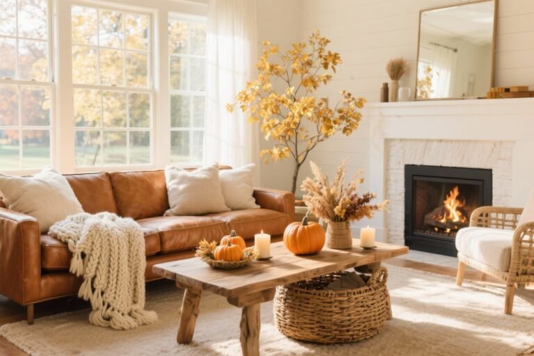
1. Cinnamon & Cream (Warm, Soft, And Oh-So-Inviting)
This palette is basically a latte for your living room. Think **cinnamon**, **caramel**, **cream**, and a dash of **terracotta**. It’s warm without feeling heavy, and it plays nice with most wood tones (even that IKEA piece you swore you’d replace).
Tired of snacking when you’re not even hungry? This reset helps you stop the loop and feel back in control.
A simple reset for moments when cravings take over. Easy to use, easy to repeat, and designed to help you feel satisfied instead of stuck.
Why It Works
- Neutral base, warm accents: Cream walls or a beige sofa let the rich cinnamon tones shine.
- Soft and layered: The mix of toasty and light keeps things cozy but not cave-like.
How To Pull It Off
- Add **velvet or boucle pillows** in cinnamon and caramel on a cream or oatmeal sofa.
- Layer a **jute rug** with a smaller **rust-toned kilim** for instant texture.
- Use **terracotta planters** and **brass hardware** for warm sparkle.
- Art tip: botanical prints or abstract line art with warm neutrals. Easy win.
Pro move: Swap in creamy curtains with a thick weave. They soften the light and make everything look intentional—IMO, the cheapest luxe upgrade.
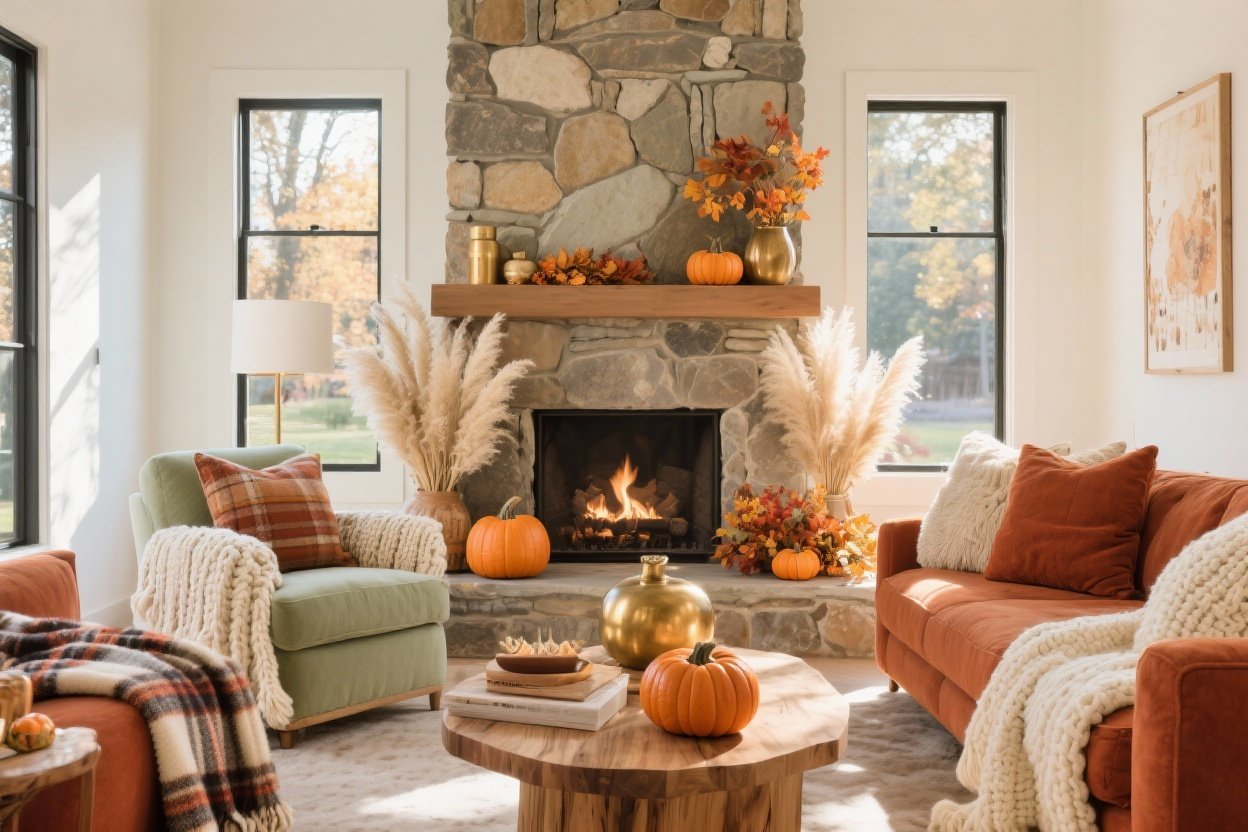
2. Forest Green & Ember (Moody Cabin, But Make It Chic)
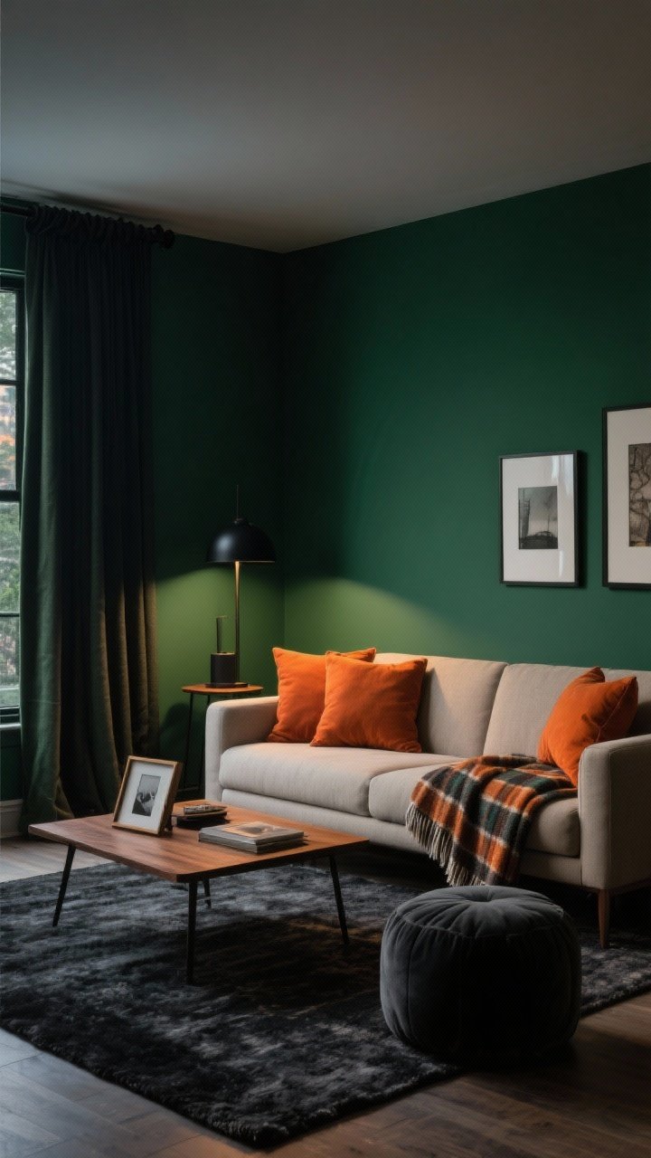
If you want a dramatic fall vibe, this palette slaps. Pair **deep forest green** with **ember orange**, **walnut**, and **charcoal**. It’s cozy, sophisticated, and a tiny bit mysterious—like your one friend who always brings good wine.
Why It Works
- High contrast: The green grounds the room, while ember accents bring warmth and energy.
- Natural nod: Feels like a forest at golden hour—very fall, very calm.
How To Pull It Off
- Paint a **single accent wall** in deep green (or use peel-and-stick if commitment issues are real).
- Bring in **ember-toned throw pillows** and a **wool plaid throw**.
- Choose **walnut wood** frames, coffee tables, or lamp bases.
- Balance with **charcoal**: a charcoal rug or pouf keeps it grounded.
FYI: Matte black lamps or curtain rods look extra sleek against green walls. Instant “designer did this” energy.
3. Dusty Rose & Maple (Soft, Romantic, And Totally Fall)
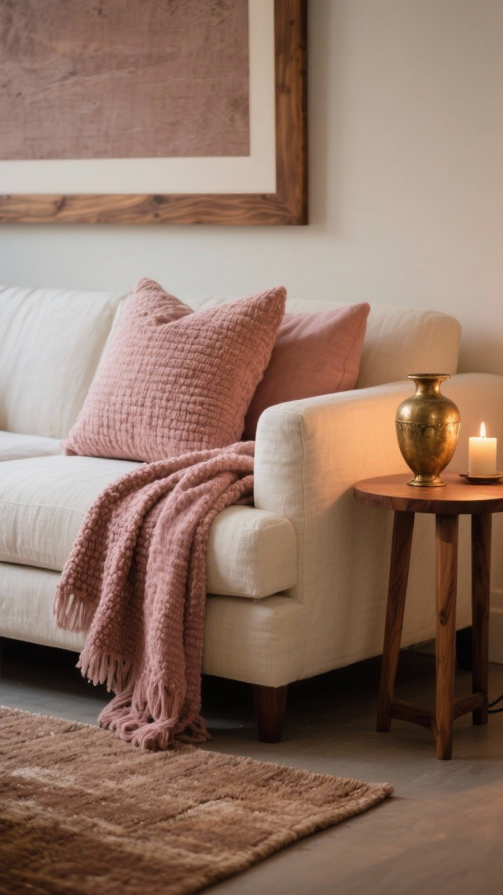
Before you roll your eyes at pink—hear me out. **Dusty rose**, **maple**, **warm taupe**, and **antique brass** make a grown-up, cozy palette that’s gentle but not saccharine. It’s fall in a candle-lit, glass-of-pinot kind of way.
Transform Your Home With 7,250+ Stunning Landscaping Designs—No Expensive Designers Needed!
- 🌿 Access 7,250+ stunning landscaping designs.
- 💰 Save thousands—no pro designer needed.
- 🏡 Plans for gardens, patios, walkways, and more.
- ✨ Simple, beginner-friendly DIY layouts.
- 🛠️ Customize any design to fit your yard.
Why It Works
- Muted tones: Dusty rose reads as a warm neutral in low light—super flattering on fabrics.
- Elegant warmth: Maple wood adds classic autumn richness without going full pumpkin spice.
How To Pull It Off
- Try a **dusty rose throw** or **nubby pillows**—texture matters here.
- Use **maple frames or side tables** for depth and warmth.
- Layer a **taupe area rug** for a calm foundation.
- Finish with **antique brass**: picture lights, vases, or a mirror. Chef’s kiss.
Quick swap: Replace bright whites with **warm off-white** (think linen or bone). It keeps everything cohesive and cozy.
4. Harvest Ochre & Ink Blue (Bold, Artsy, And Surprisingly Versatile)
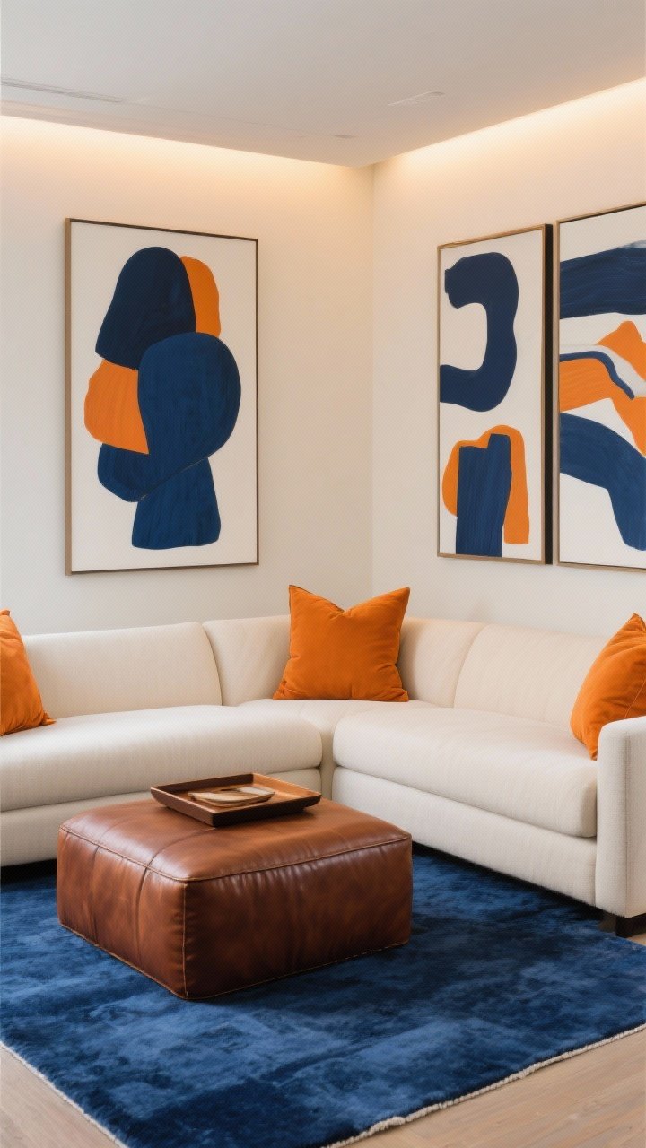
This one brings drama with balance. Pair **harvest ochre** (a golden mustard) with **ink blue**, **cream**, and **burnt umber**. It’s modern, it’s classic, and it makes your living room look curated—even if you just hung your art five minutes ago.
Why It Works
- Color theory magic: Ochre and blue are complementary, so they pop without screaming.
- Seasonal but timeless: You can switch accessories after fall and it still looks intentional.
How To Pull It Off
- Anchor with an **ink blue rug** or **sofa throw**.
- Layer **ochre pillows** and a **burnt umber leather ottoman** or tray.
- Keep **cream walls** or upholstery to let the colors breathe.
- Art idea: **abstract prints** with navy, ochre, and a hint of white space.
Lighting tip: Warm LED bulbs (2700K) make ochre glow. Cool bulbs will make it look sad—don’t do that to yourself, please.
5. Smoked Clay & Olive (Earthy Minimalism With Depth)
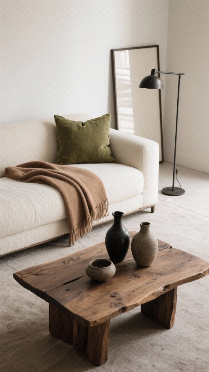
For a quieter fall vibe, go for **smoked clay**, **olive**, **ecru**, and **blackened bronze**. It’s earthy and minimal but still layered—perfect if you’re allergic to visual clutter.
Why It Works
- Grounded palette: Clay and olive add warmth while staying muted and sophisticated.
- Clean lines, cozy feel: You get calm without sacrificing the fall mood. Win-win.
How To Pull It Off
- Start with **ecru walls or sofa**, then add **olive pillows** and a **clay-toned throw**.
- Choose **linen, wool, and raw wood** for texture over pattern.
- Use **blackened bronze** for curtain rods, frames, or a sleek floor lamp.
- Finish with **stoneware vases** and a **chunky knit rug** to warm it up.
FYI: If you hate seasonal decor clutter, this palette transitions to winter with zero effort. Just add a darker throw—done.
Quick Styling Cheats For Any Palette
- Start with textiles: Pillows, throws, and rugs are the fastest color switch—no paint required.
- Repeat colors 3 times: For balance, echo each accent color in at least three spots.
- Vary textures: Mix velvet, linen, leather, and wool so your palette doesn’t fall flat.
- Use natural elements: Branches, gourds, and dried florals add seasonal color for free-ish.
Ready to curl up in your newly cozy space? Pick the palette that matches your vibe, layer in a few textures, and let the warm tones do the heavy lifting. Your sofa, your cider, your rules. Enjoy the glow-up!