10 Beige Kitchen Ideas Designers Use to Create a High-end Look You’ll Love
Think beige is boring? Not when designers get their hands on it. Beige kitchens can look insanely high-end—like “did you hire a celebrity designer?” high-end—when you play with tone, texture, and just the right amount of contrast. Let’s turn your neutral kitchen into a quiet luxury moment.
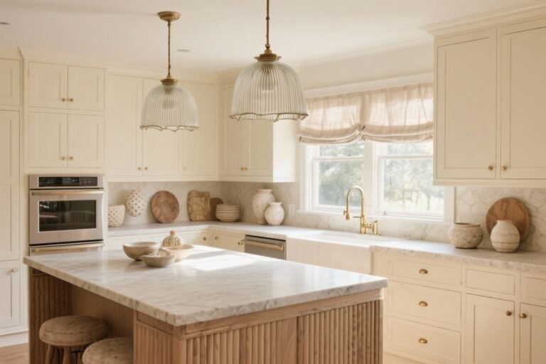
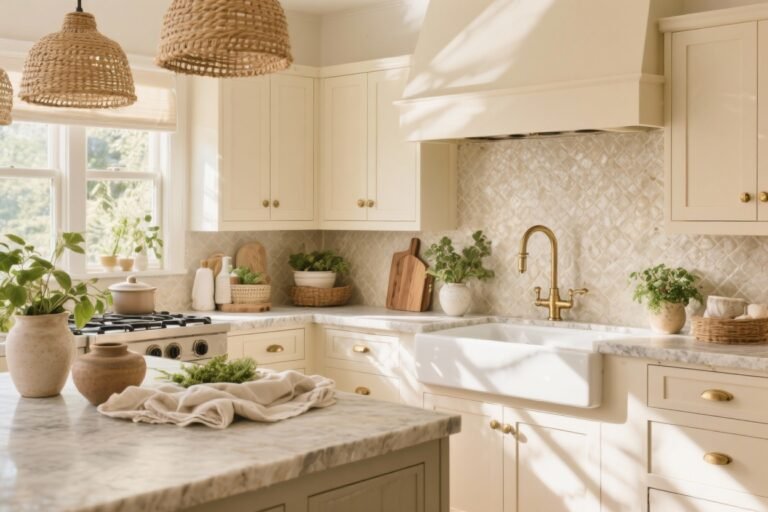
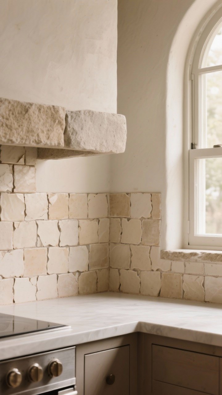
1. Layer Textures Like a Pro
The secret sauce of a chic beige kitchen isn’t the color—it’s the texture. When everything’s the same flat tone, the space can fall a little flat too. Add depth with tactile surfaces that catch light differently.
Tired of snacking when you’re not even hungry? This reset helps you stop the loop and feel back in control.
A simple reset for moments when cravings take over. Easy to use, easy to repeat, and designed to help you feel satisfied instead of stuck.
Where to Add Texture
- Cabinet finishes: Mix matte paint with reeded or fluted panels.
- Backsplashes: Zellige, tumbled stone, or honed marble = quiet drama.
- Countertops: Try leathered quartzite or a brushed granite.
- Hardware: Knurled pulls or ribbed knobs add subtle detail.
FYI: Even a woven Roman shade or linen bar stools can make the whole room feel richer—no demolition required.
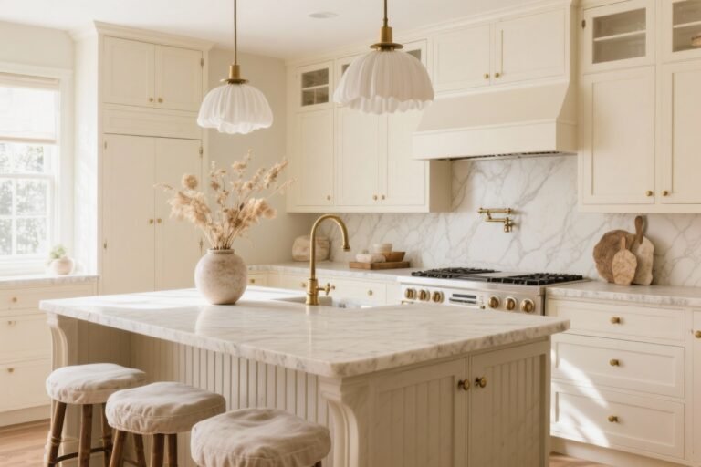
2. Play the Tone-on-Tone Game
Designers love a tone-on-tone palette because it looks curated and expensive. The trick is to layer multiple shades of beige—warm, cool, and everything in between—so the eye keeps moving.
A Foolproof Palette
- Cabinets: Warm greige (think mushroom or taupe-beige).
- Walls: Soft oatmeal or putty, one shade lighter.
- Island: Slightly deeper beige for subtle contrast.
- Trim: Creamy off-white to frame everything.
Pro tip: Test swatches in morning and evening light. Beige can go yellow or pink fast, and that’s… not the vibe.
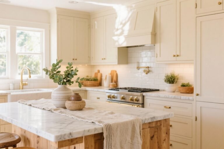
3. Upgrade Surfaces for a Luxe Finish

If you want instant “custom kitchen” energy, invest in hero surfaces. You don’t need everything to be top-tier—just choose one or two showstoppers.
Transform Your Home With 7,250+ Stunning Landscaping Designs—No Expensive Designers Needed!
- 🌿 Access 7,250+ stunning landscaping designs.
- 💰 Save thousands—no pro designer needed.
- 🏡 Plans for gardens, patios, walkways, and more.
- ✨ Simple, beginner-friendly DIY layouts.
- 🛠️ Customize any design to fit your yard.
Designer-Favorite Combos
- Waterfall island: A creamy quartz or veined quartzite wrapping down the sides.
- Honed stone: Less shine, more sophistication. It photographs beautifully IRL too.
- Slab backsplash: Match it to the counters for a continuous, luxe look.
On a budget? Use a high-end slab on the island and a simpler material on the perimeter. No one will notice—promise.
4. Add Contrast With Dark Accents
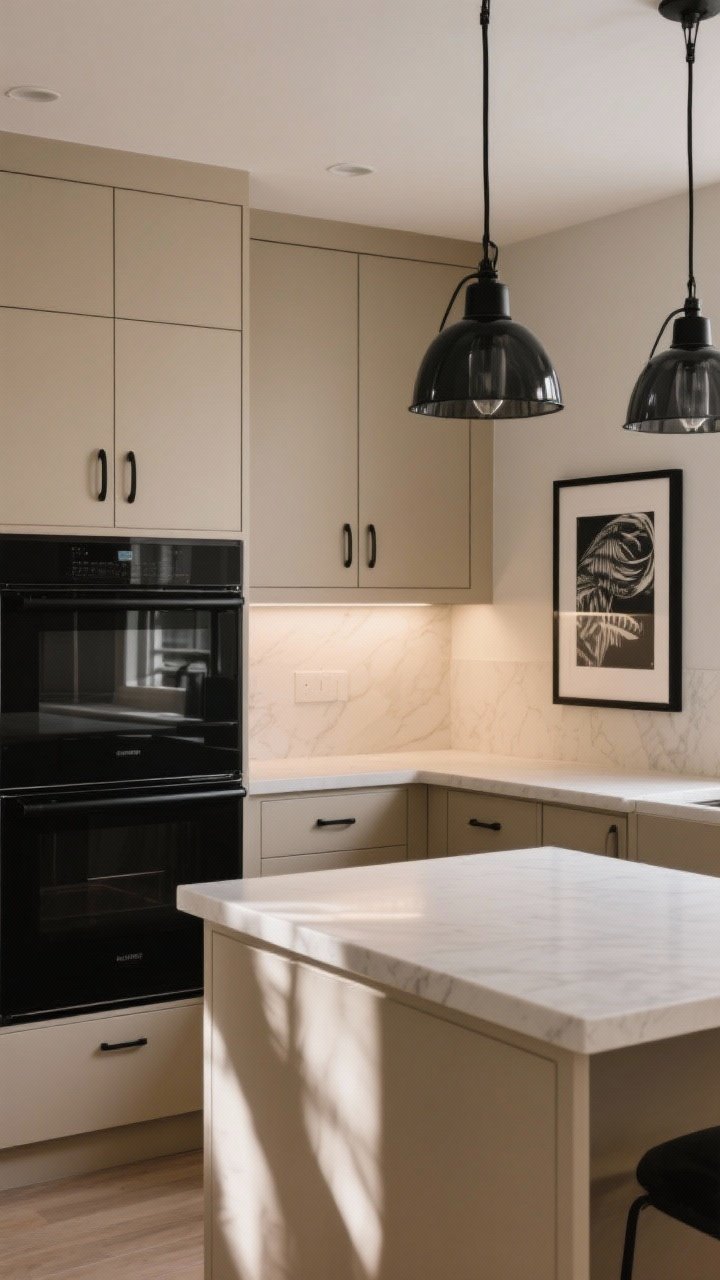
Beige needs a little edge to avoid going bland. Enter dark accents—think light fixtures, hardware, or a moody coffee nook. The contrast makes the beige feel intentional and modern.
Where to Add That Edge
- Hardware: Oil-rubbed bronze or matte black pulls.
- Lighting: Black metal pendants or smoked glass shades.
- Appliances: Black range or panel-ready to keep it seamless.
- Art: Graphic black-and-white prints in simple frames.
Keep it balanced—about 10–15% dark moments is enough to make beige pop without feeling heavy.
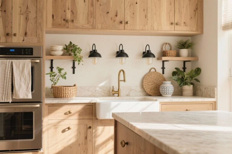
5. Warm It Up With Natural Wood
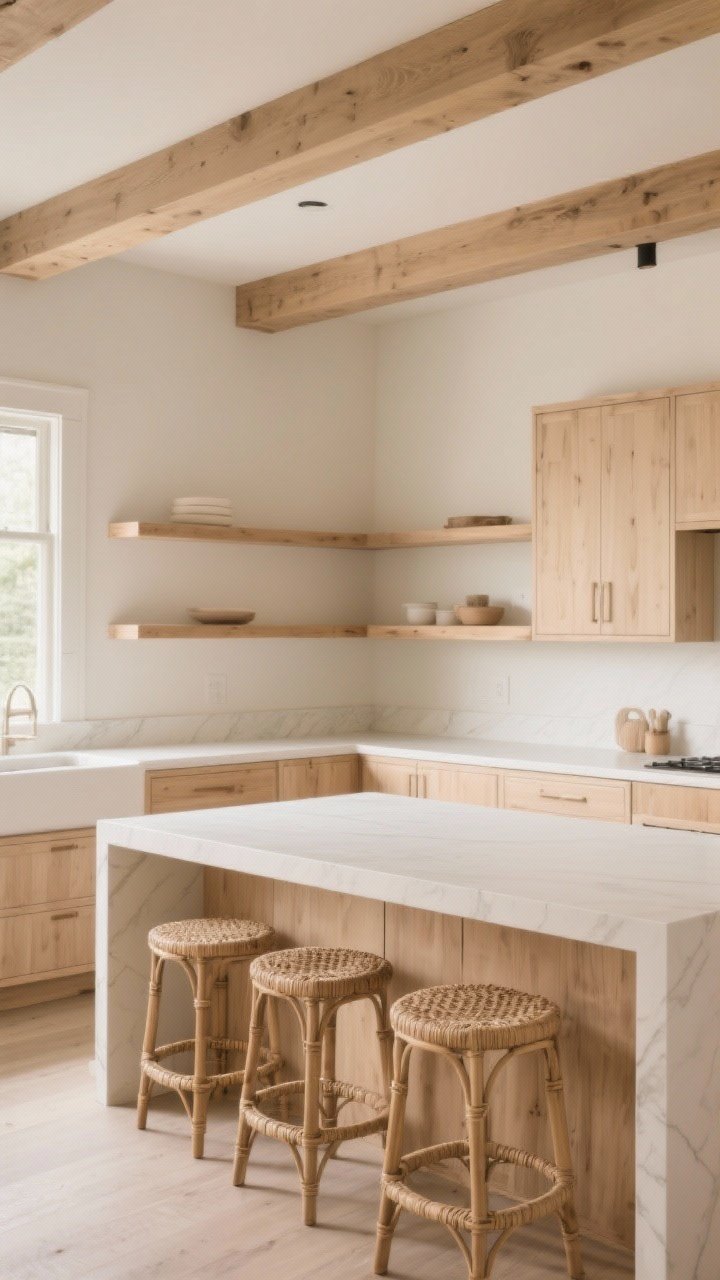
Beige and wood are a love story. Mixing warm wood tones with neutral cabinetry adds soul and makes the space feel layered and custom. Designers do this constantly because it just works.
Best Places for Wood
- Island base: White oak or walnut in a natural finish.
- Open shelves: Float a pair above the counter to break up uppers.
- Ceiling detail: Wood beams or slatted panels for texture overhead.
- Stools: Woven seats or cane backs to bring in an organic vibe.
Match undertones: cool beiges pair with light, desaturated oaks; warm beiges love richer walnuts and chestnuts.

6. Choose Lighting That Flatters (and Flexes)
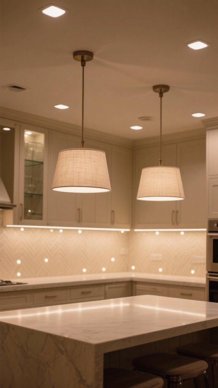
Lighting can make beige glow or look blah. Designers layer ambient, task, and accent lighting to highlight texture and keep the space from feeling flat.
Lighting Blueprint
- Ceiling: Dimmable recessed lights for even, shadow-free prep zones.
- Pendants: Statement fixtures above the island—linen shades or frosted glass for softness.
- Under-cabinet: Warm LED strips (2700–3000K) to make beige feel creamy, not yellow.
- Inside glass doors: Tiny puck lights = instant boutique display.
IMO, tunable LEDs are worth it. You can shift warmer for dinner parties and cooler for cooking marathons.
7. Go Minimal With Maxed-Out Details
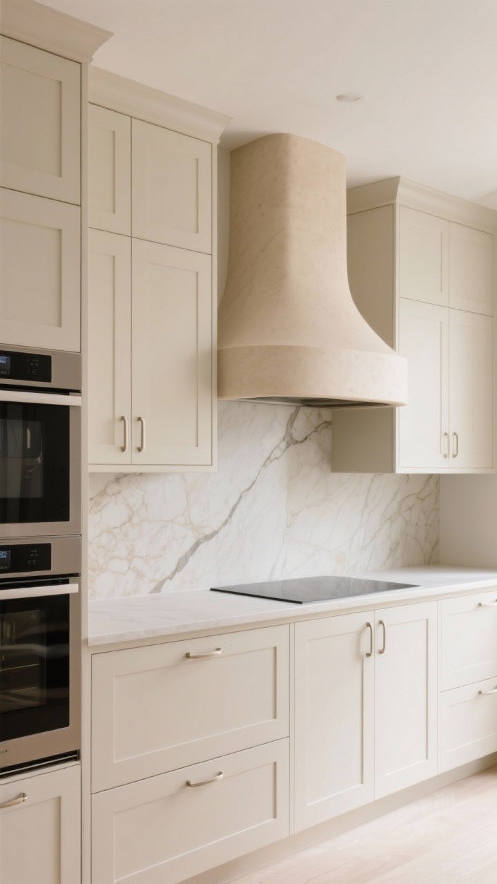
Minimalism doesn’t mean empty. It means every detail is considered. In beige kitchens, designers edit visual noise and double down on ultra-clean lines that let the materials shine.
How to Nail Quiet Luxury
- Integrated pulls: J-channel or hidden edge pulls for sleek fronts.
- Panel-ready appliances: Keep the visual rhythm uninterrupted.
- Thin profiles: Slim shaker or flat slab doors for a tailored look.
- Seam work: Bookmatched stones and aligned grout lines—nerdy, but stunning.
Want personality? Do it with one sculptural element—like a curved hood or a fluted island—so it feels intentional, not chaotic.
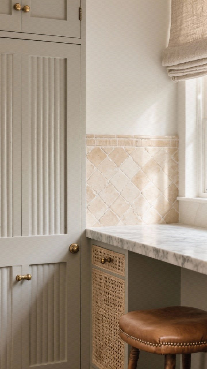
8. Style the Backsplash to Steal the Show
Your backsplash is prime real estate for subtle drama. Keep it neutral but nuanced to complement the beige without competing.
Designer-Approved Backsplash Moves
- Zellige tiles: Hand-glazed, irregular edges, tons of movement—gorgeous with beige.
- Large-format slabs: Fewer grout lines, more luxury. Great for small kitchens.
- Herringbone or stacked bonds: Play with pattern using tone, not color.
- Rounded returns: Wrap the stone to the window for a custom finish.
Bonus: Match grout to tile for a cleaner look. Contrasting grout is trendy, but in beige kitchens, subtle usually wins.
9. Curate Cozy, Not Cluttered
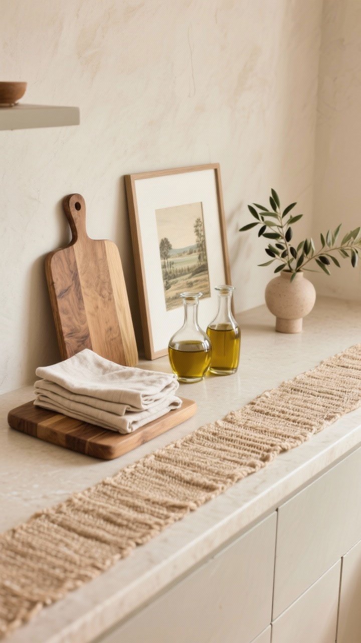
Beige can read serene or sterile depending on how you style it. Aim for curated warmth—functional pieces that also look beautiful, with just a couple of decor moments.
Styling That Actually Works
- Functional displays: Wood boards, a stack of linen napkins, pretty oil decanters.
- Greenery: Olive branches, eucalyptus, or a trailing pothos for softness.
- Textiles: Nubby rugs or runner in a natural fiber to ground the space.
- Art: Vintage landscapes or charcoal sketches in slim frames—instant depth.
Set a “display cap”: two styled moments per counter run. Anything more starts to feel like a yard sale, and your beige deserves better.
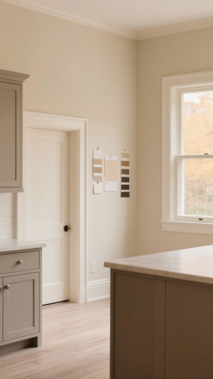
10. Nail the Undertones and Paint Finish
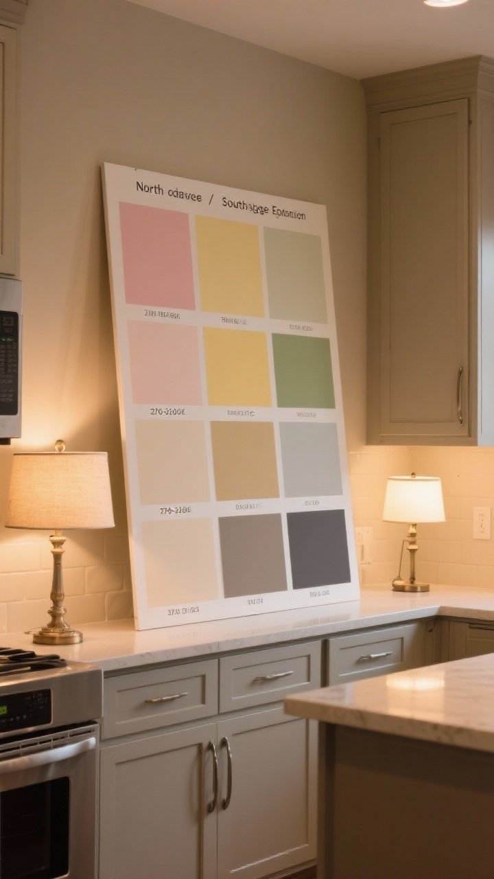
This is the part where designers quietly obsess—and you should too. Beige has undertones (pink, yellow, green, gray) that can shift with light. Get this right and everything else falls into place.
Undertone Cheat Sheet
- North-facing light: Cooler—choose warmer beiges with a hint of yellow or peach.
- South-facing light: Warm—use neutral-to-cool beiges to avoid going too golden.
- LED temp: Warmer bulbs (2700–3000K) make beige look creamy; cool bulbs can turn it ashy.
- Finishes: Matte or satin on walls; satin or semi-gloss on cabinets for cleanability.
Sample boards are your BFF. Paint two coats on posterboard, move them around for a few days, and yes—look at them at night too. Beige changes mood like a cat.
Bonus Mini-Guide: Designer-Favorite Beige Paints
- Warm/Classic: Benjamin Moore Pale Oak, Sherwin-Williams Accessible Beige
- Greige/Modern: Benjamin Moore Edgecomb Gray, Farrow & Ball Skimming Stone
- Deep/Island: Benjamin Moore Revere Pewter, Portola Paints Roman Clay neutrals
Final Thought: Beige isn’t basic—it’s a canvas. Layer textures, dial in undertones, and sprinkle contrast like a designer. Do that, and your kitchen will look high-end, calm, and effortlessly cool. Now go make beige the main character, because honestly, it kind of is.