10 Beige Kitchen Details Designers Use to Create a Warm, Timeless Look You’ll Love
You know how some kitchens just feel calm the moment you walk in? That’s the power of beige done right. Not bland. Not boring. Just beautifully soft, warm, and quietly luxurious.
If you’re craving that cozy, forever-chic look, these are the exact beige kitchen details designers lean on. Steal one, or steal all ten. Your future self (and your morning coffee) will thank you.
Tired of snacking when you’re not even hungry? This reset helps you stop the loop and feel back in control.
A simple reset for moments when cravings take over. Easy to use, easy to repeat, and designed to help you feel satisfied instead of stuck.
1. Choose The Right Beige (Yes, There Are A Million)
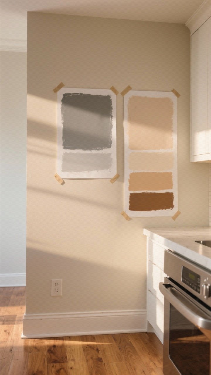
Beige isn’t one color—it’s a whole spectrum. There’s greige (gray + beige), sand, almond, linen, and warm camel. The trick is picking a beige that plays nicely with your light and your finishes.
How to Nail Your Undertone
- North-facing light: Go warmer—think creamy or almond—to counter the cool light.
- South-facing light: Slightly cooler beige (greige) keeps it from going yellow.
- Existing finishes: If you’ve got warm oak floors, choose a beige with a warm undertone. With stainless and cooler stone, lean greige.
FYI: Sample on poster boards, move them around all day, and look at them with lights on/off. Beige is sneaky.
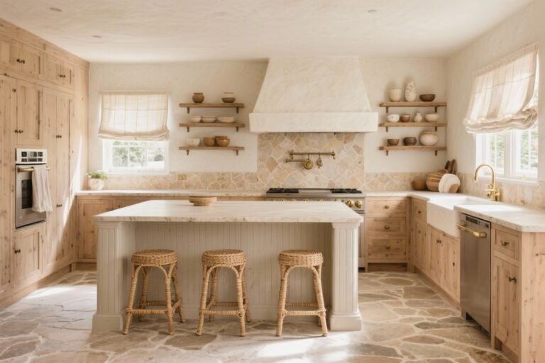
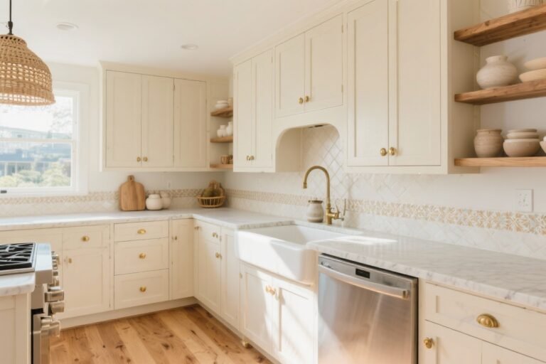
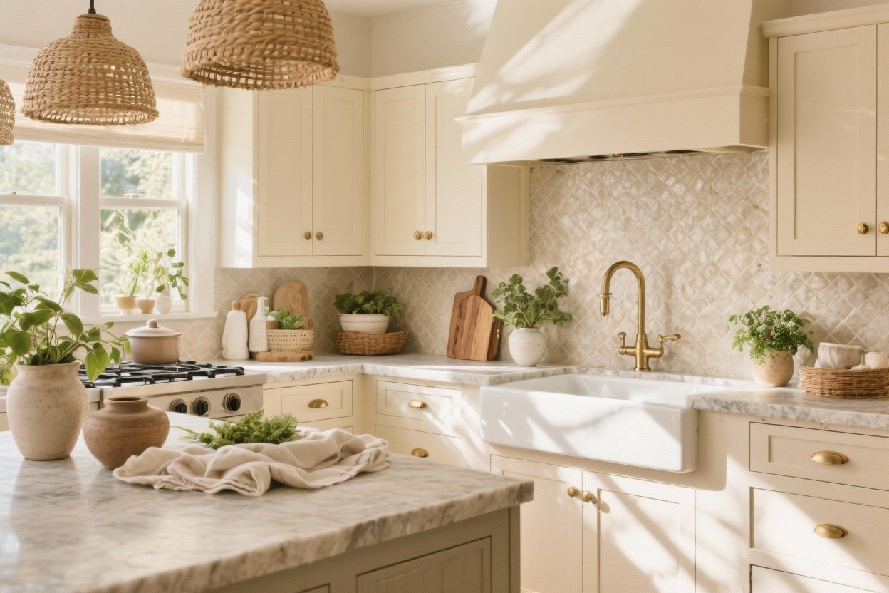
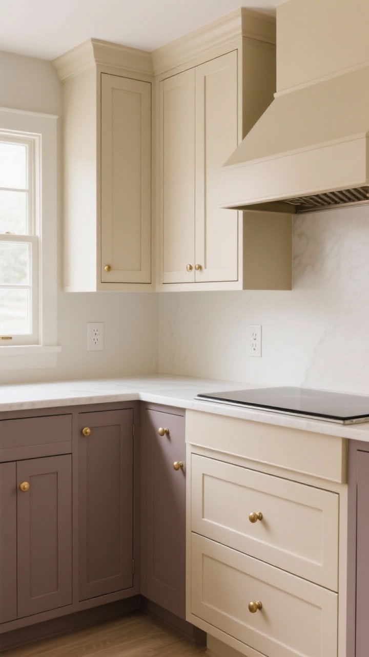
2. Cabinetry In Soft Beige (But With Depth)
Beige cabinets are the backbone of a timeless kitchen. Designers love a soft-matte finish in warm beige for that custom, furniture-like feel. It’s elegant without screaming, “I’m trying too hard.”
Designer Tricks
- Color drenching: Paint the cabinets, trim, and even the hood in one beige for a seamless, high-end vibe.
- Two-tone magic: Beige uppers with wood or deeper taupe lowers = instant depth.
- Panel profiles: Shaker or slim Shaker add interest without clutter.
Pro tip: Use color-matched caulk and outlet covers so nothing sticks out.
Transform Your Home With 7,250+ Stunning Landscaping Designs—No Expensive Designers Needed!
- 🌿 Access 7,250+ stunning landscaping designs.
- 💰 Save thousands—no pro designer needed.
- 🏡 Plans for gardens, patios, walkways, and more.
- ✨ Simple, beginner-friendly DIY layouts.
- 🛠️ Customize any design to fit your yard.
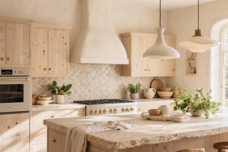
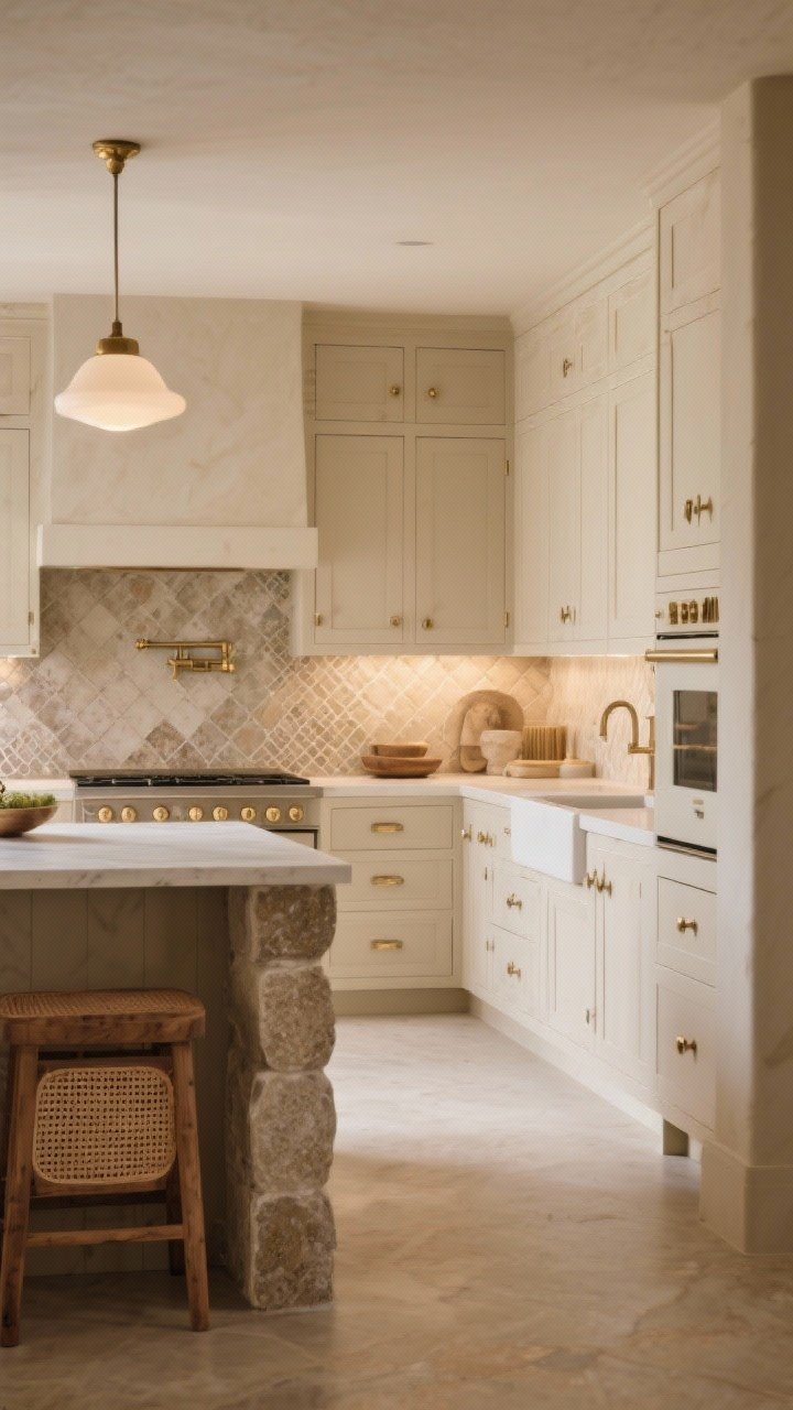
3. Stone That Warms It Up: Taj Mahal, Honed Marble, Or Soapstone
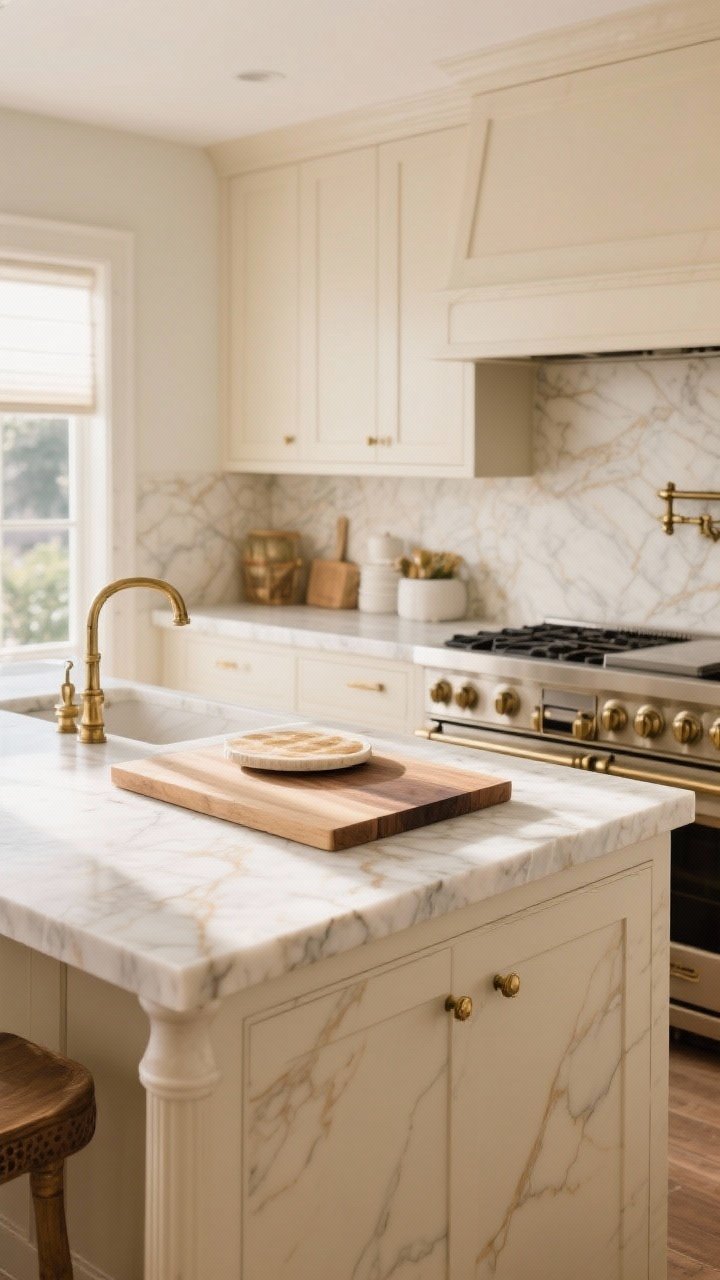
Countertops make or break beige. Designers pair beige with stones that have subtle veining and warm undertones—think Taj Mahal quartzite, Calacatta Gold marble (sealed, please), or even honed limestone if you’re brave.
What Works Best
- Taj Mahal Quartzite: Durable, creamy, whispers luxury. Great with beige and brass.
- Honed Marble: Soft and timeless. Embrace the patina; it’s part of the charm.
- Butcher Block Accents: On an island or baking station adds warmth and texture.
Skip super-busy patterns. You want quiet elegance, not visual chaos.
4. Textured Backsplashes That Glow
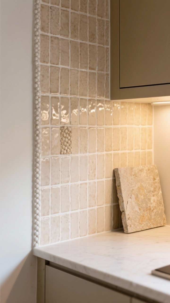
A beige kitchen shines when the backsplash adds texture. Think zellige tiles in a soft sand tone, handmade ceramic with a slight sheen, or beaded stone in a honed finish. The uneven surface catches light and makes beige feel alive.
Go Subtle, Not Flat
- Zellige or handmade ceramic: Variation = character.
- Vertical stack or half-height: Fresh, modern, still classic.
- Matching stone slab: Ultra-luxe and calm. Great for small kitchens that need fewer lines.
Grout matters: warm white or bone keeps the look soft.
5. Mixed Metals (But Keep Brass In The Chat)
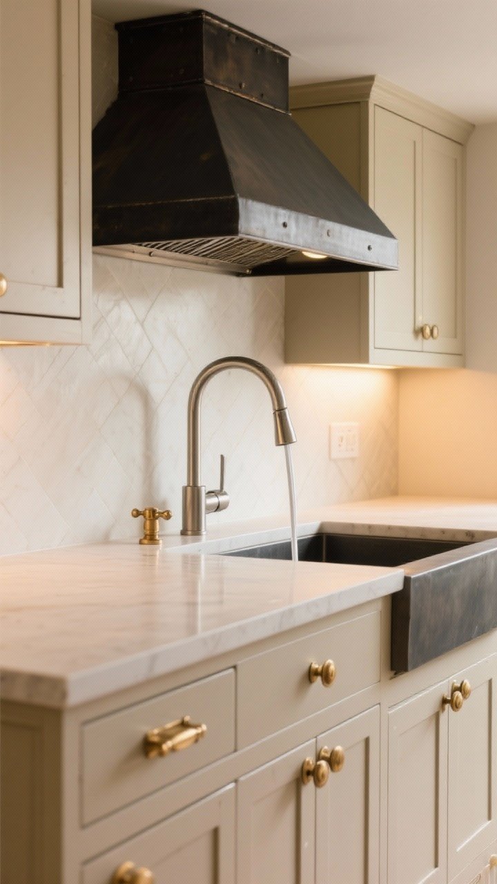
Beige loves brass. It’s warm, glowy, and adds that designer polish. Layer in a second metal—like brushed nickel or blackened steel—so it doesn’t feel too matchy-matchy.
How Designers Mix Without Mess
- Rule of three zones: Choose one metal per zone (hardware, lighting, plumbing) and repeat.
- Finish matters: Brushed or satin finishes look more expensive than shiny.
- Hardware shapes: Slim pulls, rounded knobs, and latches bring vintage charm.
IMO, unlacquered brass ages like fine wine. If you like patina, allow it.

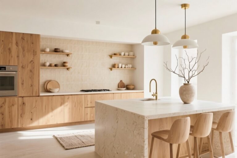
6. Warm Wood And Woven Accents
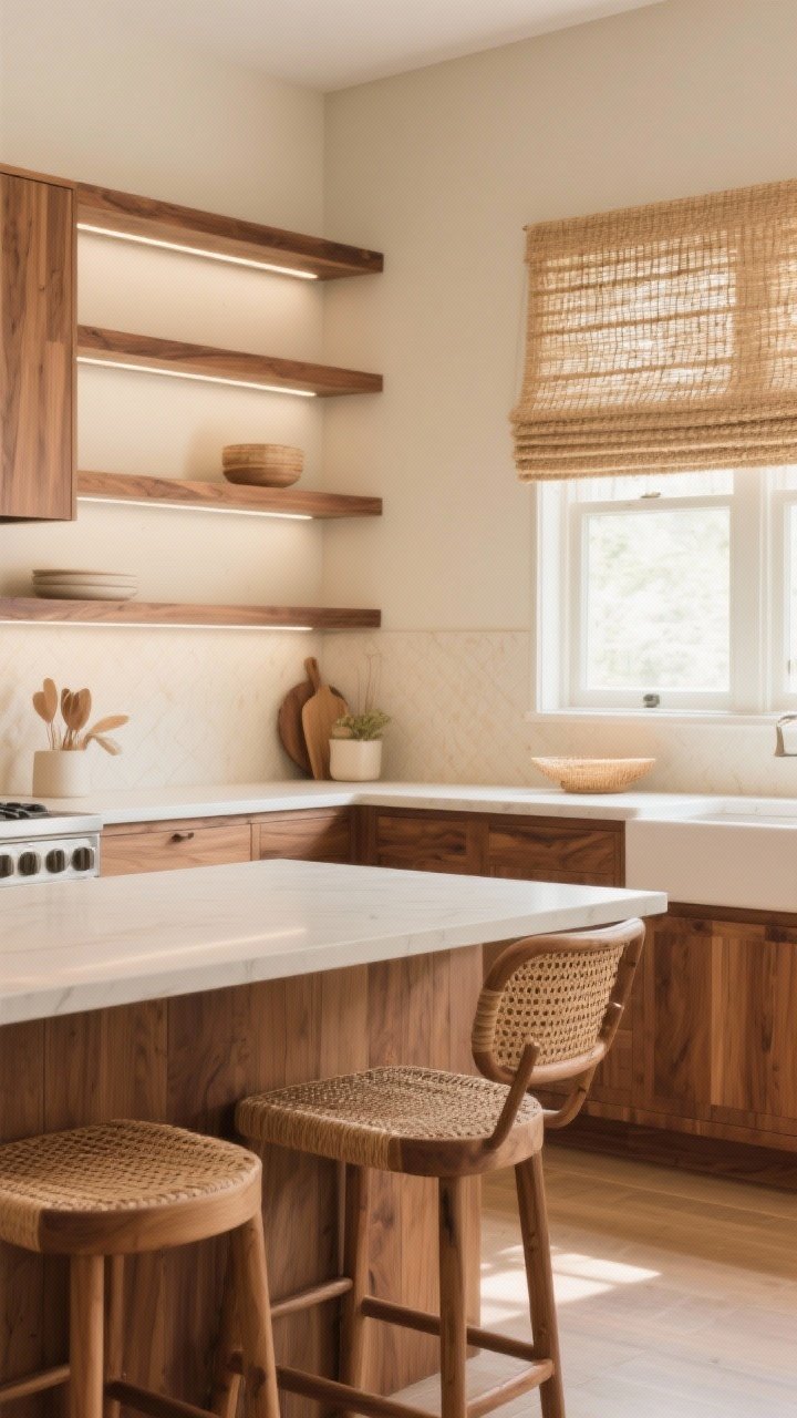
This is where beige goes from “pretty” to “I could live here forever.” Add natural wood—oak stools, walnut shelves, or a maple island—and a sprinkling of woven textures like rattan or seagrass.
Where To Use Them
- Open shelves: Thin wood shelves with integrated lighting = chef’s kiss.
- Bar stools or counter chairs: Wood frames with woven seats balance stone and tile.
- Window shades: Woven Roman shades bring softness and depth.
Keep wood tones cohesive—two species max so it doesn’t feel busy.
7. Cozy Lighting Layers (No UFO Over The Island)
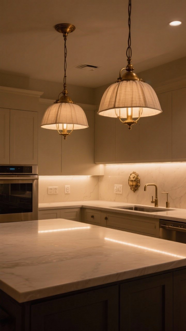
If your kitchen lighting screams hospital, beige won’t save you. You need layers: ambient, task, and accent. And make them warm—2700K to 3000K is your sweet spot.
Designer Lighting Formula
- Pendants with character: Linen shades, frosted glass, or antique brass over the island.
- Under-cabinet LEDs: Warm, dimmable strips for tasks and evening glow.
- Over-sink sconce: A charming detail that feels custom.
Dimmer switches are essential. Beige looks best when the lights can flirt a little.
8. Subtle Pattern And Fabric (Yes, In A Kitchen)
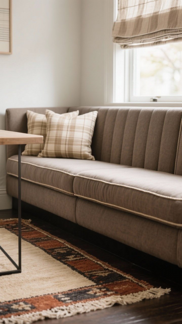
Textiles are the secret to making beige feel layered—not bland. Add a stripe or small check on cushions, a washable runner with a soft geometric, or even a tailored cafe curtain.
Where To Add Softness
- Banquette cushions: Performance fabric in taupe or sand with piping looks tailored.
- Rugs: A low-pile vintage-style runner in beige, rust, and charcoal hides everything.
- Window treatments: Linen blends soften light and match the neutral palette.
Keep patterns gentle and grounded. Beige doesn’t need to shout to make a statement.
9. Curated Counter Styling (But Leave Some Breathing Room)
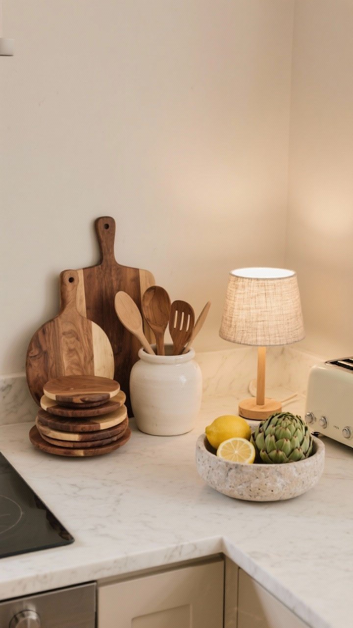
Designers don’t clutter. They curate. A beige kitchen shines when the counters have just a few beautiful, functional pieces that repeat your palette and textures.
What To Display
- Warm wood board stack: Round + rectangular for shape variety.
- Ceramic crock: Off-white or clay with wooden utensils.
- Stone or marble bowl: Fill with lemons or artichokes for quiet color.
- Small lamp: A mini lamp on the counter adds instant coziness.
FYI: Hide the toaster. You’ll thank me later.
10. Paint, Trim, And Ceiling Tones That Hug The Room
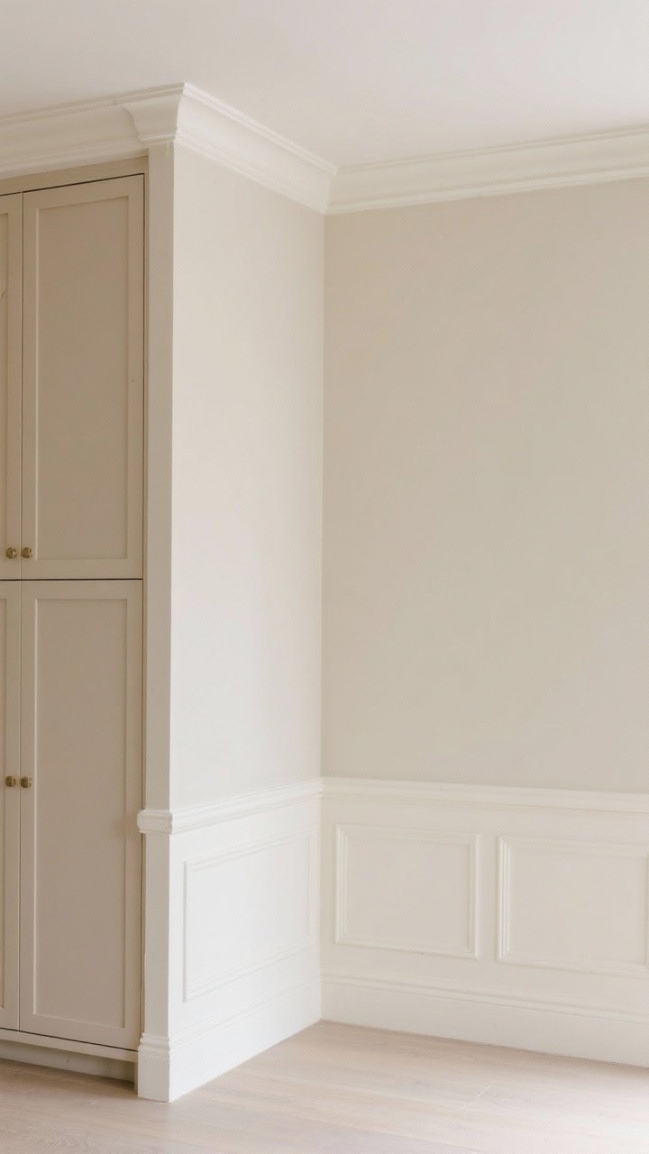
Don’t stop at cabinets. The surrounding walls, trim, and ceiling should support the look. Designers often go one or two steps lighter or darker than the cabinet beige to add depth without contrast overload.
Balanced, Envelope-Style Color
- Walls: Soft beige or warm white with the same undertone as your cabinets.
- Trim: Either match the cabinets for a seamless look or use a creamy off-white for a light frame.
- Ceiling: Don’t default to stark white. A 50% tint of your wall color feels sophisticated.
Keep your undertones consistent across paint, stone, and tile. That’s the secret sauce.
Conclusion
Beige isn’t basic—it’s the quiet luxury that makes a kitchen feel calm, warm, and endlessly livable. Choose the right undertone, layer textures, add warm metals, and let lighting do the heavy lifting. Steal a few of these details or go all in—either way, your beige kitchen will age gracefully and look effortlessly chic. Honestly, isn’t that the dream?