10 Kitchen Cabinet Paint Colors That Add Instant Personality You’ll Brag About
Ready to give your kitchen major main-character energy without a full reno? Paint. Your. Cabinets. It’s the fastest way to transform the vibe—from “fine, I guess” to “who is her designer?”—and it doesn’t require a trust fund.
Below are ten cabinet colors that bring instant personality, plus tips on finishes, hardware, and what to pair them with. We’re talking bold, fresh, and totally doable—even if your “workshop” is just a tarp and a dream.
Tired of snacking when you’re not even hungry? This reset helps you stop the loop and feel back in control.
A simple reset for moments when cravings take over. Easy to use, easy to repeat, and designed to help you feel satisfied instead of stuck.
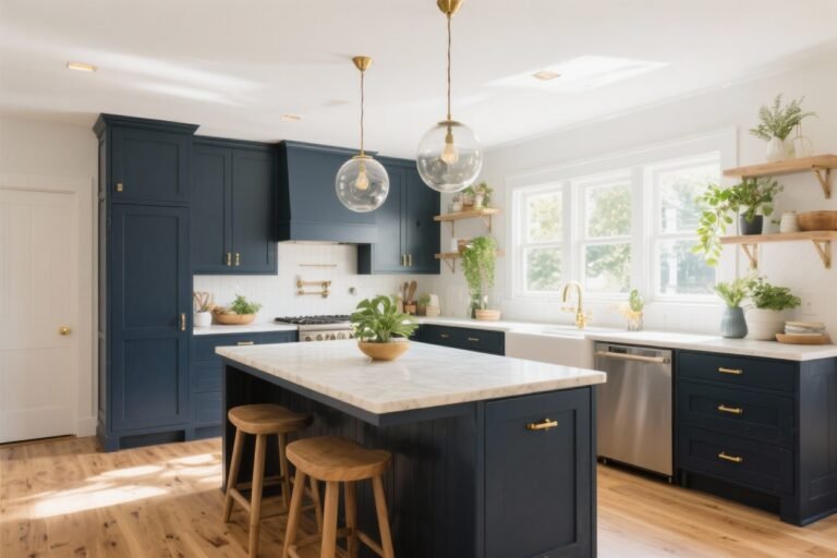
1. Moody Navy, But Make It Modern
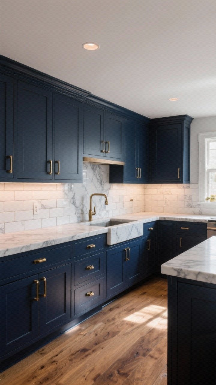
There’s a reason deep navy cabinets pop up in every designer’s portfolio. It’s dramatic without being chaotic, and it plays nice with both brass and chrome. Think bold, but approachable—like the kitchen version of a leather jacket.
Why It Works
- Depth without gloom: Navy absorbs light in the chicest way, making cheap laminate look luxe.
- Timeless and trend-proof: It won’t feel dated in two years (pinky promise).
Pro Tips
- Finish: Satin or semi-gloss for wipeability.
- Hardware: Aged brass or brushed gold for warmth; polished nickel for crisp contrast.
- Pair With: Marble-look quartz, white subway tile, and a warm wood floor. FYI, this combo photographs beautifully.
2. Forest Green That Feels Boutique-Hotel Fancy
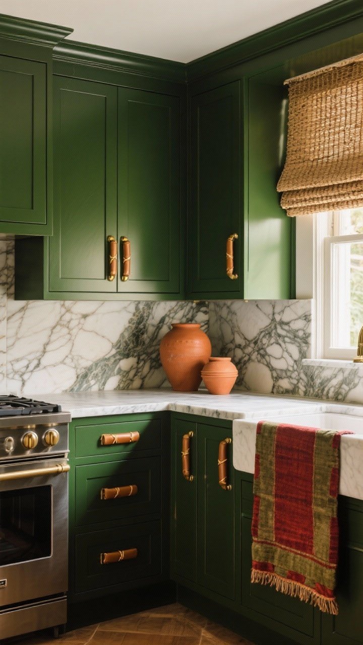
Forest and hunter greens are basically nature’s black—grounded, lush, and ridiculously sophisticated. They make a kitchen feel custom even if the boxes are off-the-shelf.
Why It Works
- Organic vibe: Brings a calm, spa-adjacent feel to busy kitchens.
- Elevates hardware: Gold, bronze, or even leather pulls shine against green.
Pro Tips
- Finish: Satin to reduce fingerprints; matte reads ultra-luxe if you’re tidy.
- Pair With: Veined stone, terracotta accents, woven shades. Add a vintage runner for chef’s-kiss texture.
3. Warm Greige, AKA The Quiet Luxury Neutral
Greige is that subtle blend of gray and beige that screams understated elegance. If you want a calm, designer-y look that still feels cozy, this is your MVP.
Why It Works
- Soft and versatile: Plays nicely with cool metals and warm woods.
- Lightens a space: Reflects daylight but doesn’t glare.
Pro Tips
- Undertone check: If your countertops are warm, choose a greige with a slight taupe undertone; for cooler stones, lean gray.
- Finish: Semi-gloss for family kitchens—easier to clean spaghetti night off, IMO.
4. Soft Black That’s More Chic Than Stark
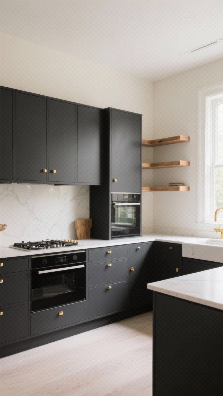
True black can be harsh, but a soft, charcoal-leaning black? Chef’s kiss. It’s dramatic, moody, and surprisingly forgiving—like dimmer lighting, but for your cabinets.
Transform Your Home With 7,250+ Stunning Landscaping Designs—No Expensive Designers Needed!
- 🌿 Access 7,250+ stunning landscaping designs.
- 💰 Save thousands—no pro designer needed.
- 🏡 Plans for gardens, patios, walkways, and more.
- ✨ Simple, beginner-friendly DIY layouts.
- 🛠️ Customize any design to fit your yard.
Why It Works
- High contrast: Makes white walls and light counters look bright and intentional.
- Design cred: Instantly modern without looking try-hard.
Pro Tips
- Finish: Satin to avoid scuffs showing; matte is sexy but high-maintenance.
- Pair With: Warm brass hardware, creamy walls, and natural wood shelves for balance.
5. Dusty Sage for Effortless Calm
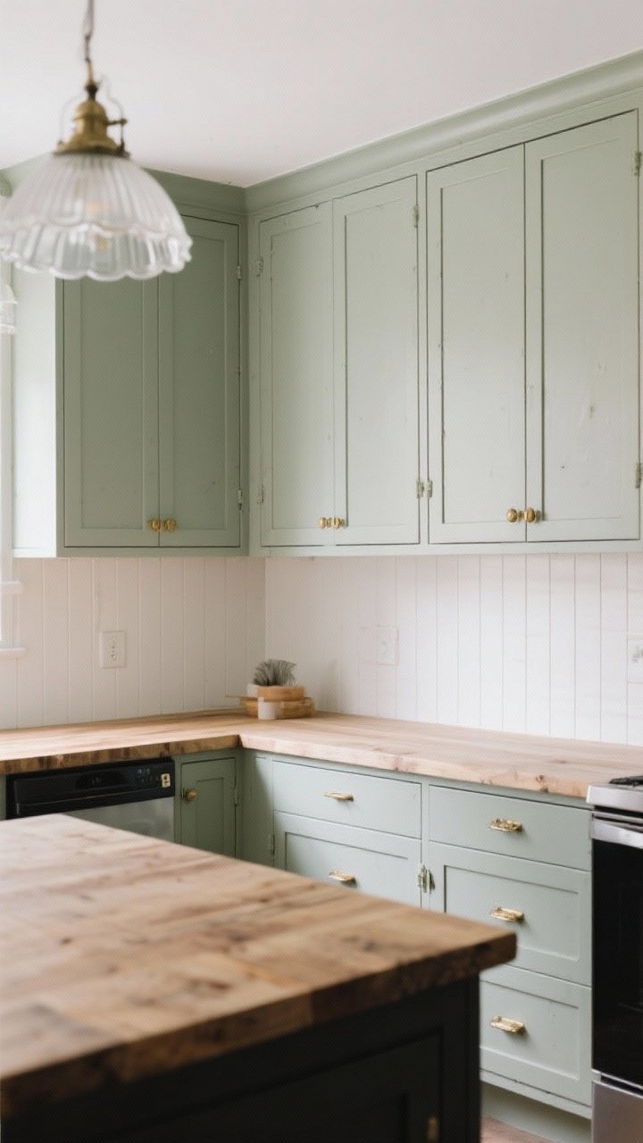
If you want color without commitment issues, dusty sage is your no-drama friend. It reads fresh, clean, and a little romantic—without going full cottagecore (unless you want to).
Why It Works
- Soothing tone: Green-gray blends hide smudges and look great in natural light.
- Pairs with everything: Brass, black, nickel—take your pick.
Pro Tips
- Finish: Satin or eggshell for that soft, velvety look.
- Pair With: Butcher block, beadboard backsplash, and milk-glass pendants for charm city.

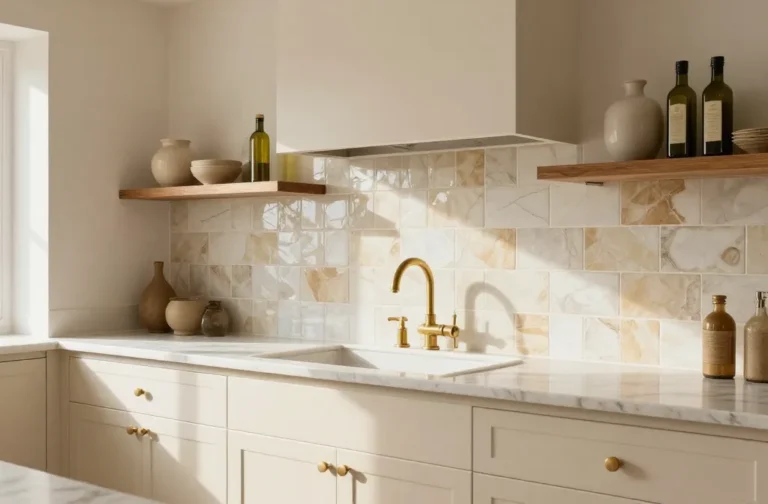
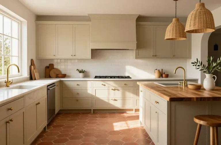
6. Creamy Ivory That Doesn’t Read Builder-Grade
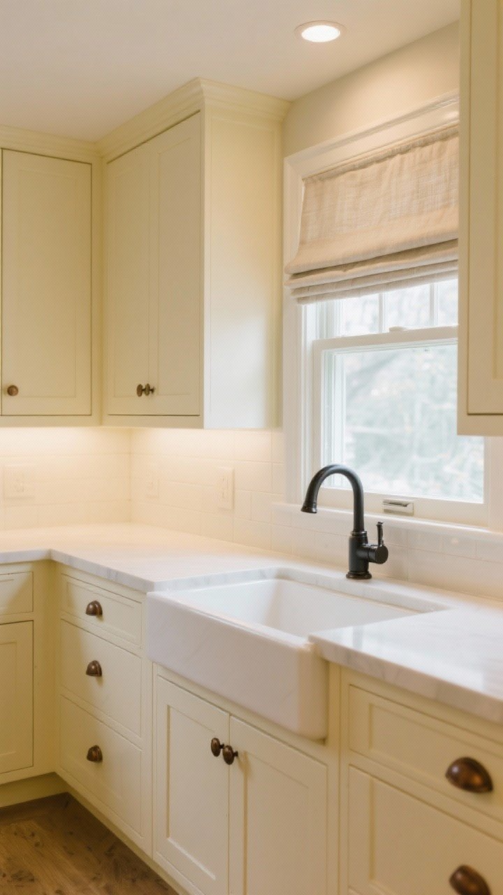
White cabinets are classic, but a creamy ivory feels warmer and way more custom. It flatters skin tones (hello, glam cooking) and softens harsh lighting.
Why It Works
- Warmth: Adds instant coziness, especially in north-facing rooms.
- Timeless: Won’t fight with patterned tile or bold rugs.
Pro Tips
- Undertone matters: Choose a yellow-based ivory for cool spaces; a neutral cream for warm rooms.
- Finish: Semi-gloss for durability; it bounces light beautifully.
- Pair With: Oil-rubbed bronze pulls, matte black faucet, and linen Roman shades.
7. Spicy Terracotta for Mediterranean Energy
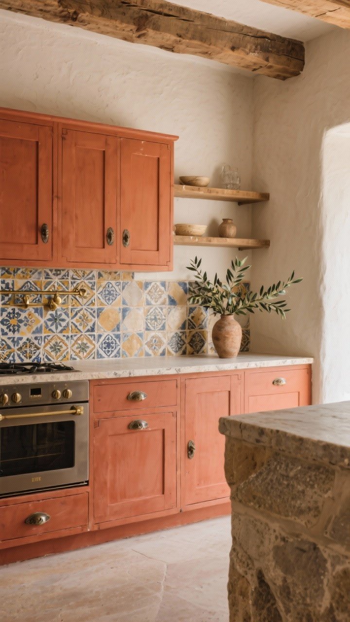
Terracotta on cabinets? Yes, and it’s a vibe. It brings earthy warmth and instant personality—like a vacation rental you never want to leave.
Why It Works
- Unexpected but livable: Bold without feeling loud.
- Plays well with texture: Stone, plaster, wood beams—go full tactile fantasy.
Pro Tips
- Balance it: Keep walls light and neutral so the cabinets sing, not shout.
- Hardware: Antique brass or aged pewter for a collected look.
- Pair With: Zellige tile, open shelving, and olive branches if you’re extra (we are).
8. French Blue That’s Fresh, Not Baby
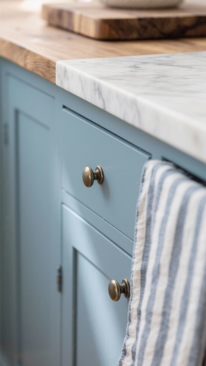
Think dusty French blue—not too bright, not nursery-ish. It brings charm and airiness, like throwing open a window in Provence. Bonus: it flatters natural stone like nobody’s business.
Why It Works
- Light-boosting: Adds color without sucking up light.
- Inviting: Makes small kitchens feel breezy and cheerful.
Pro Tips
- Undertone check: Choose a gray-based blue to avoid looking juvenile.
- Pair With: Polished nickel hardware, butcher block or honed marble, and striped textiles.
- Finish: Satin keeps it sophisticated; high-gloss can go Parisian chic if your doors are super smooth.
9. Rich Plum for Quiet Drama
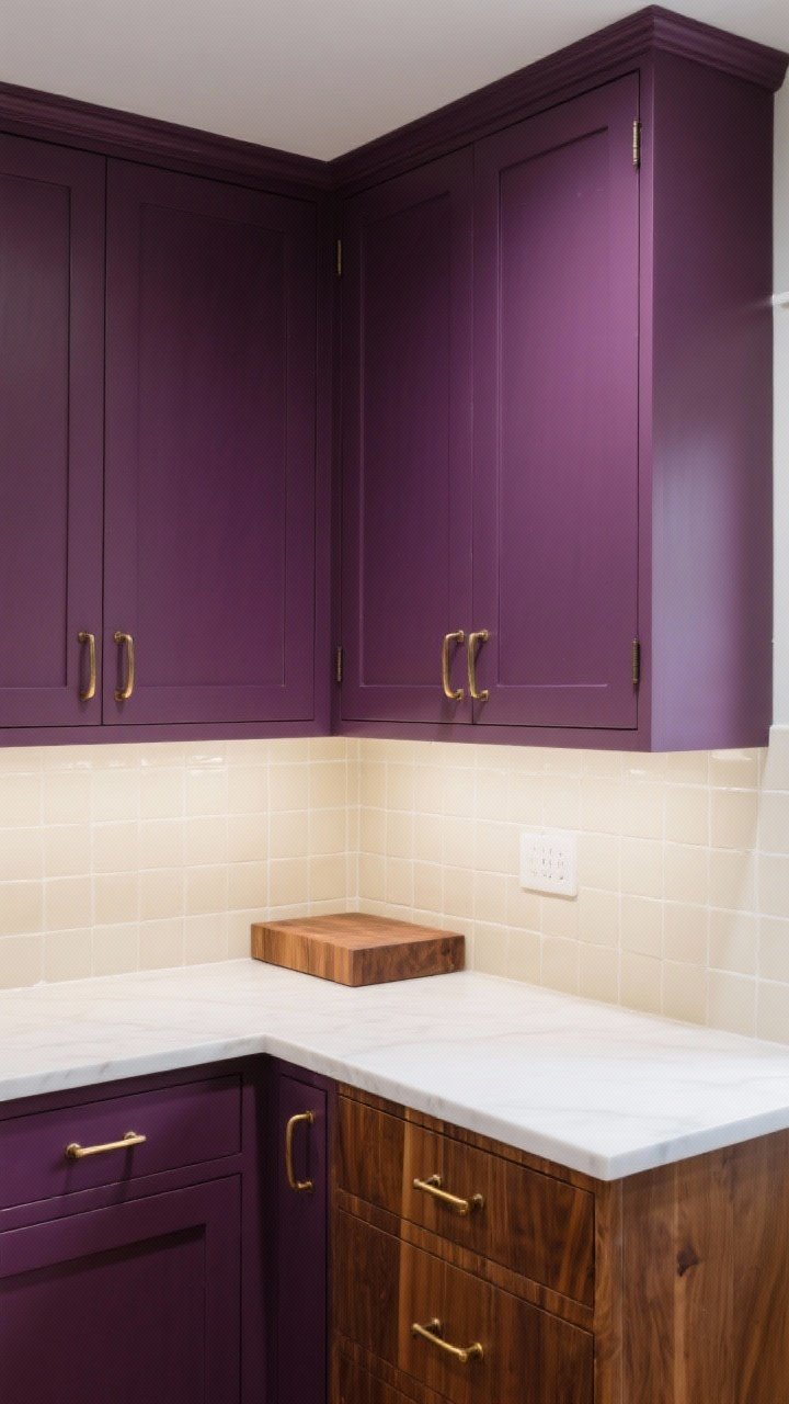
Plum and aubergine cabinets are for people who love a little drama with their morning coffee. It’s moody, luxe, and surprisingly cozy—like red wine for your kitchen.
Why It Works
- Unexpected elegance: Feels boutique and custom without screaming.
- Color chameleon: Shifts between brown and purple depending on light—very intriguing.
Pro Tips
- Ground it: Pair with warm whites, walnut accents, and unlacquered brass.
- Finish: Satin or matte for that velvety, furniture-like effect.
- Backsplash: Keep it simple—creamy zellige or beadboard to let the tone shine.
10. Smoky Teal That Feels Custom
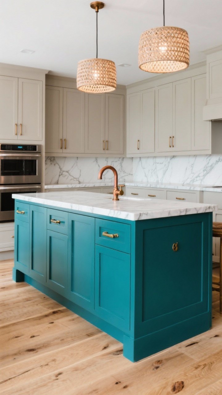
Teal is the extrovert of the blue-green family, but go smoky and it turns sophisticated fast. It’s vibrant enough to feel fun and grounded enough to live with everyday.
Why It Works
- Balanced color: Blue keeps it calm; green adds richness.
- Amplifies metals: Copper, brass, and even black hardware pop.
Pro Tips
- Finish: Semi-gloss for kitchens that get a workout.
- Pair With: White oak floors, quartz with subtle veining, and woven pendants for texture.
- Accent Idea: Paint the island smoky teal and keep uppers neutral for a designer look on a budget.
How To Nail Your Cabinet Paint Job (Quick Guide)
- Prep like a pro: Degrease, sand lightly, and vacuum dust. Skipping prep = chipping. Don’t do it.
- Prime: Use a bonding primer, especially on laminate or factory finishes.
- Tools: Foam roller for flats, angled brush for rails, sprayer if you want that pro finish.
- Thin coats: Two to three thin coats beat one gloopy one, every time.
- Cure time: Let doors cure at least a few days before rehanging. A week is safer.
Choosing Your Undertones (Don’t Skip!)
- Sample big: Paint poster boards and move them around the room morning to night.
- Match to fixed elements: Check against counters, backsplash, and flooring. Undertone harmony = pro result.
- Lighting matters: LED temps change everything. 2700K warms; 4000K cools. Adjust bulbs to flatter your paint, not fight it.
Hardware and Finish Pairings
- Navy/Black: Brass, bronze, or nickel with leather pulls for texture.
- Green/Sage: Aged brass or matte black; add natural wood knobs for artisan vibes.
- Greige/Ivory: Polished nickel or black for crisp contrast.
- Terracotta/Plum/Teal: Antiqued brass or copper for warmth; keep shapes simple.
Gloss Level Cheat Sheet
- Matte: Gorgeous, but shows wear. Save for low-traffic or very careful households.
- Satin: The Goldilocks finish—soft sheen, easy to clean.
- Semi-Gloss: Durable and bright; can highlight imperfections, so prep well.
Pick your color, prep with patience, and go for it. Your kitchen’s about to have a personality—and yes, you absolutely deserve the compliments that are coming. Now, which shade is calling your name?